Welcome back to our journey in maturing analytics. In Part 1, we looked at our job to be done and why it wasn’t building dashboards. In Part 2, we dove into the details of how dashboards can be a mismatch to users’ needs. Now, we’ll tackle how you might be building the right thing, but failing to delivery value in an effective way. To put it succinctly: Are we data driven if nobody opens up our well-designed dashboard?
Dashboards Fail Because We Choose the Wrong Delivery Path
Your company is in the business of creating value for customers. That work isn’t done in the reporting platform. Even when done brilliantly, data and analytics is a support function. The real job to be done is happening elsewhere.
Bottom line: The reporting platform is a detour. Our users work in other systems and have to leave that context to view dashboards. Finding the right data could be hard. Was it in Tableau? Which site? Or was it in Power BI? Did someone send me a link in Slack? Or email?
Sometimes because of the difficulty and challenge, it’s just easy to get on with work and leave analytics adoption to another day. So much for being data driven. There has to be some solutions.
Thankfully, there are a few solutions that present themselves. Let’s talk about them.

Delivery Path – Central Analytics Portal
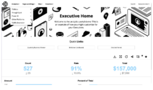
A Central Analytics Portal is a dedicated hub where all your analytics and reporting tools are accessible in one place. In real world scenarios we’ve seen this increase user adoption by as much as 350% with significantly improved satisfaction scores form end users. This approach offers several advantages:

Pros:
- White-labeled analytics: You can style the portal with your brand, ensuring consistency and familiarity for users. Users often judge the trustworthiness of information by external signals, the more professional your reports (and platform) look, the higher impact.
- Customized UI and Navigation: Web portals give you control over the navigation and discovery experience, allowing for a user-friendly environment tailored to your organization’s needs.
- Build or Buy: There are multiple market options, such as Curator or Metric Insights, which provide flexibility depending on your resources and requirements.
- Enforced Content Management: A big problem with existing platforms is the lack of clarity around which content is trust-worthy and in production. Content on a platform could have been built for a point in time with assumptions that are now invalid, it could still be in development, or it’s for a specific context of the business that doesn’t apply to you. A web portal puts makes it so that you have a process for determining what content will actually be considered in production and the tools to better organize and highlight it.
Cons:
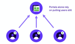
- User Pull Dependency: Despite its advantages, a central portal still requires users to leave their current workflow to access the data, which can reduce adoption rates.
- Additional Overhead: You now have another step in deploying analytics to production that would include adding content to your analytics portal. In many cases
I’m a huge believer in the power of analytic portals and have personally seen the impact with Curator by InterWorks. The key is to make them simple to use, personalized to the user and well organized. A good solution is going to make it easy for you to build it as well as maintain it.
Here are some quick testimonials about Curator:
After rolling out just Curator, our Tableau NPS went from 3.4 – 7.2.
— Finserve Customer (~750 employees)
And:
After we deployed Curator, our Tableau usage increased by 350%.
— Government Healthcare Provider (~21,000 employees)
Delivery Path – Embedding
Simply put, embedding is the capability to put BI tools (like Tableau and Power BI) in other websites, tools and applications. This is the technology that allows you to do something like the analytics portal above, but we can go a step further by putting reports directly into the tools customers are already using. One easy example is putting Tableau reporting in Salesforce so that sales staff have access to the latest information about their customers and opportunities.
Pros:
- Seamless Integration: Embedding reports within tools like Salesforce means that users can access crucial analytics without leaving their primary workspace.
- Contextual Data: Users receive relevant data at the right time and place, enhancing decision-making efficiency.
Cons:
- Complex Implementation: Embedding can require significant development effort and may need specialized skills or additional resources. You are also greatly increasing the number of systems that contain analytic content which will require additional administration and maintenance.

Delivery Path – Scheduled Distribution
Scheduled distribution involves sending reports and data insights to users at regular intervals via email or other communication channels. The most common form is email, but in a very recent project, we built a chatbot for a customer that worked in Slack to notify team members of stats that were important to them.
Pros:
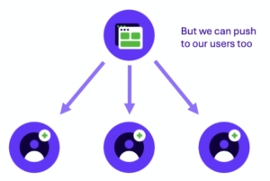
- Proactive Delivery: Users receive data without having to seek it out, increasing the likelihood of engagement.
- Customizable Schedules: Reports can be scheduled to align with business cycles, ensuring timely data delivery.
Cons:
- Overload Risk: There is a risk of information overload if too many reports are sent, which can lead to users ignoring the emails. Moderation is key.
- Static Data: The data provided is static and may not reflect the most current information.
- Static Layout: Because you’ll be delivering within an email, PDF or Power Point attachment, the content can not have a flexible layout. For example: Images of dashboards will now allow a user to scroll if there are more rows than can be displayed.

To avoid overwhelming your users, it’s important to not oversubscribe them and to bundle reports where it makes sense. Tools such as Curator’s Report Builder help make this process easier.
Delivery Path – Metric Alerts
Metric alerts involve setting up automated notifications that trigger when specific conditions are met, such as reaching a sales target or falling below a performance threshold. This is a big part of the promise of new tools like Tableau Pulse.
Pros:
- Real-Time Updates: Users receive immediate notifications when important metrics change, allowing for swift action.
- Targeted Information: Alerts can be customized to provide only the most relevant data to each user, reducing noise and focusing attention.
Cons:
- Alert Fatigue: Too many alerts can desensitize users, causing them to overlook critical notifications.
- Complex Setup: Configuring meaningful and effective alerts can be complex and require thorough understanding of business metrics and will require ongoing maintenance as targets change and acceptable thresholds drift.
- Alert Upkeep: Many systems embrace a “self-service” model for users, but this means that users will need to be proactive in managing their own alert subscriptions. Over time, it’s easy for users to keep alerts that are no longer relevant and forget to add alerts that are vital. That loss of relevance increases the chances they will ignore future alerts. One path around this would be centralizing alerts into group chats, such as a Slack channel, that would allow for some centralized management while giving users control over notification settings.
- Lack Context: Metric first analytics of this nature tend to isolate single data points away from the useful context that might provide better explanations. It’s important to mitigate this by providing paths for users to drill down into relevant data.
With the rise of Metric Layers such as Cube and dbt Semantic Layer we’ll see a increase in both metric-focused tools and features in existing platforms that support this workflow.
Conclusion
Choosing the right delivery path for your analytics is crucial to ensuring user adoption and driving data-driven decision-making. Whether you opt for a Central Analytics Portal, Embedding, Scheduled Distribution or Metric Alerts, the key is to align your delivery method with your users’ workflows and needs. By doing so, you not only enhance the accessibility and relevance of your data but also foster a culture where analytics is integral to everyday business operations. As you continue to mature your analytics capabilities, remember that the ultimate goal is to deliver actionable insights in the most effective and user-friendly manner possible.
In Part 4, we’ll put on our Product Management hats on and look at the techniques to understand what techniques and solutions we should be looking to use in your specific environment.
