
In today’s visual analytics landscape, it’s more important than ever that we are building tools (dashboards, apps, websites) that prioritize effective insights. Too often, we see clients that have all sorts of data collected, loads of dashboards, excel exports, printed reports and email trails that are all trying to solve a simple set of problems. It’s easy for tools like Tableau or ThoughtSpot to suggest visualizations and layouts that fill the screen without having done the necessary preparation to build something that:
- Eases users into a sea of data
- Gives users choices as to how to dive deeper into their analytics
- Solves more than one problem
Our experience practice notices these trends which is why we offer full UX/UI Sprints that create a redesigned dashboard in collaboration with our clients after working through several exercises. For instance, the Persona Mapping exercise gets InterWorks experts on a screen-share with a variety of project owners within one of our client’s organizations. We create diagrams for each user-type to better understand what apps these users are used to interacting with, their unique challenges and goals on a daily basis, and we eventually end up interviewing members from each of these user groups to confirm and test our hypotheses with them.
In another exercise, we create low-fidelity wireframes live with our clients to be able to quickly see variations in ways that we can interpret a given subset of data. The overall goal here is to go into a dashboard redesign project with a plan that everyone agrees upon before spending days, weeks or months in the build phase of the dashboard. Let’s dive into the full three-phase process.
The Research Phase
The Research Phase is where we strive to understand the state of things in your organization today. If we were going to build a house, this would be the phase where we figure our where we want to build this thing.
- Survey Existing Applications: We want to know what kinds of things your users are used to interacting with. Have you ever worked with someone on a Mac that has never used a Mac before? They usually have a learning curve that is easy to overcome once they understand a few basic principles. Or, maybe you are a devout Google user and are trying to onboard someone that strictly uses Adobe applications. There are similarities between the environments, but they’re different at the core. Understanding preferences and workflows is essential to designing a tool (dashboard, website, liveboard, etc.) that will be adopted by your employees, colleagues or customers.
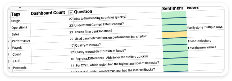
- Identify User Needs: Too often we hear that some groups within an organization have not taken to adopting their suite of visual analytics. This is usually a case of something being built for the group without consulting with them first to understand why and when they would actually need to use such a tool. It would be like gifting someone a charcoal grill without them ever asking for one, but they already have their own ways of preparing food that has worked for them for years. It’s new and different, and we need to understand how these users can benefit from a change in their workflow.We recommend communicating with these people early on and often to hear them out and eventually test prototypes with them before agreeing on a direction to build. Users might not even understand how to effectively utilize live data, or they may not trust anything other than a raw excel file, so let’s use this time to enable them and give them confidence in change.
The User Experience (UX) Phase
This phase focuses on conceptualizing the overall experience. If we were building a house instead of interactive dashboards, this would be the phase when the concrete gets poured for the foundation. We’ve made some progress in understanding what this house needs to entail and it’s rough scope, but no walls are up yet and no style has been applied at this point.
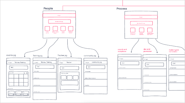
- Define User Personas: Create detailed user personas that represent the different user segments. This is the moment that we document the various groups that will be using this tool, as well as who is contributing to the data that supplies the tool. Example personas might be: CEO, Staff Managers, Stakeholders, Teachers, Nurses, Students, Mechanics, Dentists, Policy Makers, etc. Can you imagine all of those groups of users using the same tool? They’re likely used to conventions they’ve had in place for years, and we need to meet them where they’re at to create something that fits their expectations. After all, we want these tools to be used.
- Map User Journeys: Illustrate the paths that users might take when interacting with the analytics environment. Each person at your organization has slightly different goals and tasks on their list each week. By getting clear step-by-step instructions that a user group would take to solve a problem, we can map those steps to our wireframes so that each screen or moment in the tool is solving one (or two or three) of the steps in this person’s journey to checking things off their to-do list.
- Prototype Solutions: This step might seem unattainable to some, so let me ensure you that it’s easy, crucial and sometimes jaw-dropping how revelatory a simple prototype is to a final product. In the most basic form, we would collaboratively design three or more screens that show light interactivity of the interface. This then provides an interface we can put in front of our users to ask questions like, “If you had to find the most egregious outlier amongst this set of data after applying enough filters to only be looking at five properties, how would you do that?” Or, it could even something simple like, “Where would you click to bookmark these results?”By watching your users navigate these rudimentary interfaces, we learn so much about where they might expect certain elements to appear, and we get to learn about moments along their user journey that might be confusing or intimidating. Then, we can take these learnings back to our easy-to-update prototype and make drastic changes to prepare for another round of testing. All of this testing ends up being about 1/10th of the time that our clients traditionally spend building a dashboard.Once we have a prototype that is agreed upon by all parties, the development then takes less than half the time than it normally would have because it’s all paint-by-numbers at this point. The hard part of figuring out the layout, which charts should appear and when, where filters should be positioned and how many screens are involved, are already figured out.

The User Interface (UI) Phase
Once we hit this phase, we’re able to bring our low-fidelity wireframes into high-fidelity. Back to the house analogy, this would be the phase where we pick the materials and paint colors and decide where exactly the door and window frames will go. This means we’ll apply branding (working within established brand guidelines), define the final layout and propose colors that will be used to dictate a range of information throughout your interfaces.
- Visual Design: When someone experiences joy while using your tool, they are appreciating the visual design and the user experience. It’s working for them and it feels correct. We want our interfaces to speak the language of your brand while bringing the most modern touches possible to your users. Think whitespace, clarity, the right options where you need them and having that all be on brand and fresh.
- Interaction Design: Even though we’ve likely decided that there will be a click action to navigate to a different screen during our UX Phase, we’ll use this phase to decide what that button looks like and how prominent it is on screen. Is it the first thing we want people to notice? Second? Fifth?
- Accessibility and Responsiveness: Since we’re striving for usability and high adoption of the tool we’re designing, we need to consider all users. This includes those with vision impairment who may need high contrast or shape-coded objects rather than relying on the defaults from a brand guidebook. This may mean creating smaller screens with fewer steps on them so that they can be accessible on smaller devices or preparing the interface to be screen-reader friendly. We’ll have hopefully identified any groups we want to design for specifically in our earlier research phase, but we need to be mindful of accessibility all the way until the end of the design process. This means we’ll be testing our prototypes and keeping the users at the heart of the process.

Final Thoughts
A well-designed data analytics environment, built through a thorough understanding of the user, can lead to increased adoption, satisfaction and, ultimately, better decision-making within your organization. We encourage you to consider your own organizations approach to user experience, especially in the data analytics space.
Do you have tools in place that feel easy to use? Are there dashboards or certain pages on your intranet that require a bit of hand-holding or explanation when you onboard a new employee? Are there dashboards/liveboards/applications that don’t get used by many people? Use these opportunities to run those projects through a design sprint. You’ll love the process and will ultimately have a more refined usable, and joyful product in the end.
If you’re interested in booking a design sprint with InterWorks, reach out to us here.
The Latest
-

Thoughts on Tableau Conference 2024
16 May, 2024 -
Matillion DPC: How to Git Going
14 May, 2024 -
InterWorks Blog Roundup — April 2024
09 May, 2024