
Video replays for this webinar are available at the bottom of the blog. Scroll down to access them for each region: APAC, EMEA, USA.
In this webinar, the Experience Design team shared insights into the thinking, processes and principles behind what makes a dashboard successful.
First, Build a House
Building a house is one of the ways that the Experience Design team visualizes how to build a dashboard. Dashboard development can take months at a time and can be a tumultuous process depending on a number of factors. It will have highs and lows, both in progress made and roadblocks encountered. This is paralleled by the process of building a house.
There’s plenty of steps to be taken before breaking ground on a building project, like consulting with architects or construction contractors on blueprints or plans. In the same way, we like to apply something similar to the dashboard creation process:
A Brick-by-Brick Approach to Building Dashboards
The first step in this analogy is to survey the land. The location provides the context for both the building and the dashboard. Where is the land located? Where will the dashboard be used?
Secondly, a designer for both house and dashboard would go about laying a foundation. Here, the parameters are defined and a plan is in place for the overall structure of the project.
Finally, the designer can visualize the end goal properly. With a foundation in place, the fine details can be ironed out, like the number of rooms, what materials to use where and picking the colors for the walls.
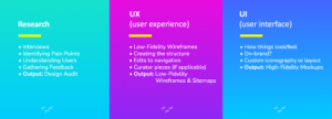
This whole metaphor ties back to the research phase of the dashboard. Dashboards are going to be significantly more useful if they’re specifically catered to the needs of the users. The research phase is there to help designers understand those needs, assess their technical ability and decide on the scope of what to build.
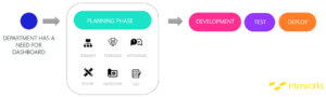
From Planning Phase to UX and UI
Immediately following the planning phase where the goal and scope of the project are decided upon, the UX phase begins. This involves experimenting with various layouts and quick iterations to find out what works best. Any currently used dashboards are reviewed to see what should stay, what needs to be added or what needs to be merged into the final product. The UX phase is all about making a dashboard that’s usable and will be used frequently.
The UI phase follows immediately after UX and is one of the most exciting times of the development process. This is where the data truly comes to life. Once the UX is figured out, UI is like the wrapper that provides color and aesthetics to the data and presents it in a pleasing way. It’s technical as well, where designers bring the content to be “on brand” and establishes color as a functional tool:
Design Deep Dive: Examples from our Process
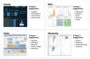
The main design principles that we hit on with our feedback and reviews are clarity, KPIs, color and hierarchy. These are the principles that we go over most often with clients’ existing dashboards to help improve them with visibility, readability and other factors:
Speaking on assessments from the planning phase, we ask questions during user interviews to gauge factors like user adeptness, dashboard location, and what should be a visualization vs. a list vs. a filter. Beyond technical questions like these, we’re also factoring in aesthetic considerations like branding and preferences to satisfy creative needs.
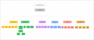
Blueprints for a Dashboard
A fantastic tool we also use is a sitemap, which helps us understand where everything is in the hierarchy of the client’s information architecture. Sitemaps let us make sure we’re in line with the client’s existing structure and that our dashboard functions seamlessly within it:
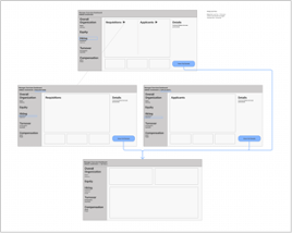
Wireframes, in the same vein, provide similar insights to a sitemap in a low-fidelity/medium-fidelity format:
Moving into high fidelity, we get mockups and prototypes that provide a close-to-finished view of the dashboard that allow us to get better reads on major decision points like branding, color, layout conventions and more:
With these, we can prototype and test before we move on to development, after which we’ll test the final product again.
Utilizing Prototypes
Prototypes allow for testing of the mechanical parts of the dashboard as well. The main features established, like filters, categories and other navigational aids, are reviewed using pointed questions to users that help determine what changes, if any, need to be made. Recording user interactions on the prototype is also invaluable in that regard.
With feedback, dashboards can be improved to the point of release. The point of this testing is to understand users and cater to their needs. Surveying a diverse population of all skill levels and locations improves legibility, user friendliness and ease of use.
Applying these Concepts: Superstore
For a detailed example of how these design philosophies break down into the production of a dashboard, we’ve illustrated the entire process in a dashboard mockup using a Tableau classic: Superstore. We highly recommend checking out the links to the webinar below for the full breakdown with commentary.
Closing Thoughts
There are a few other smaller bits of advice we want to share on the design process that have proven valuable:
- We highly recommend the creation of a style guide when starting a project in Tableau, so you can keep track of your color choices, fonts, etc.
- Limiting variety, or creating conventions in your work, helps with keeping things familiar across your dashboard and enables users to quickly find their answers.
- Fight for breathing room in your designs. Tableau doesn’t often give the option for white space in dashboards, but it can help give dashboards a clean, concise appearance.
- Utilize your blueprints, and if there’s a problem, go back and edit them before the changes you make to a dashboard snowball into a larger problem.
- Keep your font choices to three-four variations of a single font for a clean look.
- Decide if you’re using floating containers, fixed sizes or a background image.
- Lean towards simple.
If you’d like to check out the presentations, you can find them below. If you’re looking to sign up to any future webinars or just check out what we have coming up, we’ve got you covered.
Webinar Replay – US
Webinar Replay – EMEA
Webinar Replay – APAC