
The following table, which employs URL links, bars, background colors and icons to visually depict data, was created in Power BI. To achieve a similar result in Tableau would necessitate at least three applications of the “forklift” technique or, if precise control over column widths is desired, use of map-layering techniques. Nevertheless, in Power BI, these configurations can be implemented relatively effortlessly using its conditional formatting functionality:
Conditional formatting is one of Power BI’s more powerful and, arguably, underutilized features. This tool uses measure or column values to dynamically update the appearance of cells in tables and matrices, thus enabling end users to more easily identify trends and outliers in their data.
With conditional formatting, users have the ability to represent their data though background colors, font colors, data bars, icons or as Web URLs. In this post, we’ll explore the different settings and options available for each of these options.
As an individual with extensive experience in Tableau development and consulting, I find conditional formatting to be a standout feature of Power BI. While many of the capabilities discussed here can be achieved in Tableau, they often demand extensive workarounds. With Power BI, these features are readily accessible straight out of the box.
Data
For this post, we will showcase examples using the Adventure Works 2022 dataset which can be downloaded here.
Background Color and Font Color
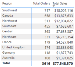
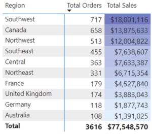
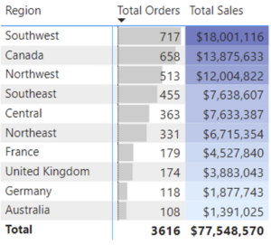
For our first example, let’s delve into Total Sales and Orders by Region:
To enhance this table, we’ll utilize conditional formatting.
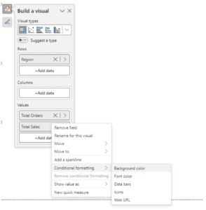
Here’s how to access these options: while in Report view, select a table or matrix, right-click on the desired field within the Visualization/Build a Visual pane and choose “Conditional formatting” from the dropdown menu. From here, we can opt for various visual representations of our cell results. For this example, we’ll focus on Background color:
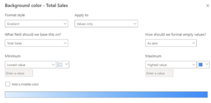
Choosing this option opens up the following dialogue box:
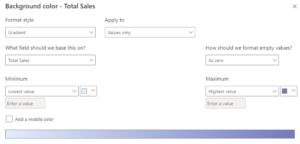
First, we select our Format style. Our options here are Gradient, Rules and Field Value.
- Gradient assigns hues to cells based on each cell’s context filter and the selected field value. We set minimum and maximum data values and define colors at the extreme ends of our color scale to associate with these. We can also opt to include a middle color for our gradient. Below is an example where the minimum Total Sales aggregate value is represented by a light blue hue, while the maximum is represented by a darker blue. All cells containing intermediate values will be assigned a hue on the gradient between these two colors:
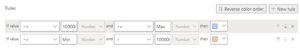
- Alternatively, using the Rules Format style, we can assign cell colors on numeric thresholds. In the example below, if Total Sales is greater than or equal to $10 million and less than or equal to the maximum aggregate value, the cell will be colored light blue. If Total Sales greater than or equal to the minimum aggregate value and less than $10 million, it will be colored orange:
- Field Values allows us to color code based on a text value from another column. This field may include values such as:
- 3, 6 or 8 digit hex codes
- Color names such as violet, red or teal
- RBG or RGVA values
- HSL or HSLA values
For this example, we will apply the gradient option using the settings above. Region is sorted on Total Sales in descending order, and we can see that all cells in the Total Sales column are assigned a hue that falls somewhere between the darker blue we designated for our maximum aggregate value and the lighter blue designated for the minimum:
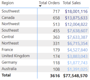
Conditional formatting options for font color are identical to those for Background color. Assigning hues similar to those we selected for our Background color settings, we get the following result:
Data Bars
Next, let’s use data bars to represent Total Orders. In the image below are our options:
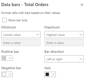
We can choose to represent our cell values solely with bars, rather than with bars and text. We can select minimum and maximum data values to determine bar lengths and can assign distinct colors for positive and negative data values. Additionally, we can select the direction of our bars (increasing to the left vs. to the right) along with a color for our axis.
In the subsequent image, you can view the results of adding Data bars for our Total Orders measure:
Icons
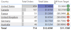
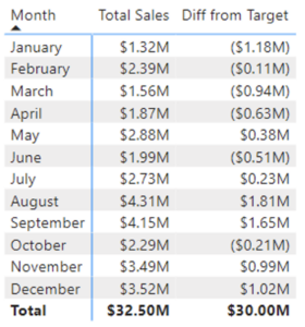
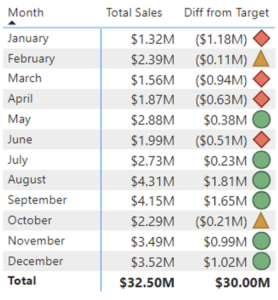
Let’s consider a new example and assume that Adventure Works had a sales goal of $2.5 million for each month during 2020. In the table below are sales for each month of 2020 along the difference between this amount and the target goal of $2.5 million:
Let’s enhance this table by using the Icons conditional formatting option to assist our end users in efficiently identifying months when the company achieved this financial target, came close or missed the target by a wide margin.
Below are our options when selecting Icon from condition formatting:
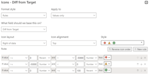
Similar to the color background and font color options, we have the choice to assign icons by rules or field values. With the Rules format style, we select the field on which to base our formatting, along with the positioning and alignment of our icons. We can opt to apply our settings solely to cell values, to column totals only or to both.
For our example, we’ll format the Diff from Target column with Icons using the rules format style with the settings above. Months in which the target value was missed by more than $500,000 will be delineated by a red diamond. Months in which the target was missed but by less than $500,000 will be marked with a yellow triangle. Months in which the target was met or surpassed will be marked with a green circle. The results are displayed below:
Web URLs
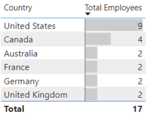
For our next example, let’s consider a table listing the number of employees by country. Note that we’ve added Data Bars to enhance readability:
Suppose we want to make each country name a clickable link that opens up the user’s Browser to the Wikipedia page for that region. When we open the Conditional formatting dialogue box for Web URL, we receive the following options:
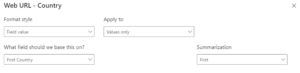
The only format style available to us is field values. Initially, our data value did not include a column of web links for regions. So, we created the “Country URL” column for our “Region” table, which assigns a URL to each row of data based on that row’s value for “Country:”
Country URL = SWITCH(
    Region[Country],
    "Canada", "https://en.wikipedia.org/wiki/Canada",
    "United States", "https://en.wikipedia.org/wiki/United_States",
    "France", "https://en.wikipedia.org/wiki/France",
    "United Kingdom", "https://en.wikipedia.org/wiki/United_Kingdom",
    "Germany", "https://en.wikipedia.org/wiki/Germany",
    "Australia", "https://en.wikipedia.org/wiki/Australia"
)
In the dropdown box for, “What field should be base this on?” we selected this new column, Country URL. Our Summarization options are “First” and “Last.” However, because we have a unique URL for each country in our table, our selection is arbitrary, so we chose the default “First.”
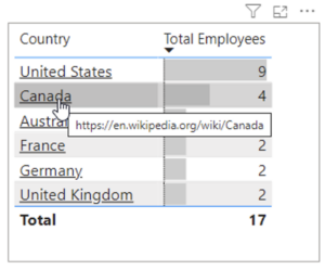
Below is our resulting table. Each country name is now a clickable link, with the URL viewable when we hover over each Country name:
In Conclusion
Conditional formatting in Power BI proves to be a powerful tool that helps us to highlight key information in our tables and matrices effectively. With this thoughtful application of these formatting options, we can craft more compelling data stories and more easily direct decision-makers to the information that will be most pertinent to them.