Our tech-savvy audience is used to clicking their way through to their goals, be it an Uber Eats late evening order or selecting trains on a timetable.
Why not offer them the same interactive experience in Tableau where they can use buttons to toggle between views?
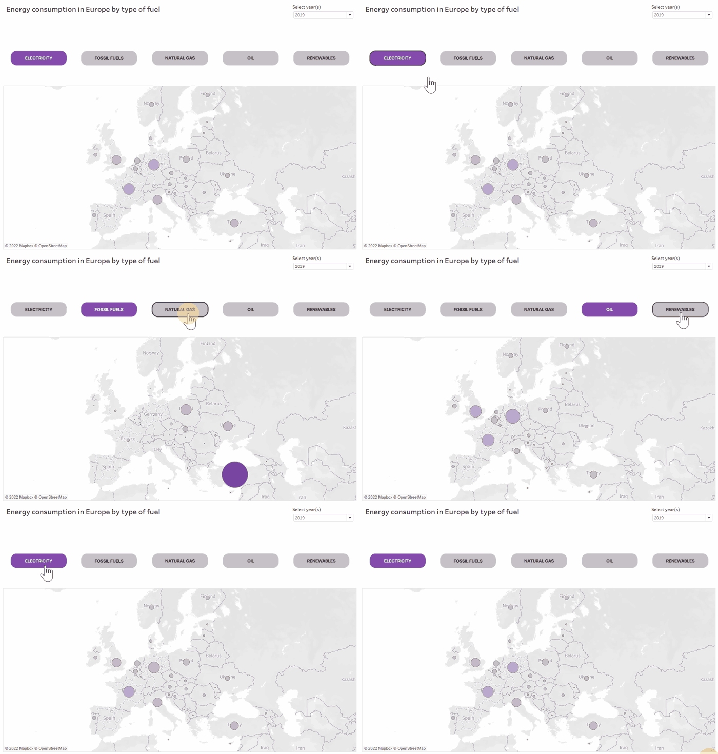
In this tutorial, we’ll use parameter actions to achieve just that. The end result will look something like the example shown below. The selected option will remain highlighted until a different button is clicked on.
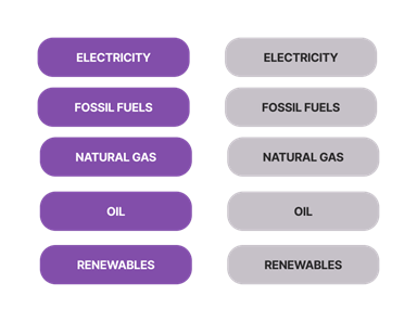
First, we will need to create custom images, two for each option: selected and unselected. Not too much design expertise is needed here beyond simple DIY in PowerPoint using Shapes feature, or you could use tools like Figma. The end result should preferably be a PNG image with consistent sizing and transparent background. Save these images to a newly-created Shapes folder in My Tableau Repository (This PC > Documents > My Tableau Repository > Shapes).
Next, create a worksheet that will control our custom buttons. In this particular case, dimensions already existed in the dataset and aliases were used for easier readability. If button choices are not available as a dimension, there is an option of creating a manual list in Excel and adding that as a second data source.
Drop the dimension on the Columns shelf.

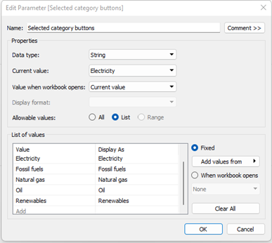
Following this, create a parameter with all possible choices.
Moving on, we’ll create a couple of calculated fields to execute selection actions. The formula shown below classifies each selected option as either active or inactive, that is, in Boolean logic matching or not matching the current parameter selection.
[Dimension] + " " + IIF([Dimension] = [Selection parameter], "active", "inactive")
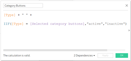
The end result will be ten options based on original five dimension members in this case (Dimension active + Dimension inactive, etc.). We can now assign custom shapes to each of these options. Place the calculated field onto the Shapes marks card. The current parameter selection is always marked as “active.”
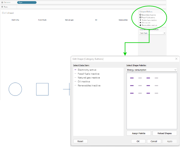
Now we can assign all possible selection options to the custom shapes we created earlier. Right-click on the parameter in the bottom section of the Data Pane and select Show Parameter. Make sure to toggle between different dimensions until you’ve mapped all of them. Add final touches like adjusting the shape size and removing lines and headers.
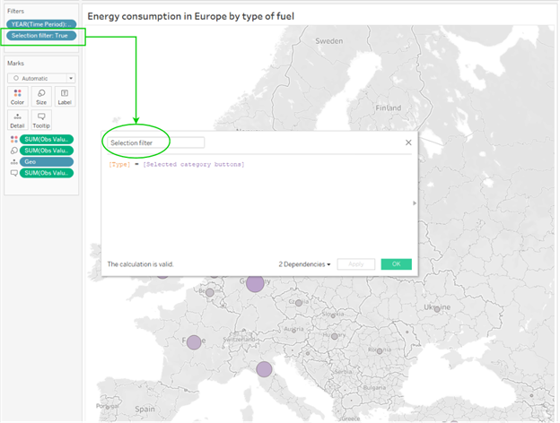
Almost there! Create a worksheet that will reflect the changes made by the parameter. The key step here is to create a filter that will pass through the currently selected value. Drop the following calculation on the Filters shelf: [Dimension] = [Selection parameter]
Only a couple of steps left from here on.
Create your dashboard. Don’t forget to include the sheet with selection buttons. We’ll use it to filter all other charts.
For this, we’ll need to add a parameter action that will grab the latest selected option as the parameter value.
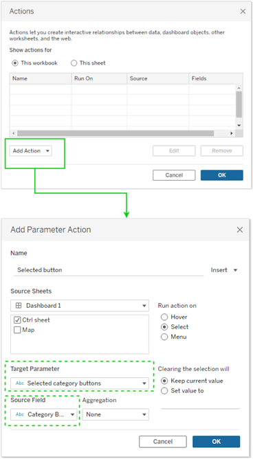
As the source field, identify the dimension that contains the different categories.
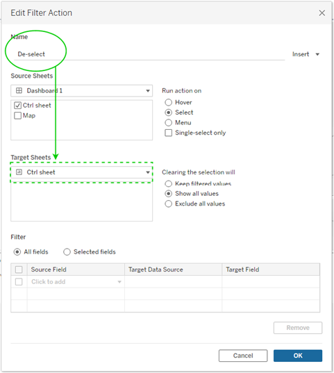
First test run! If you click on specific buttons, the parameter updates to show the selected category. Pretty neat! Still, there is one minor pet peeve. Tableau automatically highlights the current selection and greys out other buttons which kind of defeats the purpose of our shiny new solution.
But don’t fret! There is a simple workaround. We will create an additional Filter Action to de-select as shown below:
Second round of testing!
Everything is working as intended. Bam! With a few extra steps we achieved a great user experience.
Thanks for reading and following along. If you’re ready for another tutorial, get inspired by browsing through our InterWorks blog library.
