Please note that Portals for Tableau are now officially known as Curator by InterWorks. You can learn more at the official Curator website.
A video replay for this webinar is available at the bottom of the blog.
A lot of analytics tools are fantastic at visualizing data, but they don’t really have a good solution for presenting that data in a clean and effective way. That’s where Curator by InterWorks comes in.
Why Curator?
The common state of analytics is a lot like a garage sale: it’s messy, disorganized, but there are a lot of treasures out there to find. That can be exciting on a casual Saturday, where you have time to sift through and find that diamond in the rough, but it’s less exciting when you’re on a deadline and pressed to make a decision with your data.
That’s why your presentation matters. There’s a big contrast between a garage sale and an Apple store. The presentation aspect is hyper focused on in an Apple store, and it elevates the whole experience as a result. That effectiveness, in turn, helps with their incredible success.
Curator exists to take that dashboard you poured your heart and soul into and elevate it just the same.
Brand Your Analytics
Curator initially started out as a way for users to white label their dashboards so they wouldn’t look like their clients’ or anyone else’s. Now, it’s turned into something much, much more.
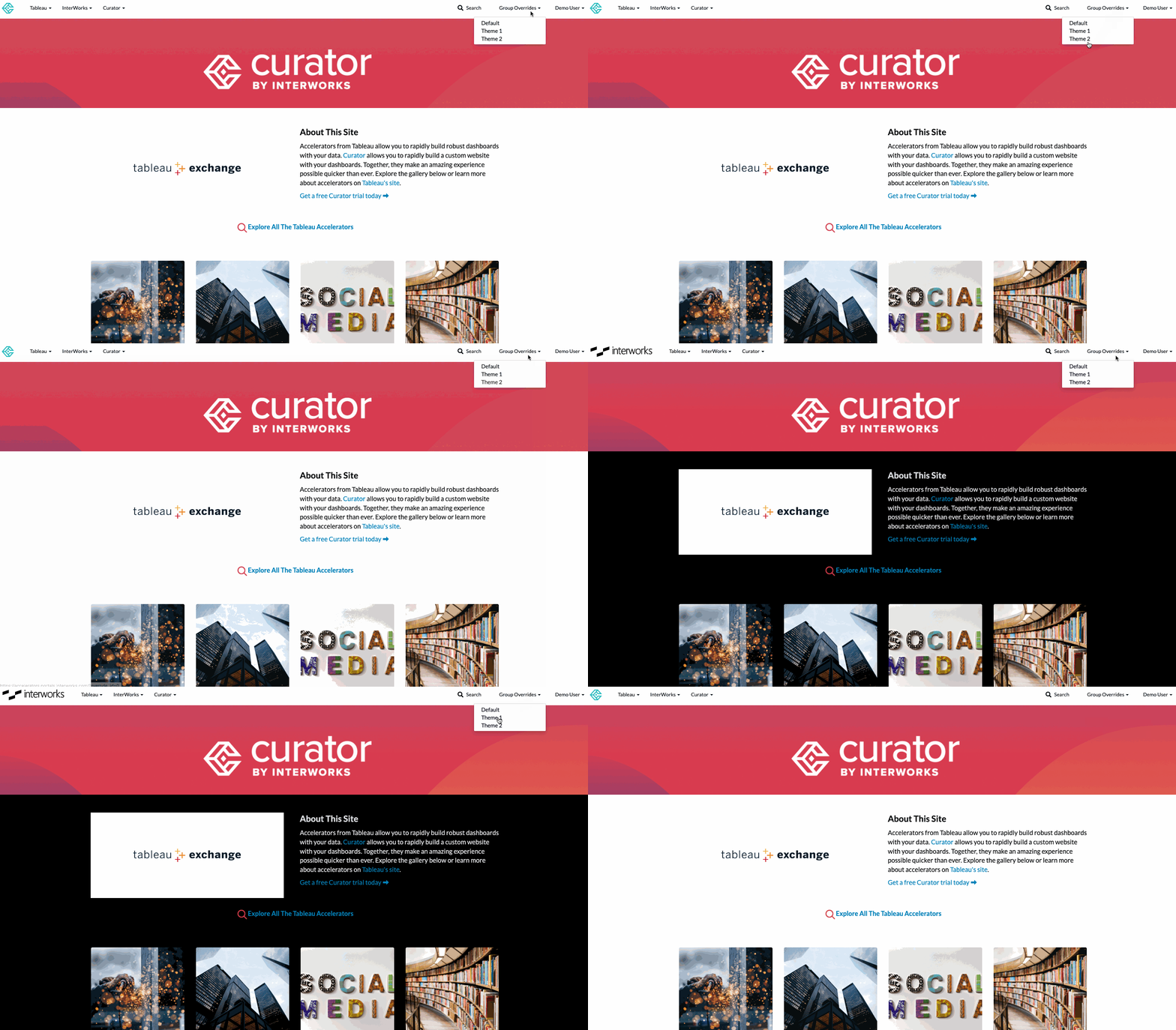
Above: Switching between dark theme and light theme on the same Curator page
For instance, customization on a Curator site is a given, but you can also change the customization based on user groups. The logo can change, like you can see above, between an InterWorks brand and Curator brand with a click.
It doesn’t just stop at styling. Utility wise, an executive group can set which KPI’s they need to see every day as a default, while marketing or general users see something completely different.
All of these options can be implemented in an easy to use, no code environment.
Customize Your Analytics
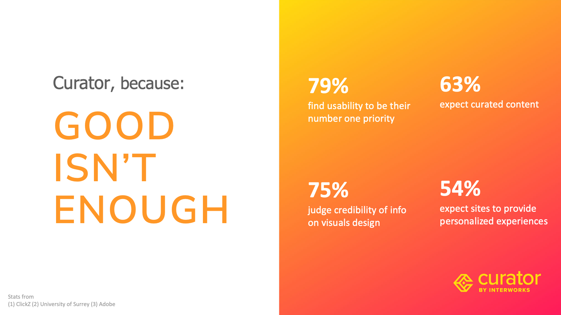
Above: common attitudes of users when interacting with data.
A lot of effort can go to waste with low-usability, sub-par design work on otherwise good data. Users instinctually may not trust your data if it’s not in a cohesive, joyful environment.
To combat this, navigation is completely customizable in Curator, so you can decide the best way to intuitively share your data. Drop downs, sidebars, whatever you need is available for use. Easier navigation means your users are better able to drill down into the usefulness of your data, without having to fight your site just to see where it is.
Again, this is customizable with no code required. We use a drag and drop system to keep things simple, so your menus function exactly as needed.
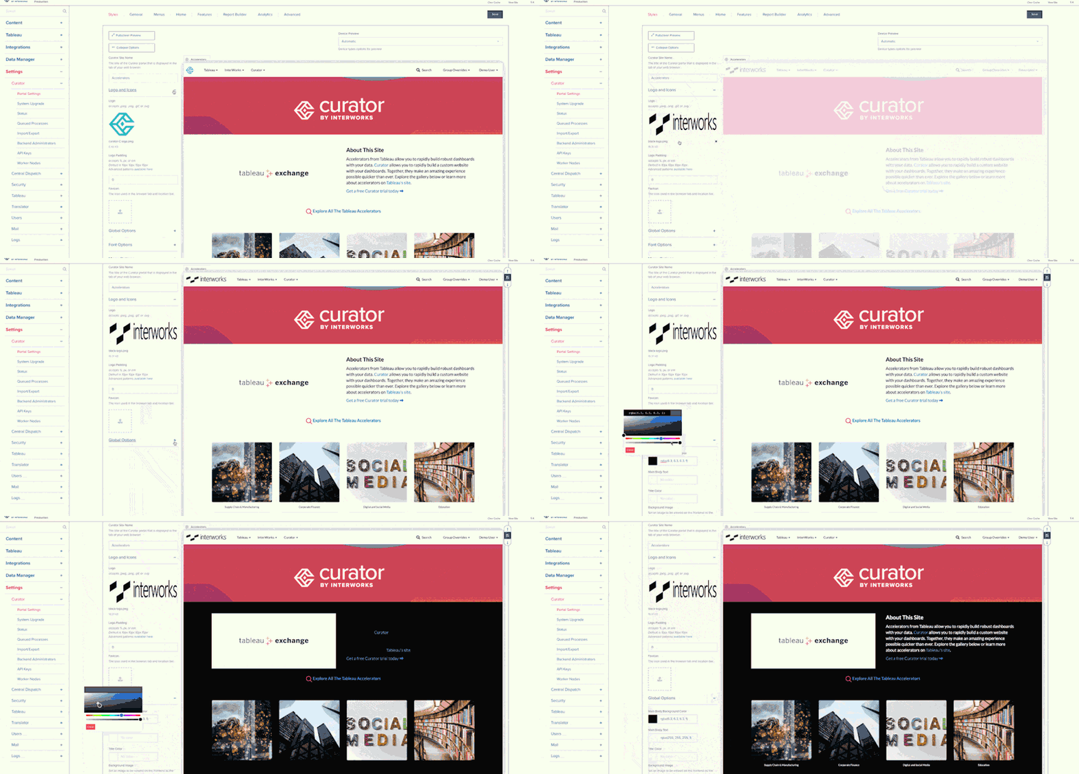
Above: Demonstrating easy, no-code customization
The page builder is tailored to assembling a landing page, to step users through your data stories or just to help mix and match all your content. Web development is available to those without a web development background.
If you have a user base that may not be familiar with your dashboards or how to use them, you can create custom tutorials to walk your users through making the most of your analytics with minimal training required. Videos and gifs are also able to be embedded in said tutorials to be extra thorough.
With Report Builder from Tableau integrated into Curator, your users can build their own reports in real time. These reports can easily be turned into PowerPoints, complete with your own company branding baked in.
Unify Your Analytics
A lot of the experience of going into a Tableau or other analytics tool server is sorting through tons and tons of content. Some clients we’ve seen have multiple sites on multiple servers that they use, leading to a long game of trying to find out where the data that actually matters might be.
If you want all of your data available in one place, Curator currently supports Tableau, ThoughtSpot and Power BI in one safe, secure location for your use. There’s also integrations for SSRS, Box, YouTube and more peripheral additions to bring together all of your tools, even outside of analytics.
This isn’t just a single home for your analytics, but a way to leverage the best of your tools. You can play to the strengths of Tableau’s visualizations while using a ThoughtSpot integration just below to drill down into the same dataset for better insights.
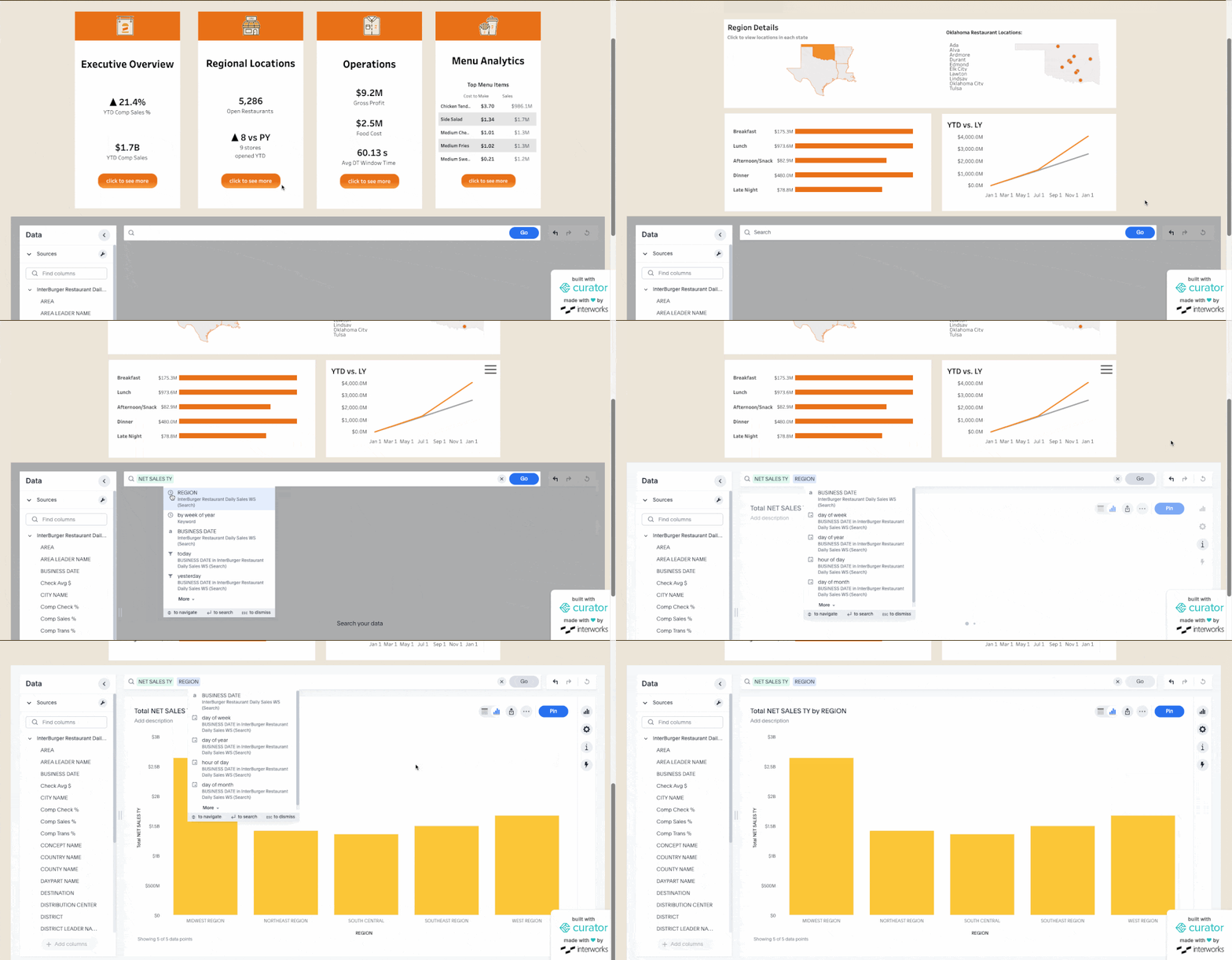
Above: Combining different analytics platforms on the same page
For Curator enterprise customers, this unity expands with Central Dispatch, where a central analytics hub can be utilized for users worldwide. Self-governed sites allow organizations to mix and match internal and external audiences for extending the Curator experience.
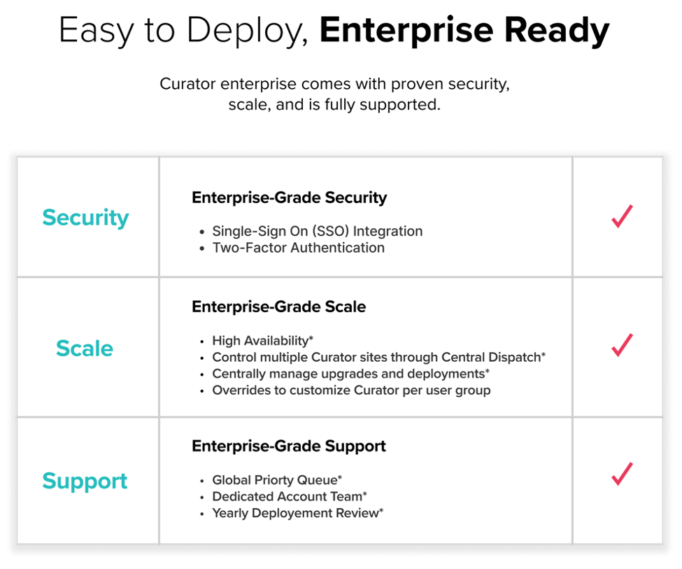
Above: some of the features available for Curator enterprise customers.
If you want to watch the webinar replay where we go over each of these topics in more detail and have an in depth Q&A session with Curator customers, we’ve got you covered:
