Why do some businesses fail while others succeed? What are the factors that determine their outcome? Answering questions like these is why I’ve chosen a career as an Analytics Consultant. I’ve always been fascinated to learn what drives business outcomes and one of the best ways to investigate that is through the power of data.
As such, in my spare time, I enjoy researching and learning about great companies and particularly public companies since much of their data is available to the public. Like many others, I love to pore over data, and the common tool for this is Excel.
How to Use Data Wisely
However, in today’s day and age, there exists a problem where you often find yourself with too much data, and that’s what happened with me. I was pulling metrics and data from all different sources, and I was getting a bit fed up. There was so much data that I couldn’t tell what was actually important.
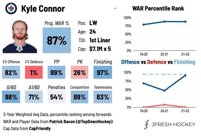
It reminded me of a situation a couple years ago in the hockey analytics community on Twitter where most of the information was presented in hard-to-understand tables. But then someone in the community started building Player Cards, an all-in-one summary of a player’s performance, and it proved to be a game-changer in communicating insights easily to a wide audience:

Above: Player Scorecard by JFresh
Building the Scorecard
This easy-to-read visual got me thinking, and I realized I could apply these same ideas to understanding different businesses. In my mind, I see companies the same as players, with different stats to evaluate them by and judge their performance, so I adapted the design for a personal project. I identified the most important metrics for the companies in question, determined where I could source the data, cleaned and transformed it and put together a list of the top 89 public cloud companies to track the most important performance metrics.
A few of the most important KPIs on the scorecard include:
- Revenue Growth LTM (Last Twelve Months) and NTM (Next Twelve Months)
- Net Revenue Retention: The percentage of revenue that existing customers are bringing over to the next year
- Gross Margin: The percentage of revenue that can be attributed to gross profit
The Value of Scorecards
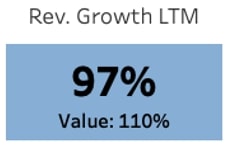
Scorecards like these do a great job of painting a broad picture of what’s happening and providing an entry point for digging into deeper questions. Adding context is also crucial in understanding data points and key performance indicators. In this example, context is provided not just historically but also among a company’s peers where the colors represent the percentile of a company’s metrics across the portfolio:

Above: Large number is the percentile; Number below is the actual value; Color based on percentile
When looking at the KPIs, the large number is the percentile of a company among its peers. The Value below it is the actual value of the company.
Shoutout to Jamin Ball for putting together a lot of the data found here and JFresh for the great work he does in hockey analytics. You can explore my Tableau dashboard at the bottom of this post.
Creative Problem Solving with InterWorks
The process I just walked through is exactly what we, InterWorks, do with our clients every day. Clients come to us with similar issues: data is coming from everywhere, there’s too much data, reports are all over the place, etc. We aim to work closely with clients to deliver end-to-end solutions that store the data, transform it and ultimately drive actionable insights in a clear, concise story.
If you could use a trusted advisor to guide you through your next project, let’s talk.

