
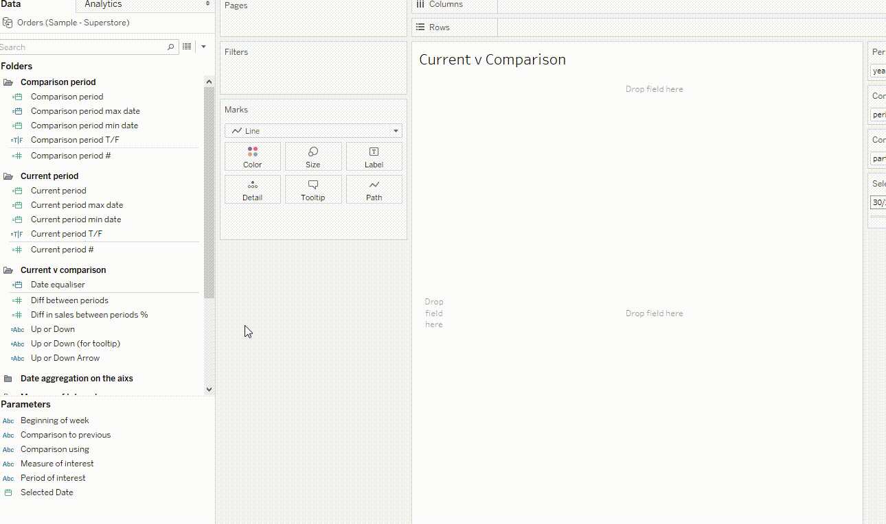
Current vs. comparison periods are one of the most common queries our Assist team receives. They’re so common I was inspired to put this blog together – it’s actually one of two blogs. The first tackled how to create these comparisons, while this one focuses on how to visualise them.
If you want to download and reverse-engineer anything, here’s the template for the items below. You’ll also find the template for creating the calculations outlined in my earlier blog on creating these comparisons.
Step 1. Showing Data on the Same Date Axis
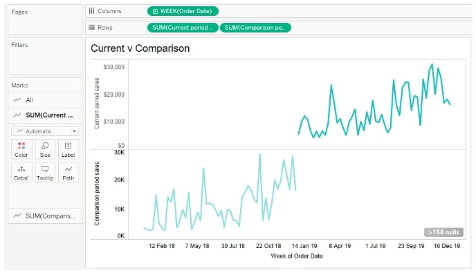
Assuming we’ve got numbers for current and comparison periods made – if you don’t, check out my earlier blog – the first issue we’ll face is putting data on the same graph. We want visualisations like the below:
… but because the dates of the periods are different, data shows up in different spots of the timeline, and we tend to end up with something like this instead:
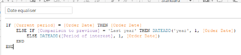
We want a way to show the timelines overlaid on top of one another. To do this, we’re going to force the comparison period to sit on the same timeline as the current period:
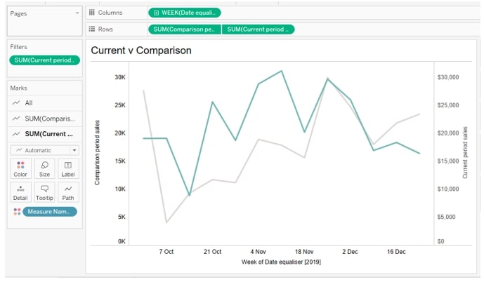
This requires something we’ll call a ‘date equaliser’. It adjusts the comparison period dates so they sit right on top of the current period. We then use this date equaliser as the axis, in place of our order date. Huzzah!
Step 2. Date Aggregation to Match the Period We Want
All right, so now we can have a bunch of KPIs showing our change over time, with things on the same axis. If you joined me in the first half of this series, you probably have a bunch of dynamic changes to this period too, e.g. you can swap between visualising by week, month, quarter and year. Moving between these gives great flexibility but can result in some ugly visualisations; for example, you set the date axis to be by month, and now you’re looking at monthly periods, so it’s just two bars on top of each other.
To improve upon this, we’ll fix our date granularity so that the data shown is more sensible for the parameter we choose. You can make this as simple or complex as you like, but the below should give you an idea and get you started. Check out the template here for some more elaborate versions that change aggregation if we have less than x months or weeks of data:
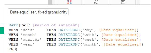
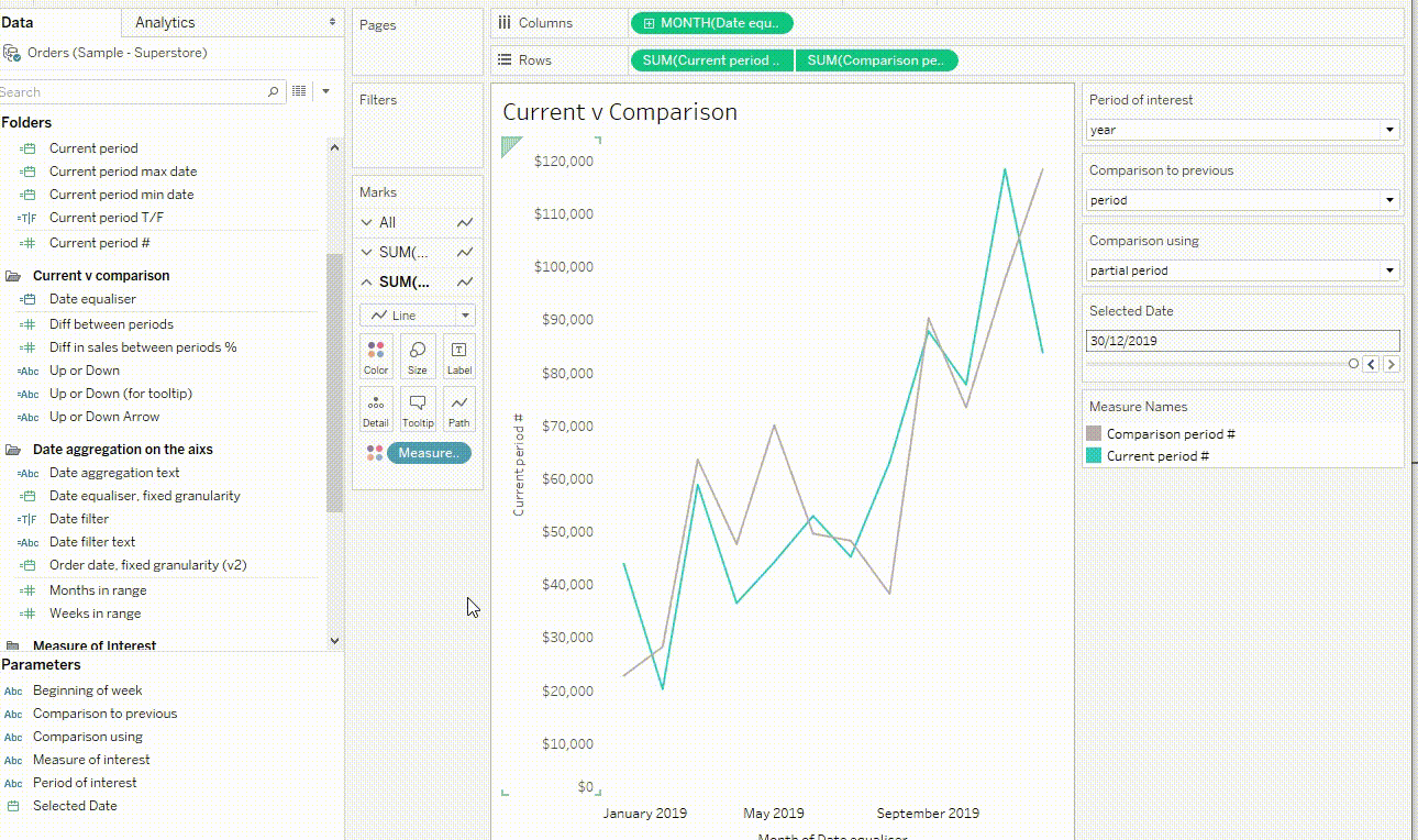
We then use this instead of our initial date equaliser. Now, our viz updates as we change the period:
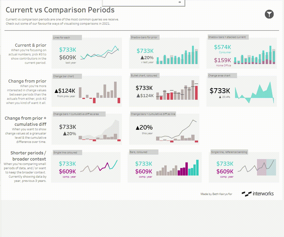
Step 3. Work out Your Viz Preference
There are a ton of ways to visualise current vs. comparison. We’ve compiled some of our favourites, including when and how we’d use them – some are more suited to when you want actual numbers, others when you want the amount of change. Each of the items we’ve included has a few components:
- Some big numbers, like for the current year, or current, comparison and change values
- A larger visualisation – such as a line, bar chart, or combo of line and area, etc. – that shows the aspect you’re interested in in detail.
This combo gives the reader both the specifics they’re after and the data in context. In terms of which option to choose, there are several paths you could choose.
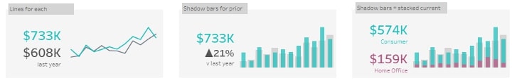
If you’re keen on the exact numbers in each period, lean on items that emphasize that; we’re talking big exact numbers, and lines or bars for each period:
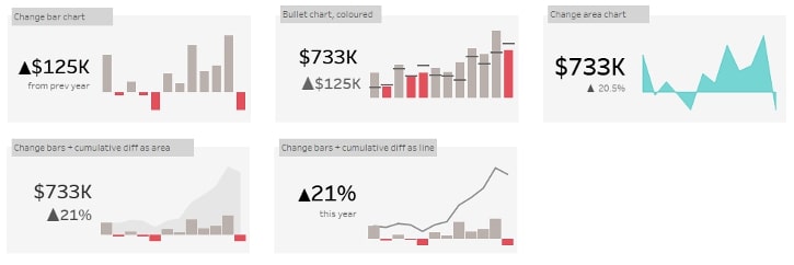
If you’re keen on change values, focus on items like difference period to period and perhaps add in cumulative change if that’s of interest, too:
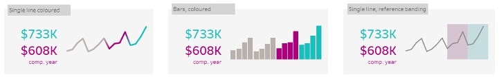
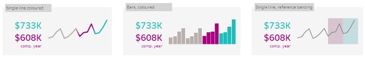
And if you’re after broader context, consider using highlights such as colours or reference bands in broader line or bar charts; this lets you keep many periods of data, rather than just the two of main interest:
This is a pretty subjective area though, so feel free to download the workbook to use and extend on for your own analysis!
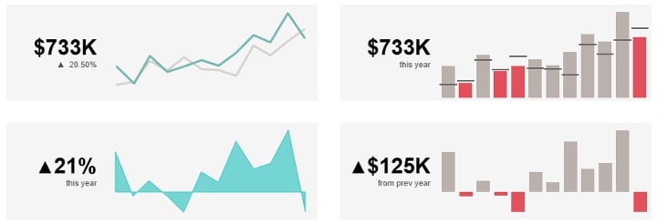
Step 4. Building the Beauties
Most of the vizzes in this article are simple to create – we’ve combined KPI style numbers with simple dual-axis charts like lines, bar in bar, and bar vs. area or line. To create our KPIs, we use our current and comparison period numbers with some simple change calcs we can mix and match the way we like. First, we create the change calcs:
Then we throw these plus our key values onto Text on our Marks card and go to town with formatting.
Extra Steps for Longer Line and Bar Charts
If you’re after versions like the ones below, you’ll need two more sets of calcs:
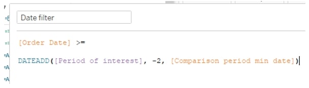
First, a date filter – this will ensure you show a reasonable amount of data, e.g. that you don’t show five years of weekly data, rendering the periods of interest tiny and unable to be seen on your very long line:
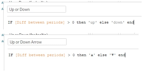
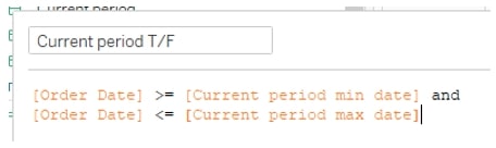
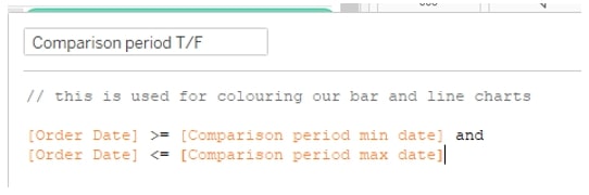
Next, some Booleans for current and comparison period – we’ll use these to colour critical areas:
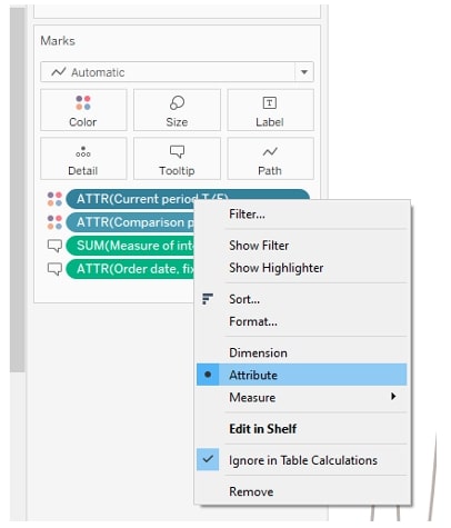
To use these Booleans, add both to Color, and make sure to set as Attributes. If having multiple items on Colour is new to you, check out this article from Tableau:
That’s it! Have fun and remember to check out InterWorks Assist if you’re keen on help building these in your own environment.