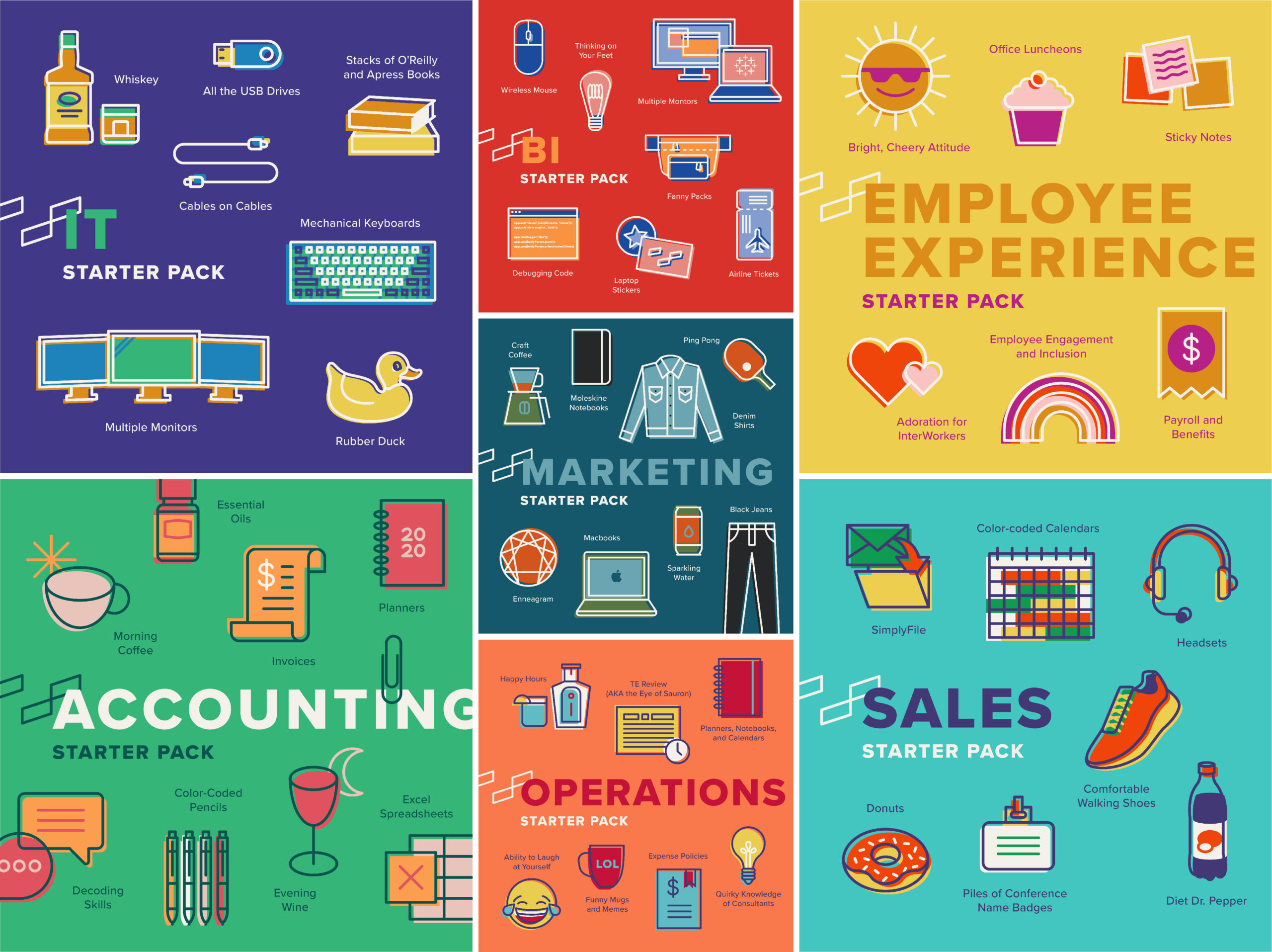
The process of designing the department starter packs has been such a treat. Andrea Avey, InterWorks Content Coordinator, originally came up with the idea when we were discussing ways to increase employee engagement, and I thought it was wonderful, though to be honest, I thought the task seemed a bit daunting at first. However, as I have designed each one, I have come to enjoy them more and more. With each color palette and illustration, it feels like I am getting to know that group a little bit better.
From my end, this is what the process has looked like: Andrea reaches out to each group to ask for a list of things that are often associated with or essential to their department and roles. She then takes any responses she gets, consolidates them into a list of the most consistent responses and passes the list to me. I then take that list and come up with illustrations that represent most of the items on the list. Sometimes, this is somewhat difficult because some responses can be fairly abstract, like “decoding skills” or “employee engagement and inclusion”. After I complete the illustrations, I begin playing with color palettes and the final layout.
It’s a Match! Choosing the Right Colors
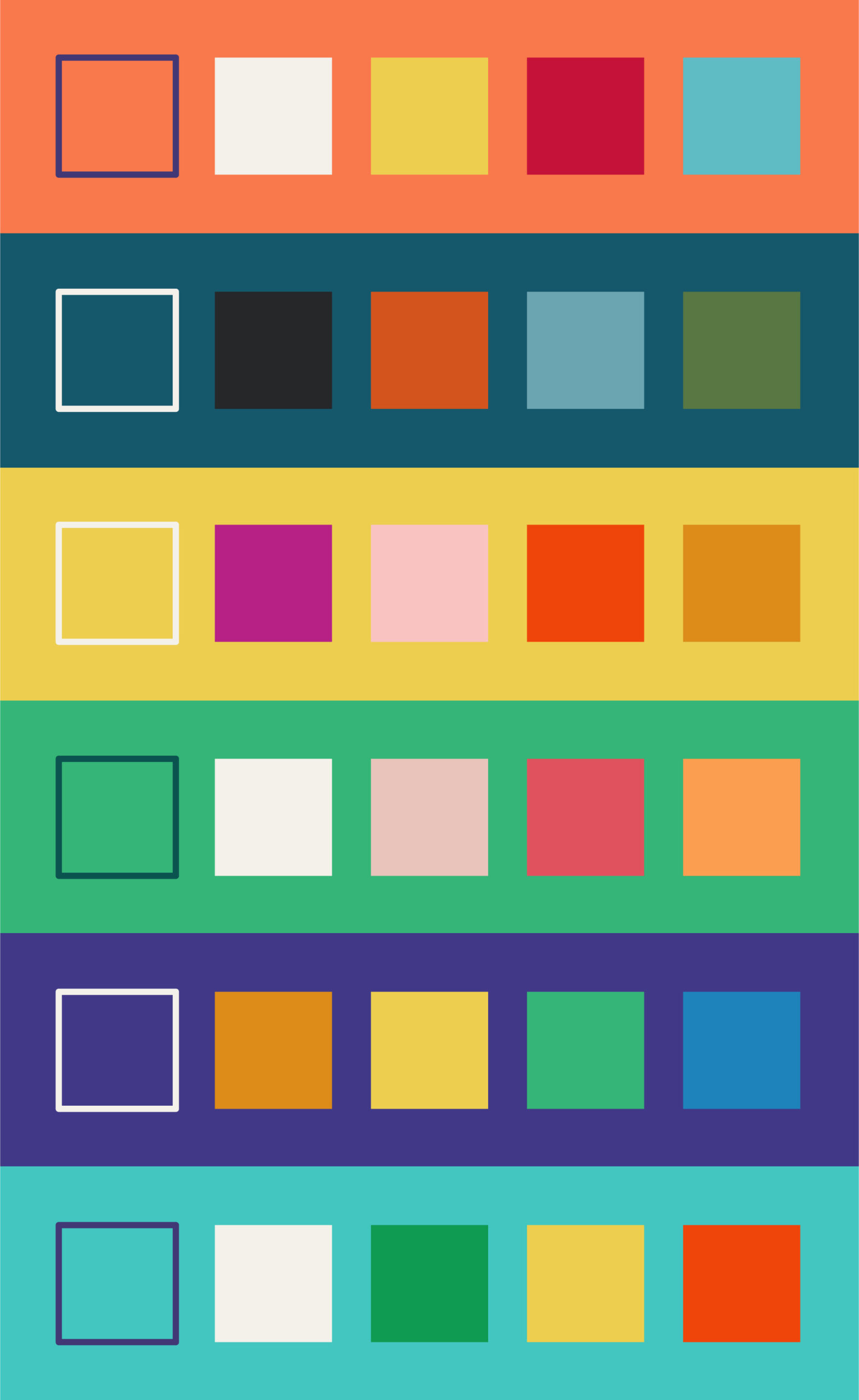
Selecting a color palette was also an important part of the process. Color has a huge impact on the overall mood of a piece, especially in illustration where colors don’t necessarily have to be true to real life. This means that as the designer, I hold a lot of power in determining how people will feel when they see it. But it is also a challenge because I am having to speak on behalf of a group, and there is no right answer. Additionally, I am having to choose a palette that feels different than, but still cohesive with, the others I have already created:

Above: The color palettes from most of the starter packs all together
As a whole, I chose to use bright, muted colors for the starter packs. I wanted them to be fun but easy for the eyes to look at. I also tried to repeat colors in some of them to add consistency. For example, I used the same shade of yellow in the Employee Experience, Operations, Sales and IT starter packs.
Color palettes for each group were chosen based on a few things, but mostly just the vibe I get from that department. I chose to mainly use green on the Accounting starter pack because they deal with money. I chose yellow for Employee Experience because of their “bright, cheery attitude”. I chose a denim color for Marketing because you can find just about everyone in a jean jacket once a week. So on and so forth.

Above: The Employee Experience color palette

Above: The Marketing color palette
One choice that some have asked about was the decision to offset the stroke from the solid part of the illustration. To me, it makes the illustrations feel a bit retro, like they were screen printed just ever-so-slightly incorrectly. I think the idea of a starter pack feels nostalgic, so the offset was really to enhance that feeling.
Getting to Know the Best People Better
My hope is that each starter pack has felt personal and accurate to each group. Andrea and I have tried to keep everyone involved in the process because we don’t know their team like they do, and it has been so fun to get a glimpse into each group’s sense of humor and favorite memories with their co-workers. I have heard some great stories and explanations, and I hope that the process of collaboration has been as fun for each group as it has been for me to help make it happen.
To see all of the starter packs with their accompanying descriptions, check out our Instagram feed!


