Tooltips are the missing link between a mark and its underlying data. They provide a valuable opportunity to explain more about the chart without requiring the user to examine the underlying data.
The motivation for these posts was seeing so many vizzes on great charts on Tableau Public being let down by the publisher leaving the tooltips in their default state. It’s easy to think this okay, but the tooltip is an eager beaver: even viewers with hyperactive mouse movements are guaranteed to hover long enough for the tooltip to appear. Given that’s the case, you want to make sure you’re showing the user something pretty!
I’ll start off with basic good practise tips; later posts will look at advanced techniques to make your tooltips shine.
1 Make a header
My first rule when publishing a viz, is to put a “Header” into the Tooltip. The header should be the mark’s primary dimension, or a summary. For example, consider the default tooltip on the Sales Outliers sheet in the Wow Workbook:
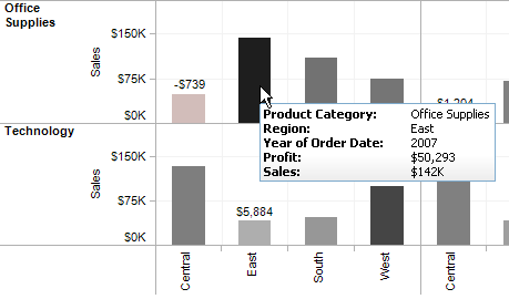
I can’t deny that the tooltip has all the info and, yes, the tooltip is an elaboration of the mark. But it doesn’t really draw the eye, or encourage fast interpretation. Now let’s see what the Tableau staff actually did to the tooltip when they released the workbook:
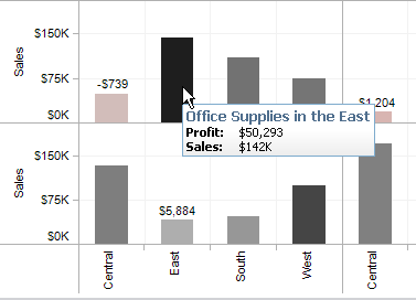
See what they did? They moved the two main dimensions,
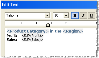
2. Less is more
When building your viz, some of the dimensions/measures you add to the worksheet might be necessary for the viz itself, but have no meaning for the viewer. For example, here’s the default tooltip from my visualisation of Pub Closures in the UK:
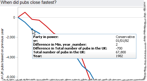
As you can see, the are two dates, yr and Year. One is a year, and the other is a date. The latter is necessary in the viz to use a continuous scale on the x-axis, but meaningless for the viewer; all they care about is the year. Delete the unnecessary data from the tooltip.
3. Make sure the labels are meaningful
If you’re using aggregations or table calculations in your view, the default label might be something crazy like “% of Total Count of Rate:” This isn’t always too intuitive. Look again at the default tooltip from the Pub Closures viz (above).
“Difference in Min. year_number”? What? Well, it’s a nice description of the table calculation, but it’s a terrible description of the information. In this viz, it really represents “Years since party came into power”. By making all the labels meaningful, you can end up with this:
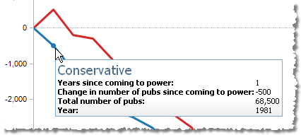
4. Order! Order!
Make sure the most important information is at the top of the list, if that’s relevant. Continuing the work on our pub closures tooltip, we should improve the tooltip like this:
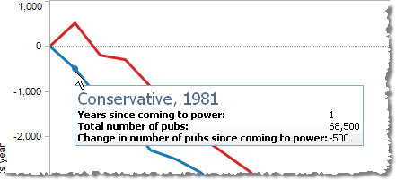
5. A sentence can say more than a label
If the tooltip has quite a lot of information in it, it can be better to turn the fields into a complete sentence that fully explains the mark. A long list of labels, colons and values can be confusing. Here’s how the final tooltip for the Pub Closures viz looked:

That’s it for this first post. Next time, we’ll look at a couple of advanced tooltip tips.
