I’m confident the sudden, all-encompassing change in pace for ‘data’ over the last few years has been fueled by our need to want more information out of our world. The immediacy and sheer speed with which it arrives is faster than most of us have been accustomed. This is not to say that the information has not always been available; rather, it’s that all of the information is now arriving, effectively, at the same time in many different ways.
Yesterday, we could manage the big data. Today, we have to manage the fast data. We need to make sense of all the disparate pieces of random information.
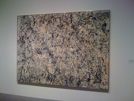
Let’s step out of the ‘data’ realm and reference the work of Jackson Pollock and his gift for understanding complexity because it relates to the importance of interactivity (I know, it’s a stretch but follow me here).
‘My painting does not come from the easel. On the floor I am more at ease. I feel nearer, more part of the painting, since this way I can walk around it, work from the four sides and literally be in the painting. It is only when I lose contact with the painting that the result is a mess. Otherwise there is pure harmony, and easy give and take, and the painting comes out well.’ – Jackson Pollock

We will (forever) get better use out of our information if we can feel as if we are a ‘part’ of it. What’s more, if we are able to ‘not lose contact’ with the art, we can discover more and more of what truly makes this information useful.
As this brilliant whitepaper explains, ‘…visual analysis typically progresses in an iterative process of view creation, exploration, and refinement. Meaningful analysis consists of repeated explorations as users develop insights about significant relationships, domain-specific contextual influences, and causal patterns.’
Tableau does the ‘iterative’ process better than any software I’ve been fortunate enough to experiment with. It works with your brain’s awesome capability for teasing out patterns as well as its enormous and remarkable ability to parallel process. After all, information is worthless if it is not comparable to something related, something associated with our existing knowledge.
Lighten the load, really. A well designed Tableau dashboard should always be considered an interactive information-driven application. We are not stuck in the grid nor are we limited to certain types of charts, widgets or colors. We’re free to express our many thoughts onto the dashboard. But with this freedom to create, we also have to think about what this might mean for the lucky individual who gets to consume your information (even if it’s only you). Should your information take 40 seconds to load? Should your information take on the guise of a dashboard when it’s really just a boring process document? No. Information which can work at our speed can be very beneficial and valuable information. Tableau lets us see the information before we see the infrastructure.
In the end, think beauty and cognitive load because ‘…working memory is limited. Users are more likely to move around a site with a simple structure than one with a very wide or very deep structure.’
If all this doesn’t make sense, go learn about Jackson Pollock and then relate that learning to your every dashboard of information ‘document’ you create. I promise it will be fun.
