With Tableau 8, users gained the ability to color marks by multiple dimensions on a single axis with some automatic combined field magic. What happens though, when you want color by a dimension and a measure? In the past, I have separated out members of a dimension and allowed the specific measure I needed with a calculated field:
Western Region Sales = IF [Region] = ‘West’ THEN [Sales] END
This doesn’t work if I have a more than a pair of items to color (Western Sales, Eastern Sales, etc). Instead, I used a technique that has been possible even before Tableau 8’s addition of multiple colors. The solution also ends up being faster than creating multiple calculated fields and seemed surprisingly obvious once I had finished.
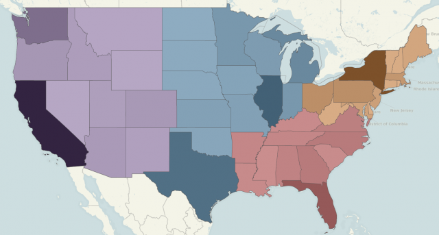
Here, I have colored the states by Region, but the intensity of the color is based on the Sum of Sales. The same principle can be applied to a variety of chart types:
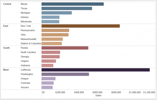
The trick is using Dual Axis functionality along with some transparent colors. One of your axes will be colored by your relevant dimension. In the examples above with Superstore data, I have colored States by Region. I then created a Dual Axis with the relevant measure (Bar Chart is Sales, Map is Latitude).
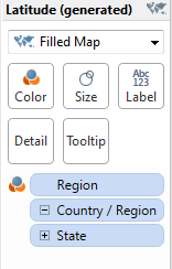
For help, see Dan Murray’s post on building a dual axis map.
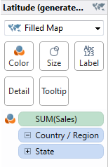
On the Marks card, select the axis colored by sales. Then click the Color box and choose Black Sequential. Also on the Color box, select 65% on the Transparency slider.
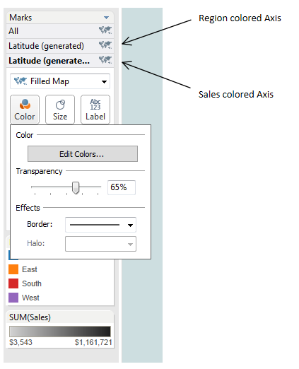
You should now have the visual effect of a dimension shaded by a measure value! You will find the workbook I used attached below. Please comment if you find other useful instances of this trick or your own solution to this problem!

