Here at InterWorks, we all love Tableau. We all know that Tableau is an amazing visualization tool that allows its users to connect to a wide variety of data sources in order to visualize their data. Being a student of the pure sciences (math and physics), I have had to transition from a world of theory to a world of application. Tableau has made this transition much smoother than it would have been otherwise. I have grown to enjoy working with Tableau and continue to learn more.
With that said, I must say that there are times when I miss being a student of science. I am continually looking for new and technical things to learn that can either be implemented through Tableau (i.e. predictive analytics using R integration) or will be useful sometime in the future.
Graphs All Around
Of all the current topics that I am actively learning, the one that gets me most excited are graphs. They’re also known as networks. These graphs represent data in a way that shows the relationships between various objects. An example graph would be your network of LinkedIn connections. Each person is an object, and each connection is a relationship. There are many examples of graphs everywhere: computer networks (objects = computers, relationships = network connections), social networks (objects = people, relationships = friendships), collaborative networks (objects = authors, relationships = collaborations), etc. These relationships are present in many different fields and are worth studying.
Tableau and Gephi
This brings me back to Tableau and an unfortunate limitation. Tableau is currently unable to effectively visualize graph data in an intuitive and interactive way. Currently, to visualize a graph in Tableau, one must essentially create a scatter plot of fixed points and edit the data to create paths between these points. This works beautifully for small data sets, but what if I wanted to analyze a friend’s Facebook network of over 1000 people? The time being spent on creating the data to generate such a scatter plot would be ridiculous! There must be a better way. Unfortunately, Tableau does not provide a solution to this particular problem. One application that does is Gephi, a free graph visualization platform.
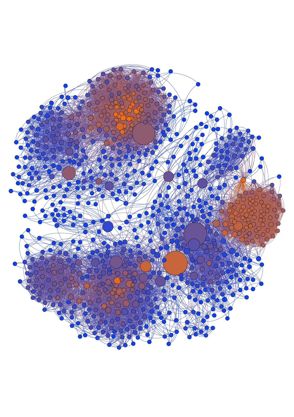
Gephi seamlessly takes graph data in the form of .csv or various graph files and creates a graph visualization. Below is an example graph that I created using a friend’s ego-centric (graph of mutual friends) Facebook network.

Much like Tableau, we can assign color to represent various dimensions or measures. In this case, color represents how many friends each person has in this particular graph. The brighter the orange, the more friends they have in the graph. Blues represent fewer friends in the graph. We can also size the nodes based on various dimensions or measures. In this case, I sized the nodes based on a measure called betweenness centrality. Essentially, the larger nodes represent people that bridge the gap between various clusters of people in the graph.
Diving Deeper
At first glance, I would say that Gephi is a great tool for visualizing network/graph data. The example of visualizing a Facebook network is just the beginning of what is possible with graph analysis in Gephi. I am excited about diving deeper into Gephi to visualize graphs as I continue to study the analysis of graph data.

