Tableau is constantly evolving. It does not chimera itself into a beast with three heads, wings, a tail, 16 arms, scales and a blowhole. Rather, it stays true to itself while making itself stronger and better aligned for its target market. Set actions are a great example of this.
This dashboard involves a few different tricks put together:
- Set Actions
- Sheet Swapping
- Tooltips: Allow Selection by Category
- Tooltips: Dynamic Text
Set Actions
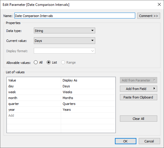
I’ve created two different set actions: one controlled from the left side (Period 1) and one controlled on the right side (Period 2). However, these charts change based on your parameter selection. The parameter selection changes what type of dates we are looking at daily, weekly, monthly, quarterly and yearly. This means the dates that are being added to the set action are also changing.
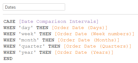
Here is where I had to be careful … I needed a way for all my various dates to be linked together. To do this, I created a parameter that would feed a calculation. This calculation would look up the custom dates. The custom dates were used because they return a single day—a day is shown as one day, a month is shown as one day, a year is shown as one year—because each interval is reduced to the first of that interval with the DATETRUNC() function.
Because of this, while swapping between the various parameter options, the charts will appear to already have some data selected. Thus, this calculated field and parameter became the backbone of everything that followed. These tricks could have previously been created using a normal filter, but it would have been impossible to compare the size of the values against each other and more difficult to compare the in/out together within each period selection:
Sheet Swapping
The sheet swapping trick is an old, but fun, trick. I use it a lot to get dynamic and creative layouts for dashboards. There is a great blog written by my colleague Robert Rouse on how to do this.
Tooltips: Select by Category
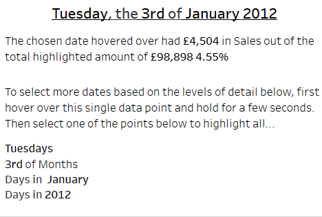
In the below example, I’ve hovered over a single date. What if I want to see all of January easily? Simple! Just click on bold text for January. What if you needed to compare the third of each month? Easy! Just select the bold 3. You can do the same for Tuesday and for 2012:
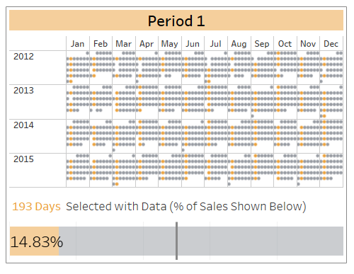
When highlighting all the Tuesdays, you get this chart:
Tooltips: Dynamic Text
I think we’ve seen parameterised text quite often. In this case, I created a few calculated fields. These all begin with the name Format. The first one is quite straightforward. It’s used to make the tooltips look better. Instead of 2 of May, I wanted it to say 2nd of May. To do this, a calculated field that looks at the last digit is used. This last digit is checked, and based on the outcome, you get a suffix:
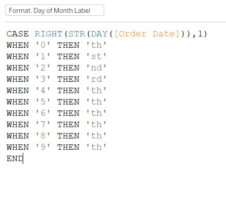
The next formatting trick for this Dynamic Text is the ‘Period 1 Says Helper.’ Period 2 has its own as well! It looks like this:

The text needs to be variable in my tooltip so that it makes sense. When I have multiple dates in my set, I want to compare the value to it. When I don’t have multiple selected, I want to just report the value instead of comparing it.

