The Problem
During a recent engagement a client asked a question I hear occasionally regarding Tableau which basically boiled down to: “How do I show marks for the percentile ranks of my customers by Sales?”
The client wanted to aggregate their measure, we’re using Superstore Sales here, up to the Customer level (Superstore stores information at a per item per order level so it’s an excellent proxy) then assign customers to 10th percentile buckets. Once assigned, the client wanted to do analysis on various relevant measures like Profit and Order Quantity (in this example).
The main challenge with the ask is how the data is shaped. Much like Superstore we were faced with data that was aggregated at a lower granularity than how we intended to judge the customer worth. Creating an aggregated view would be a good solution in our particular instance but wasn’t an option for us or for many others for various reasons: SQL competency, time constraints, access rights, etc.
Fortunately with Tableau v9 we can achieve the desired result using the FIXED level of detail function!
The Solution
The first step we need to do was define Customer Worth as the lifetime total Sales from the Customer. Because the end goal was analysis on total Customer Worth within percentile buckets instead of at the Customer level of detail (we didn’t want a mark for each Customer in the view/analysis) we had to create a level of detail calculation for total Customer Sales:
Customer Worth
{ FIXED [Customer Name]:SUM( [Sales] )}
The Customer Worth calculation returns a non-aggregate value (from Tableau’s perspective) to each row, it is essentially summing up each Customer’s Sales and returning that value on each row that Customer appears on. You could do the same thing with Excel using the SUMIF and SUMIFS functions if that was your data source.
Customer Worth gives us a new continuous measure that we would reference in our percentile distribution. We had defined 10th percentile buckets as the target so we would have a simple, even distribution of Customers. Now we needed to dimensionalize those 10th percentile buckets so that our views would only have ten marks in the view, as opposed to the thousands of Customers in the data set.
It’s important to remember that Tableau’s level of detail functions return a non-aggregate value for the purposes of views and other calculations.
To assign each Customer to a percentile bucket we have to test that Customer’s Worth against the population’s Worth and return the result as something discrete. Here’s the calculation I used:
Customer Worth Percentile Distribution
IF [Customer Worth]<={FIXED :PERCENTILE([Customer Worth],.1)} THEN "<10th" ELSEIF [Customer Worth]<={FIXED :PERCENTILE([Customer Worth],.2)} THEN ">10-20th" ELSEIF [Customer Worth]<={FIXED :PERCENTILE([Customer Worth],.3)} THEN ">20-30th" ELSEIF [Customer Worth]<={FIXED :PERCENTILE([Customer Worth],.4)} THEN ">30-40th" ELSEIF [Customer Worth]<={FIXED :PERCENTILE([Customer Worth],.5)} THEN ">40-50th" ELSEIF [Customer Worth]<={FIXED :PERCENTILE([Customer Worth],.6)} THEN ">50-60th" ELSEIF [Customer Worth]<={FIXED :PERCENTILE([Customer Worth],.7)} THEN ">60-70th" ELSEIF [Customer Worth]<={FIXED :PERCENTILE([Customer Worth],.8)} THEN ">70-80th" ELSEIF [Customer Worth]<={FIXED :PERCENTILE([Customer Worth],.9)} THEN ">80-90th" ELSEIF [Customer Worth]<={FIXED :PERCENTILE([Customer Worth],1)} THEN ">90th" END
Percentile is an aggregate function in Tableau and Customer Worth is (functionally) a row level calculation so we have to wrap the Percentile of Customer Worth sections in FIXED so they also return as non-aggregate. By not assigning a dimension inside the FIXED level of detail function we are calculating the percentile across the entire data set.
If our data had been aggregated at the Customer granularity, instead of Superstore being stored at the item per order per customer level, we would not have had to create the Customer Worth calculation. Our calculation would have instead been;
IF [Sales] <= {FIXED : PERCENTILE( [Sales] ) , .1) } THEN "<10th"and so forth.
The FIXED is still required because we are testing each row (Customer) against the population’s percentiles, which is an aggregate, but we can’t use SUM(SALES) because we need each customer tested individually.
Validating Your Calculation
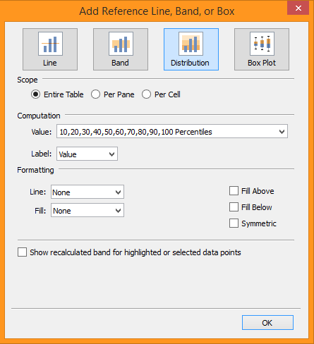
It’s always important to validate your work before making decisions, regardless of your tool or complexity of execution. To test my percentile buckets I validated in two ways. First, I created a scatterplot with Sales on one axis and Profit on another (Profit can be any measure in this case) and placed Customer (only) on Detail. Then I created a reference line distribution with Percentile as the Computation and added values for each of my bucket thresholds:

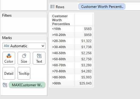
This shows the values at each percentile bucket’s upper limit so I can begin to test my calculation. Next, I made a new sheet with the Customer Worth Distribution on rows and MAX Customer Worth on text. The values displayed should match the values seen on the scatter plot.

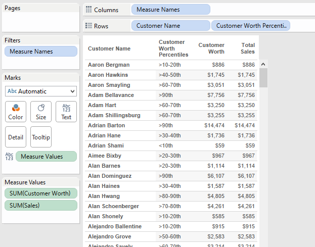
After that you’ll want to test individual customers for proper distribution. Make a new sheet with Customers on rows, then double click Sales and Customer Worth to add them to text, then put Customer Worth Percentile Distribution on rows after Customer. Check a few Customers for each bucket to ensure they fall in the expected range.
Additionally, percentiles are by definition an even distribution of members, so there should be a roughly equal (+/- 1 for rounding) number of customers in each percentile bucket.

Why Percentiles?
Because there is no objective way to quantify how valuable a customer is in relation to your other customers based on a standard score, such as a test score being A, B, C, etc, due to an infinite theoretical range of value we need a method that ranks customers versus each other based on the range of experienced values. Percentiles allow us to best define customer buckets without having to arbitrarily set ranges like old opinion based decision making that Tableau is ideal for replacing, or by relying on relationships to average which can be significantly skewed by outliers. Check out this post for more information on Percentiles: http://apmblog.dynatrace.com/2012/11/14/why-averages-suck-and-percentiles-are-great/
The Result
Once our distribution is built and tested we can start to see how the different buckets perform versus each other.
Once we have broken the Customers into buckets some important insights reveal themselves. As the average sale per customer rises by percentile, quantity remains relatively flat, and instead number of different items ordered rises which offers useful insight about the mix of products being offered. Additionally we can see how much more valuable the top tier customers are to the overall profit, this helps us determine how much to spend on client relations depending on the customer’s tier.
In a surprise, the best customers are also receiving the smallest discount compared to the lower tier customers. Knowing this we can start to explore if changing discounts drives customers away when pushed down, or if greater discounts will incentivize the top tier customers to purchase even more. We can even create an excel dump of the best customers to be downloaded for mailing lists (Tableau Public server structure has changed a bit but this is quite easy on Tableau Server).
