One of my favorite chart types in Tableau is the dual-axis chart. It’s a thing of beauty! Most often in client engagements, this chart type will be used to compare a base metric with a series of user-selected secondary metrics via a parameter. The best thing about this chart type is that not only can you compare metrics with values running along two different ranges, but with two axes, you also get the choice of two different mark types. Each axis in Tableau gets its very own marks card. Holla!
As we build our dual-axis chart, you drag your measures in one at a time after selecting which dimensions you’d like as your level of detail. As you bring in your first measure, Tableau automatically assigns a mark of bar, as such:
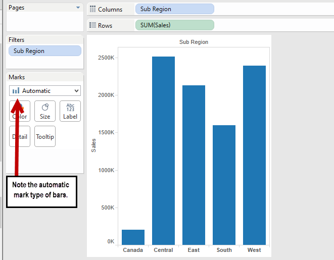
Now, as far as how Tableau assigns its automatic marks, there’s a bit of a pattern. For example, if you have a date field as one of your dimensions, Tableau will give you a line. If you have two measures, one on Rows and one on Columns, Tableau will default to the shape mark type as it will create a scatter plot for you. But by and large, when you’re building something simple with a single measure, bars are your friends. (Note: There are other times when bars are your friends, but that’s a subject for another blog …)
As an aside, I must take exception to Tableau’s use of the term “automatic” here. Personally, I think “default” would be a better choice. But hey, that’s just me!
Any hoot, let’s add in a second measure, just for good … measure:
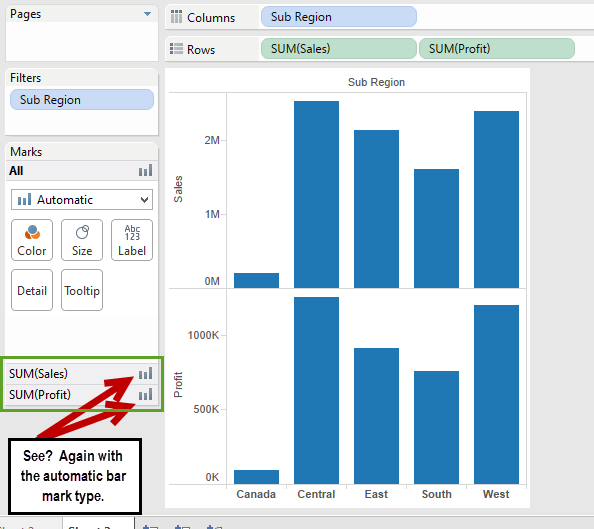
All that’s left now is to right-click on the Sum([Profit]) (or the right-most measure in the view) and choose Dual Axis from the context menu. Let’s make it happen!!
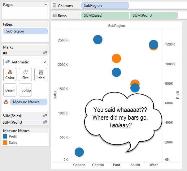
Um, Houston? We have a problem. I hate when Tableau does that. Why did it change my marks? Why am I now picturing that children’s book about the spotted animal who wanted to live in the zoo?

Here’s what’s going on: When we built our chart out, Tableau chose an automatic mark type of bar. Look, they even told us so:
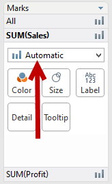
If we want Tableau to keep the mark type that it assigns as automatic (or, if you’re me, “default”), then we need to explicitly select that mark type in the drop-down so that it looks like this instead:
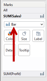
Now, instead of Tableau telling you what mark type it’s going to use, you’re telling Tableau which mark type to use. This time, before I dual axis my chart above, I will need to explicitly set my mark type. Let’s do that, and choose a bar for Sales and a line for Profit:
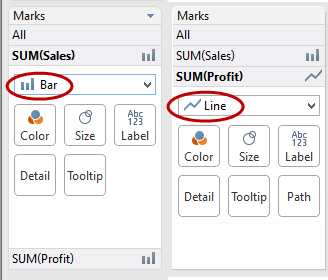
When I dual axis this time, I get what I wanted:
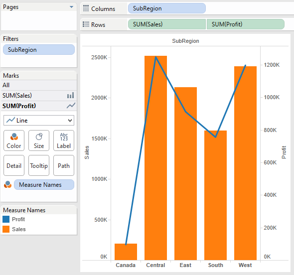
You’ll notice that Tableau changed the colors on me …
We’ll talk about how Tableau assigns colors at another juncture; wouldn’t be prudent right now.
Hopefully this helps you understand why sometimes, in the course of building out your views, Tableau seems to randomly change out your mark types. The idea is that Tableau has an algorithm for when to assign what mark types depending on what it thinks you’re building. Normally, that works just fine! But if you want the control of having your mark types stay with the original automatic assignment Tableau makes, regardless of what you do, then you’ll need to change the mark type from automatic and explicitly pick your mark – or your Mark, if you want to pick on someone named Mark.
But again, that’s another blog for another day!

