Building on the KPI tutorial from Tableau found here, I would like to add a neat trick to increase your data-pixel ratio and remove additional clutter from your KPI charts by using a custom shape. The premise is based on Stephen Few and Edward Tufte’s principle to reduce the redundant non-data pixels and increase the data visualizations effectiveness. So, here’s how:
- Download the workbook from Tableau’s tutorial here: kpi_0.twbx or go through it and build it yourself.
- Download this custom shape (14.png) and save it to C:My DocumentsMy Tableau RepositoryShapesKPI
- Open the workbook with the KPI’s and edit the shapes, converting the ‘Above Benchmark’ to the blank white shape in the KPI category. You may have to ‘Reload Shapes’ before it shows up. Also, you won’t see it but hover in the bottom left and it should show up.
- Click OK and you’ve done it!
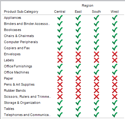
Before

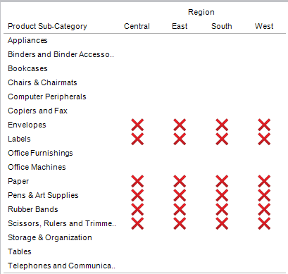
After

The data-pixel ratio now is significantly higher and you’ve succeeded in making this view more effective by removing redundant icons from your visualization. I will say that this assumes the most important purpose of this view is to identify KPIs that are ‘Below Benchmark’. Enjoy!


