Sometimes, I feel like I’m cheating the system when I find a neat way to use something that Tableau has to offer. Other times, I feel like a genius for doing an end run around them. Is that bad? Well, either way, I’m here to show you how to use Measure Names and Measure Values to solve a couple of formatting conundrums, and I hope they make you as happy as they’ve made me!
Single-Column Headers – Dance with The One Who Brung Ya
Imagine you’ve been tasked with creating a very simple chart that shows you sales by Category in tabular form. One text table to go, please! Using Superstore Sales as our data source, here’s what we get:
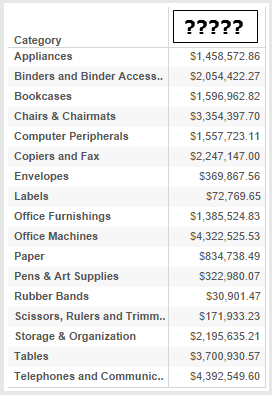
All’s well and good, except we note that with only one measure in the view, there is a distinct lack of column header. Ugh. The science behind that speaks to the difference between blue and green fields, and how Tableau handles them. Green fields are continuous, and as such, they give you an axis and a Marks card. Blue fields, by contrast, are discrete. They will always and forever give you a column/row header in your view. (You can hide or show this header if the situation calls for it, but it’s “there” nonetheless.)
So, how do you get a green field to give you a column header when that’s something only blue fields are supposed to do? Use Measure Names and Measure Values! Measure Names is a dimension, the members of which are the names of all measures in your data source, including any calculated fields you might have added (BONUS!). Measure Values is the corresponding placeholder that represents the measures that you want to use in the view.
Even though we only have a single measure in our view above, we can still take advantage of MN/MV (< -- That’s “cool kid” speak for Measure Names/Measure Values) to get us what we want. Here’s what you do:
- Bring your dimension(s) into the view, whatever it is you want to break your measure down by. In my example above, I used Category from Superstore Sales.xls, which is a data set that ships with Tableau.
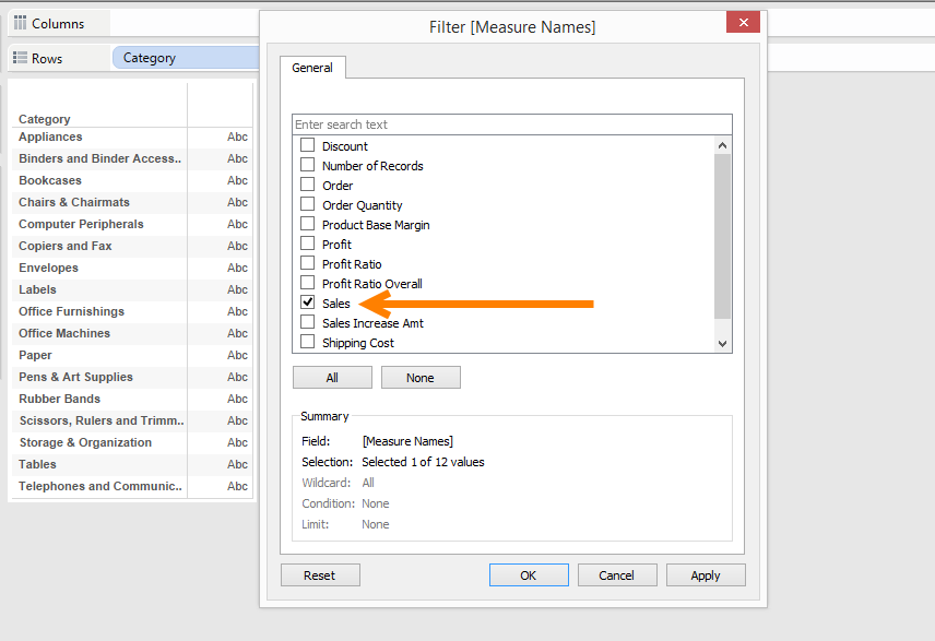
- Bring Measure Names to the Filters shelf and choose the single measure you want to include in your view:
- Next, take Measure Values and bring it onto Text on the Marks card:
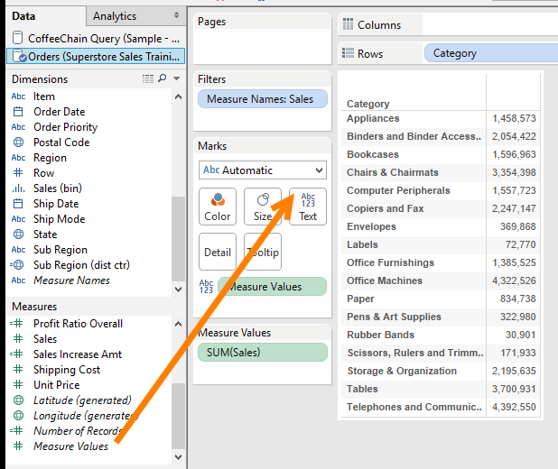
This puts the values of your Sales field, the measure that I selected in the Measure Names filter, into the view with a Mark Type of text. - To add the column header, bring in Measure Names again, placing it on the Columns shelf. You’ll need to either hold down the CTRL key and click-and-drag Measure Names from the Filters shelf, or click another copy of Measure Names from the Data window and drag it in:
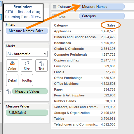
BAZINGA! We have our single-measure column header. Say that ten times fast while hopping on one foot. I dare you.
But Wait, There’s More!
Another small annoyance with single measure views is that it’s not easy to color your marks using a custom color palette (for more information on how to create a custom color palette, click here). When you bring a single measure into a view, like in a bar chart for example, Tableau will always go with a default blue color:

I’m totally OK with that because blue’s my favorite color. But if you’re dealing with a client who has a specific shade of blue that you want to use, or your marketing department has provided you with specific RGB or Hex color values that you need, then default Tableau blue is not your friend.
We could change it to our custom color by clicking the Color button on the Marks Card, but we don’t get the Edit Colors dialog that allows us to choose a new palette. Instead, we get this:
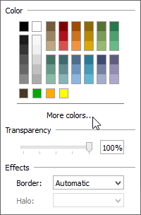
The odds of the color you need being in that little list are slim. So, you have to click More colors… Then we get a bigger set of options, and we can even input the RGB or Hex values that our marketing folks have provided:
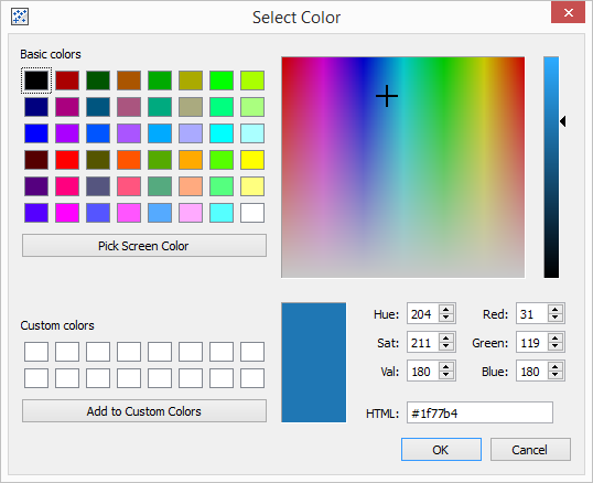
All good news, but there again, it falls short of giving me the Edit Colors button that I can click to see my custom color palettes and choose one.
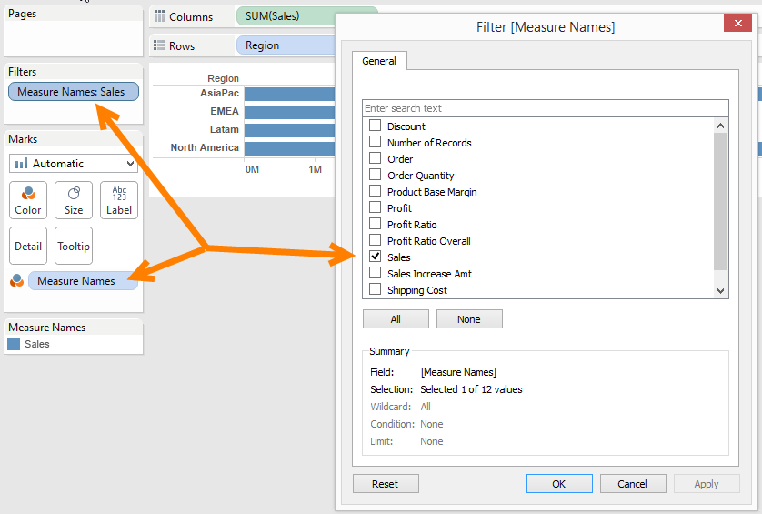
So, how do we solve this? Same way we did above, by using MN/MV. Once again, we’ll drag Measure Names to the Filters shelf and choose our measure. But then, we’ll drag another copy of Measure Names onto Color on the Marks card, configuring our view like so:
Then, with Measure Names on Color, we can click the button and voila! Up comes our Edit Colors… dialog:
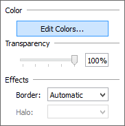
From here, we can choose our desired palette:
