
Note: As I was working on this dashboard, Jeff Schaffer posted a very similar idea. Visit this page for his perspectives and variations on this theme.
When you need to decide what chart type is best for your data, there are many great tools to choose from. The Financial Times Visual Vocabulary and Tableau’s “Show Me” menu are two examples of things that help you decide on basic forms. Once you’ve decided to make a bar chart, there are thousands of variations on each of those simplistic starting points.
Choosing the right fonts, colors, labels, references, size and other nuances can be daunting, but there’s nothing more satisfying than finding the right style combinations to pair with your data. Just as wine enthusiasts know the difference between ordering “red wine” vs. a certain vintage of Merlot, bar-chart aficionados with discerning tastes appreciate the impact of each choice.
The Bar Chart Menu
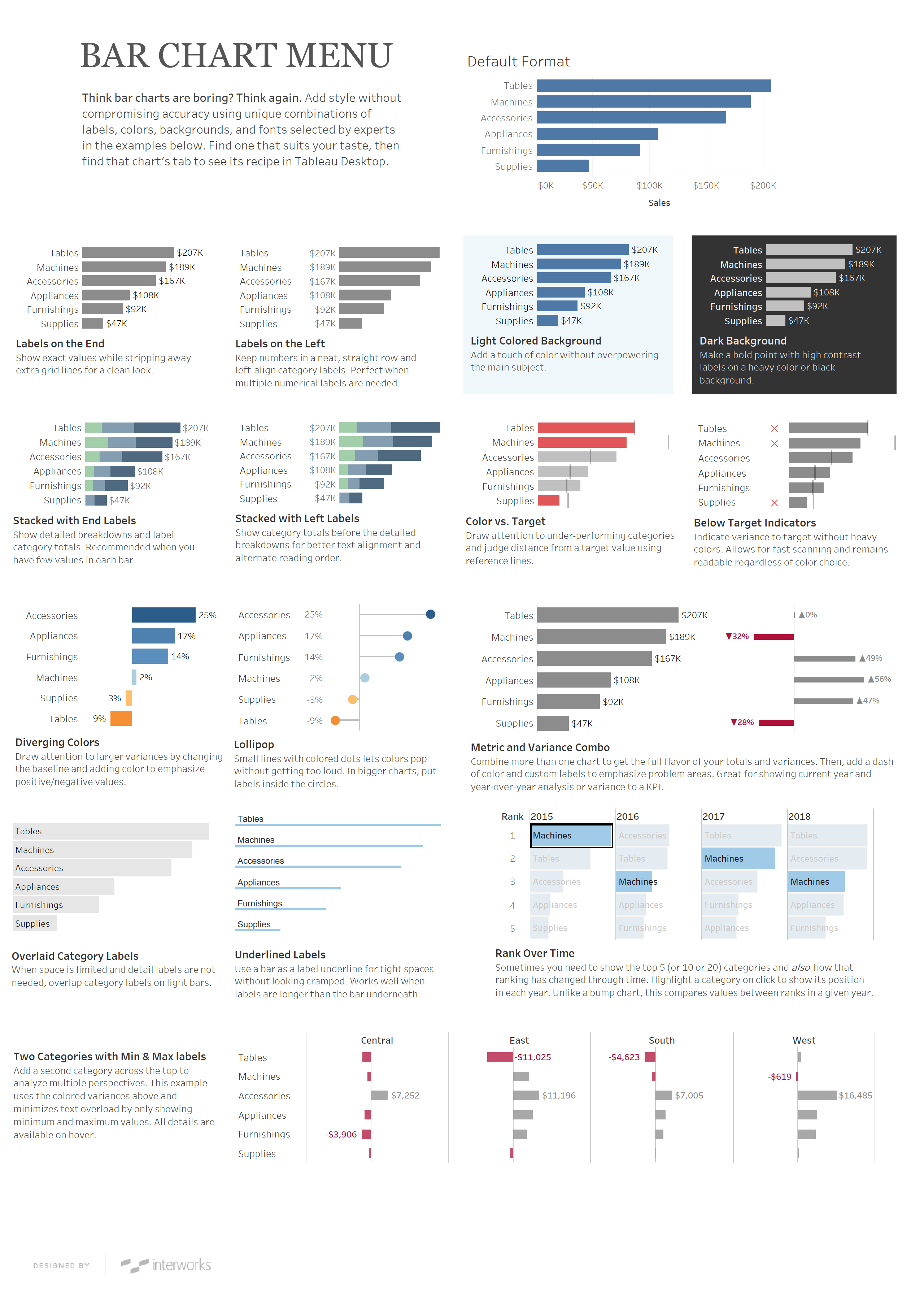
This Bar Chart Menu tool was inspired by the line of thinking we undergo when ordering something at a restaurant. We don’t have to specify every ingredient or define the recipe for the waiter to hand to the chef. Instead, we rely on the chef to expertly arrange flavors in ways that work well together and then we choose from the offerings provided. If we have particular preferences or dietary needs, though, we can always request modifications.
Often, this is what happens when working across teams on a dashboard project. Curated offerings, crafted especially because of their complementary and useful nature, are preferable and more beneficial to a client. By providing a smaller menu of already-created options, we have a range of visual examples to discuss with users. “Let’s talk about these options” leads to better discussions than “Tell me what you want.”
Pair the Right Chart with Your Needs
Feel free to download the workbook provided and open it in Tableau Desktop to de-construct how each chart is made and reproduce it for your situation. We’re also working on more chart types—lines, pies and donuts (dessert menu!) and tables (all kinds of punny restaurant terms)—so check back for updates. Until then, cheers.