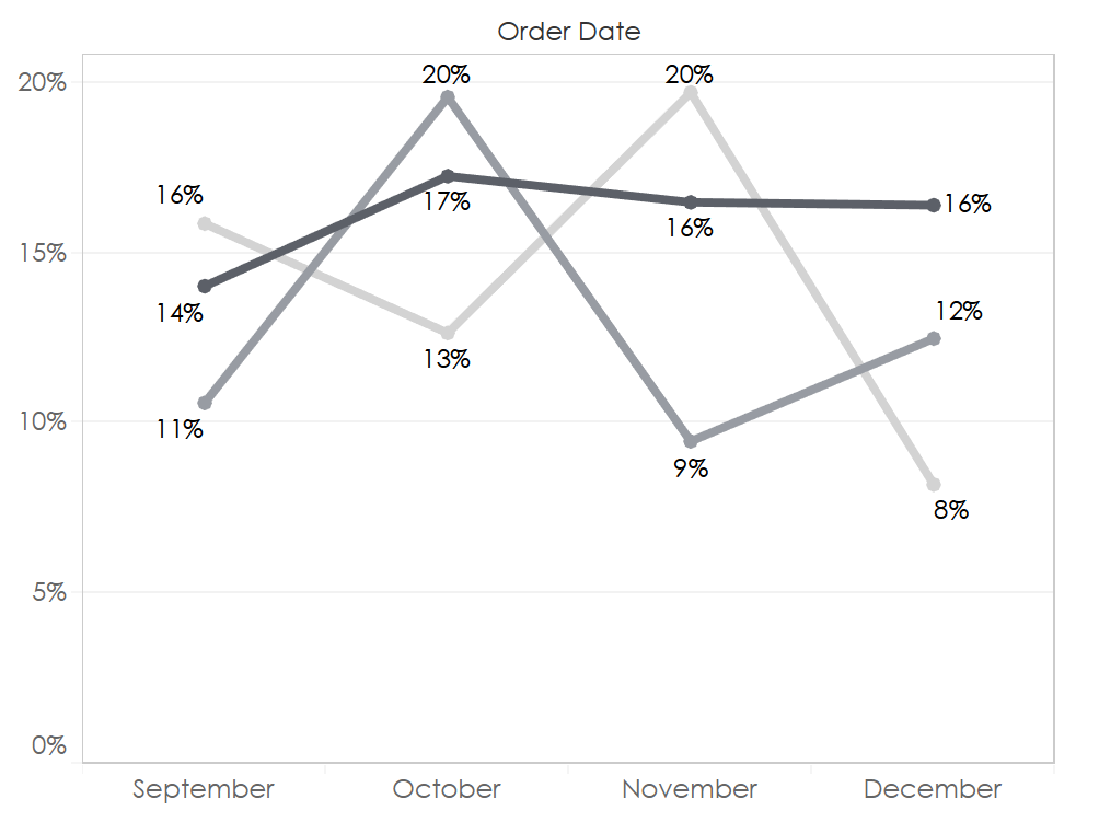
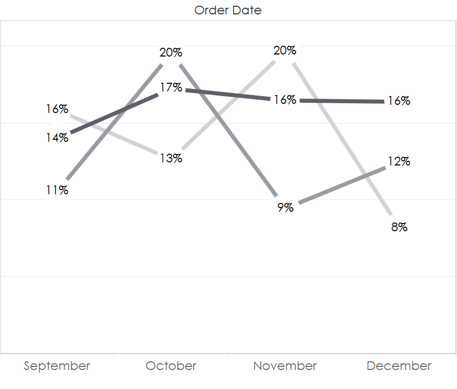
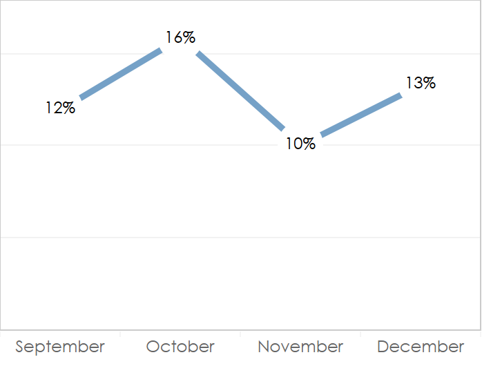
Labels on line charts can get messy. To reduce clutter, we are often are faced with reducing the labels to only the end of the line or simply removing the labels altogether. Here’s a simple trick that provides some flexibility with labels on lines. This quick method replaces the line vertices with the line labels, allowing more space for the labels and creating a slightly more direct and minimal graph.
| Before
|
After
|
Want to Try? Here’s How.
TL;DR: Create a dual axis with a white circle mark and a center-justified label.
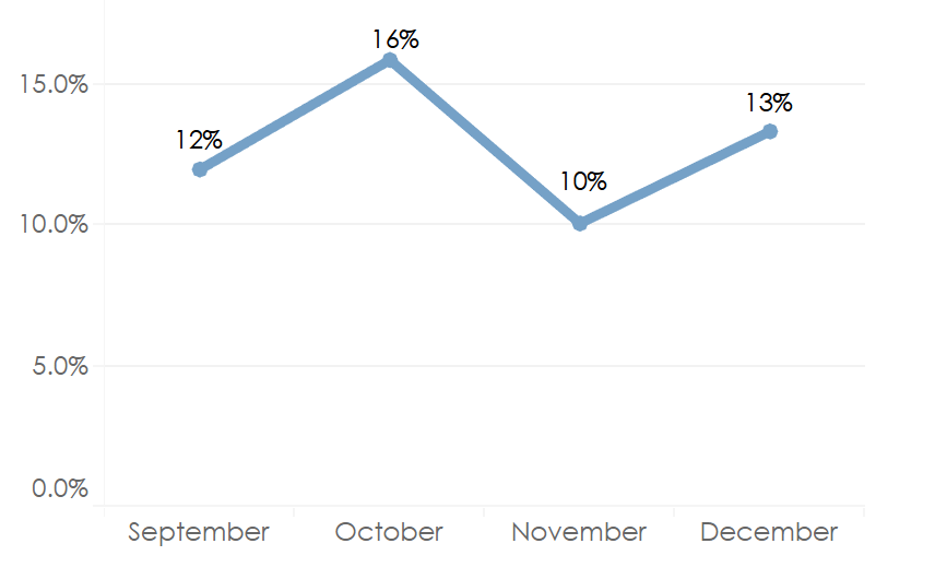
- Create a dual axis by dropping the same measure to Row again. Right-click the Measure pill and Dual Axis. Don’t forget to Synchronize axes.
- Label the mark and center justify the label both horizontally and vertically.
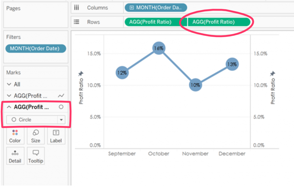
- Change new mark to Circle type from the original Line type and change color to white.And “voila!” A simple and elegant line graph.
What if you have multiple lines with varying colors by dimension? No problem! But, there’s an added trick. - Add your dimension to the view.
- Create a duplicate field of the dimension you just added. Why? We want our circle mark to be white across all values in our dimension. If we used the original dimension, Tableau would use the same color scheme as the lines. But, we want our circle to be white. By creating a duplicate field, we can assign a new color palette to our dimension while keeping our lines the original color.
- Add the duplicate field to color on the circle Marks card and change the color of all your values to white.
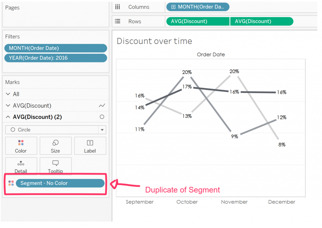
Notes: This method breaks down a bit when vertices from multiple lines overlap (you’ll get overlapping labels), but you’ll have this issue any time you use labels on a line.

