This post is an upgrade to my original 3 Way Venn post, or at least is a better alternative as it gives the right numbers loads faster and is easier to make!
This method doesn’t use sets or anything complicated within Tableau but rather it uses a self join on the data tables. I am using the demo dataset ‘Sample – Superstore Sales (Excel)’ which ships with tableau desktop.
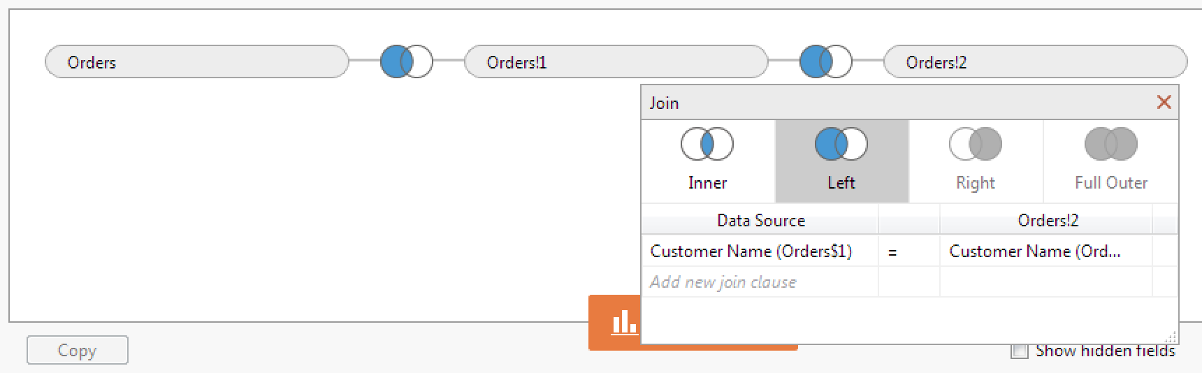
The Orders table has been joined to itself on ‘Customer Name’ twice. This gives the ability to easily compare table entries on a single row rather than needing to reference other rows using a table calculation or set. This type of self join can be used for cohort or market basket analysis as well.
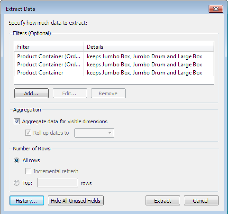
I have also created an extract and filtered it to keep only Jumbo Box, Jumbo Drum and Large Box.
I have done this on each of the ‘Orders’ tables as shown:

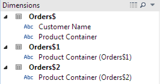
The only fields which I need to keep are: Customer Name, Product Container (Orders$), Product Container (Orders$1) and Product Container (Orders$2). The rest can be hidden for now then removed when we re-create the extract.
We now need to break our customers in to 3 groups & because of the data structure we are able to do this in a single calculated field:
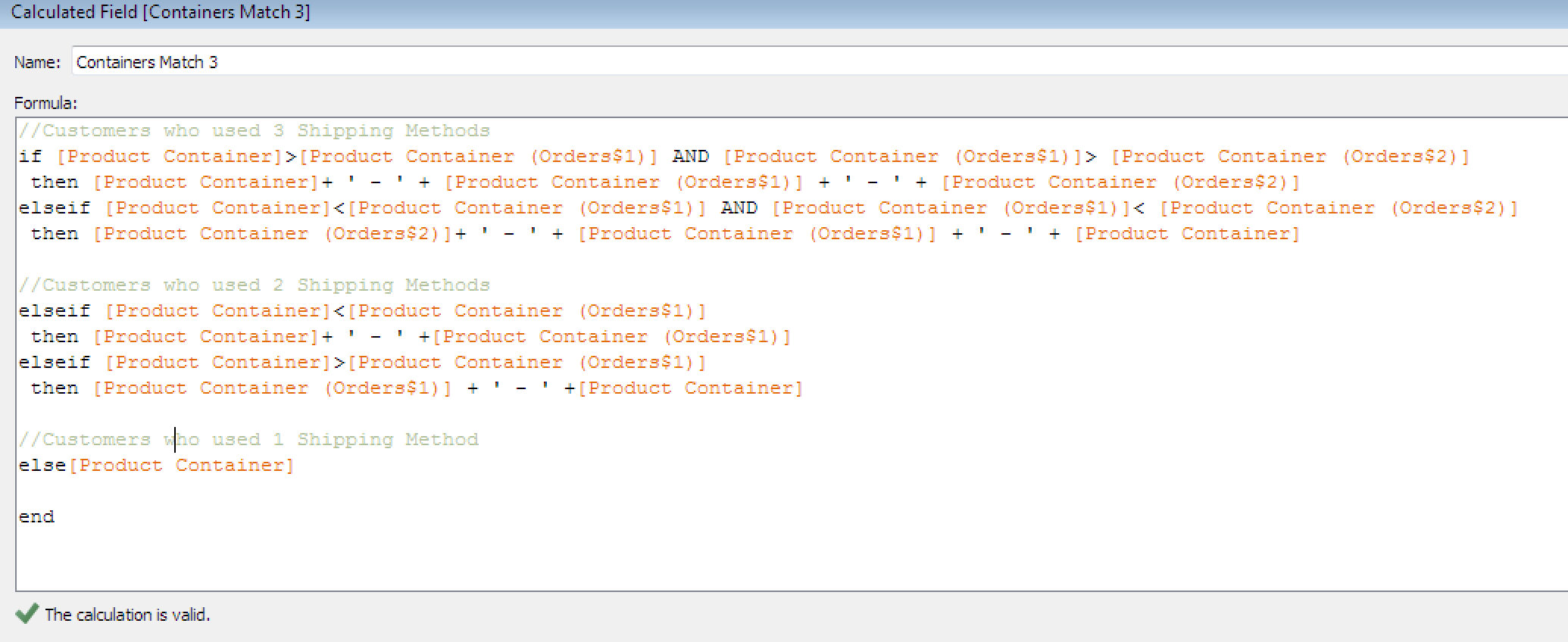
Copy & Paste if you prefer:
//Customers who used 3 Shipping Methods if [Product Container]>[Product Container (Orders$1)] AND [Product Container (Orders$1)]> [Product Container (Orders$2)] then [Product Container]+ ‘ – ‘ + [Product Container (Orders$1)] + ‘ – ‘ + [Product Container (Orders$2)] elseif [Product Container]<[Product Container (Orders$1)] AND [Product Container (Orders$1)]< [Product Container (Orders$2)] then [Product Container (Orders$2)]+ ' - ' + [Product Container (Orders$1)] + ' - ' + [Product Container] //Customers who used 2 Shipping Methods elseif [Product Container]<[Product Container (Orders$1)] then [Product Container]+ ' - ' +[Product Container (Orders$1)] elseif [Product Container]>[Product Container (Orders$1)] then [Product Container (Orders$1)] + ‘ – ‘ +[Product Container] //Customers who used 1 Shipping Method else[Product Container] endWhen we now do a distinct count of the customer names, the customers who used 3 shipping methods will also appear in the other 2 groups. The customers who used 2 shipping methods will also appear in the singles group.
Here are the other calculated fields I have used in the Dashboard:
| Field Name | Calculation | Default Direction |
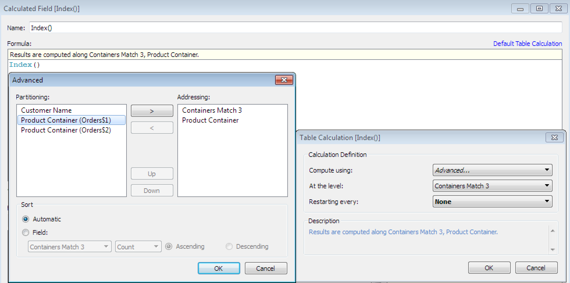
| Index() | INDEX() | Computed along [Containers Match 3], [Product Container] |
| Front / Back | IF [Index()]<=3 THEN 'Front' ELSE 'Back' END | N/A |
| Containers Match Length | LEN([Containers Match 3]) | N/A |
| Label | IF [Front / Back] = ‘Front’ THEN ATTR([Product Container]) ELSE ‘ ‘ END | N/A |
| Size | IF [Front / Back] = ‘Front’ THEN COUNTD([Customer Name]) else 0 end | N/A |
| X3a | CASE [Index()] WHEN 1 THEN 1 WHEN 2 THEN 2 WHEN 3 THEN 1.5 WHEN 4 THEN 1.5 WHEN 5 THEN 1.5 – 0.44*[Label Position] WHEN 6 THEN 1.5 + 0.44*[Label Position] ELSE 1.5 END | Table Across |
| Y3a | CASE [Index()] WHEN 1 THEN 1 WHEN 2 THEN 1 WHEN 3 THEN 2 WHEN 4 THEN 1 WHEN 5 THEN 2-0.89*[Label Position] WHEN 6 THEN 2-0.89*[Label Position] ELSE 2-[Label Position] END | Table Across |
[Label Position] is a parameter between 0 & 2 which allows us to position the labels on the inside of the top venn bubble.
Once all these fields have been created, arrange them on your worksheet as shown below:
Note that all of the Table Calculations (the fields with the triangle next to them) should be correct if the [Index()] defaults have been set up correctly:
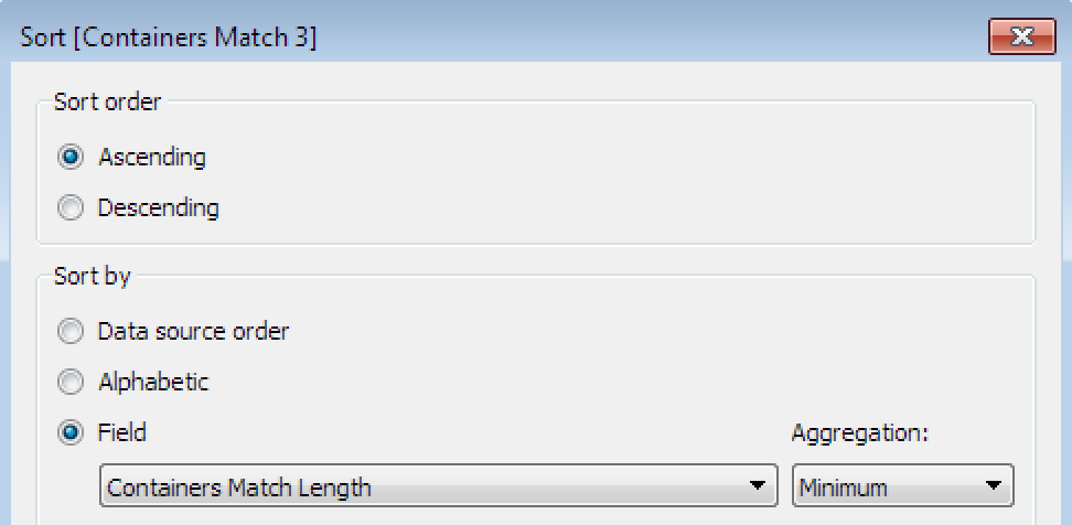
The [Containers Match 3] field should be sorted ‘ascending’ based on MIN([Containers Match Length])
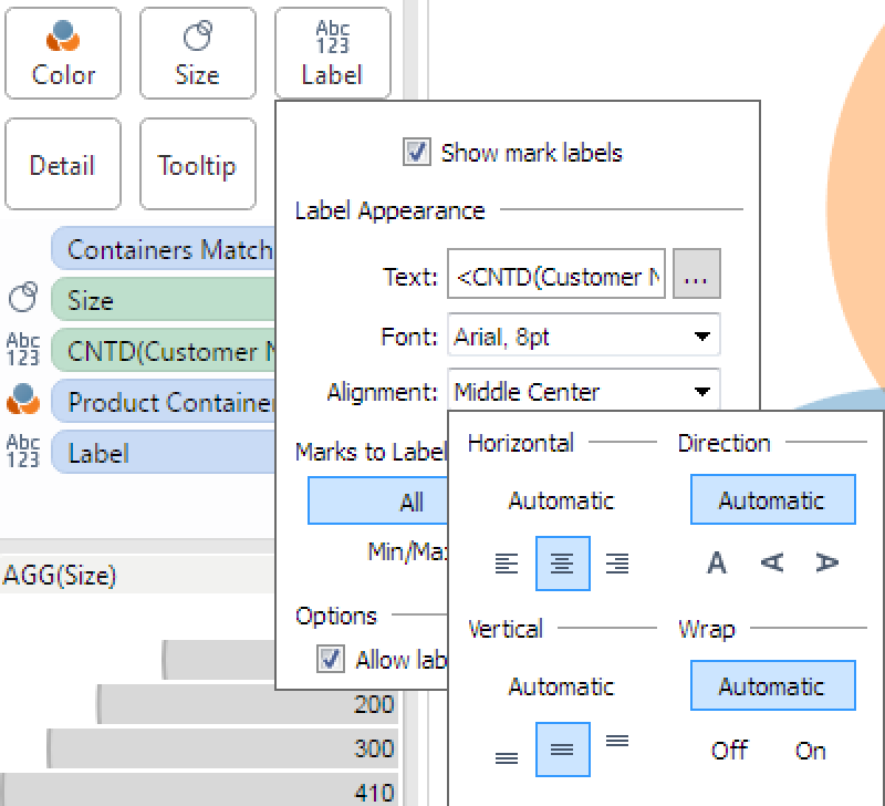
Finally, adjust the marks. Make sure that you can see all of your mark labels by allowing them to overlap and position them ‘middle centre’.
You will need to add some transparency (click ‘color’) and make sure that the sizing is dialled right up (click ‘size’).
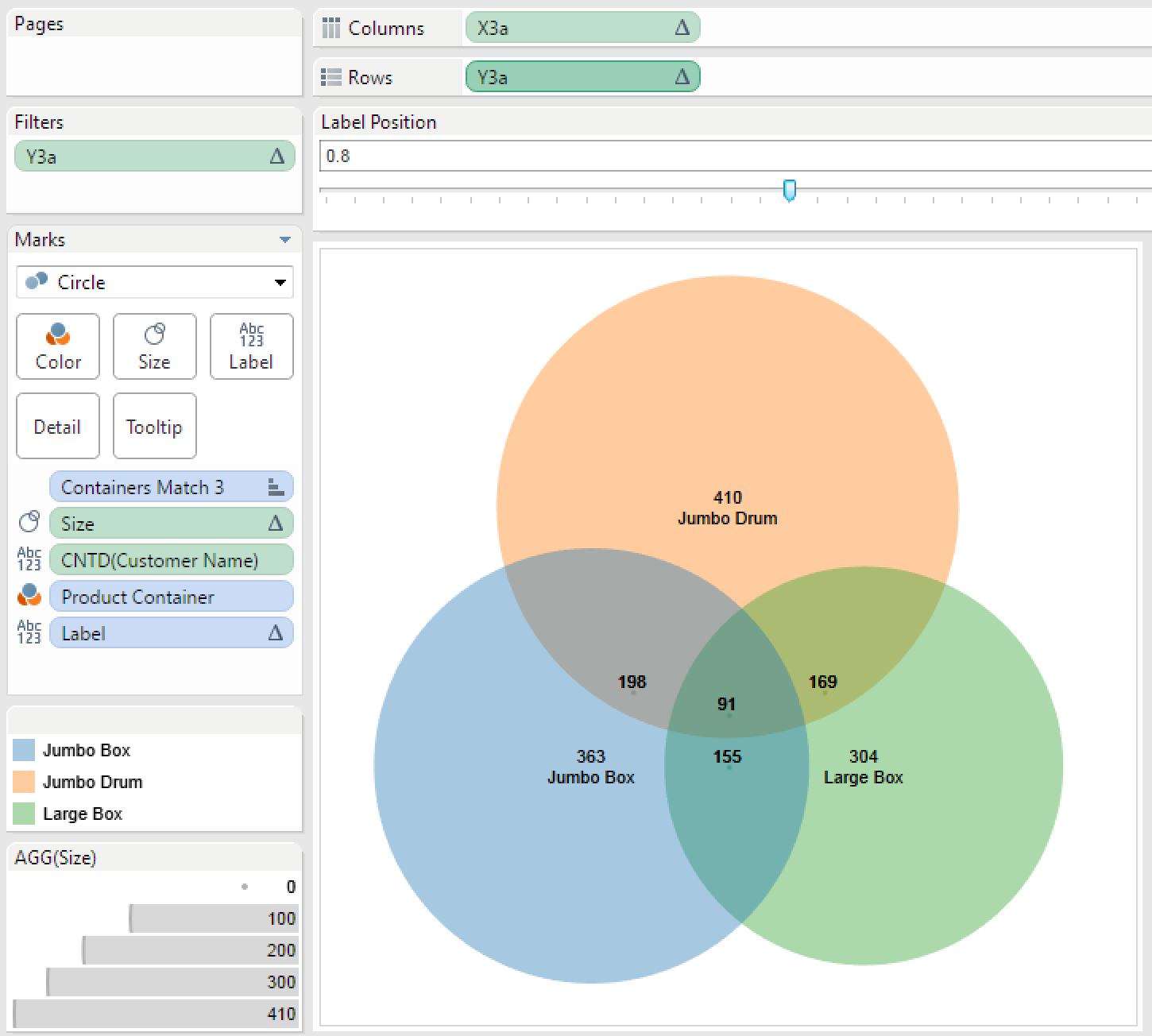
If all goes well you now have yourself a 3 way Venn Diagram. You can adjust the position of the labels using the parameter once you have brought the worksheet in to a dashboard. You will need to make sure that the dashboard size is fixed and spend a little bit of time getting the sizing right.
If your data is likely to change wildly you may need to keep an eye on the sizing to make sure that the labels stay within their boundaries.
Happy venn-ing!