
The Challenge
Visualize movement from Date A to Date B with one dimension and two measures. More specifically, display how these measures interact with each other and affect the outcome or performance of the dimension over time. This problem was posed to me by one of the most awesome clients I’ve been working with lately, and I gladly accepted.
The Solution
A “Movement Plot.” Think of it as a scatter plot with activity!
How to Create a Movement Plot in Tableau
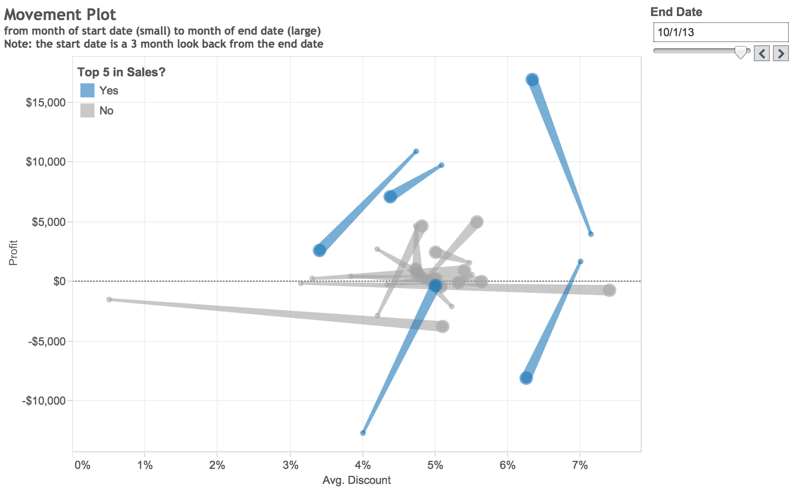
For this example in Tableau, we will look at the intersection of Profit and Average Discount, and we will plot the movement by sub-category (colored above by Product Category) in the Superstore data set. The business question could be phrased like this:
“How has discount affected profit by sub-category over a given time? Is there a direct correlation between profit and the amount of discount given? Can we track the progress or lack thereof?”
Step 1: Create Your Calculations
First, create a date parameter (this will be your end date or the date you want to see movement to). Next, create a calculated field to be used as a filter that only brings in the date selected in the parameter (end date) and the start date. I am using a static three-month look-back to define the start date. You could make that number dynamic by using a second parameter.
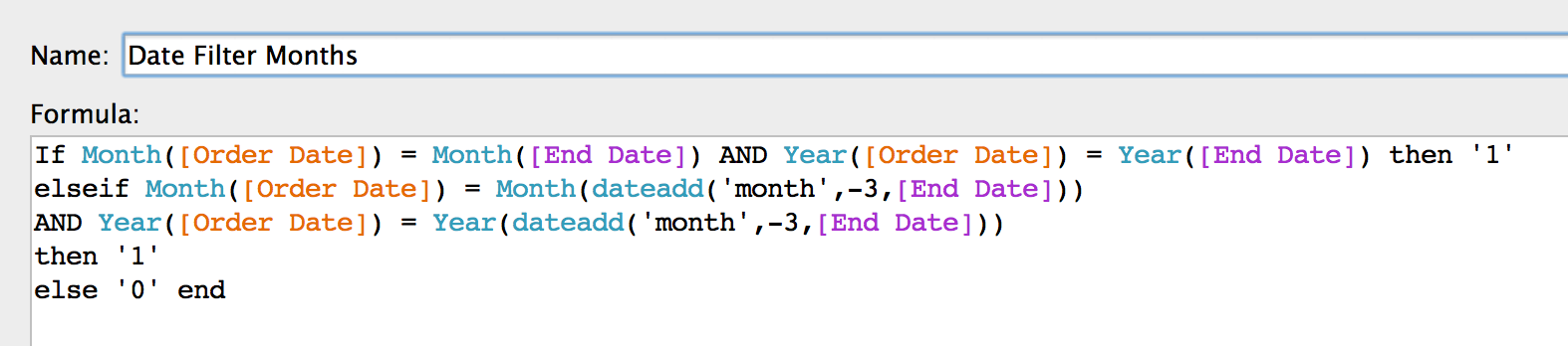
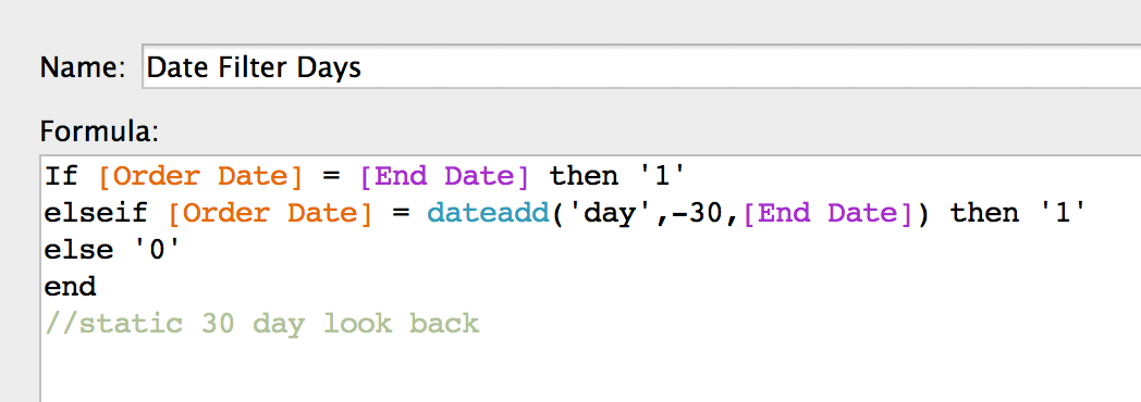
Note: I have also rolled the data up to the month level. Days would be an easier calculation like this:
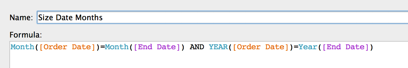
Now, create a Boolean (T/F) calculation that will be used to size the line. I do this to make the end date larger and the start date smaller. This will help us visualize direction.
Step 2: Let’s Build It!
- Move Measure A to Columns and Measure B to Rows.
- Marks Type = Line.
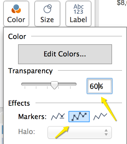
- Dimension to Color (or Detail if you don’t want separate colors). Format Color on the Marks card. Transparency will make it easier to see other members, and the second Markers option will accent the start and end dates.
- Move your Date Filter Calculation to the Filter shelf and select 1.
- Move Date Size Calculation to Size on the Marks card. This must be below Color or Detail.
Step 3: Use It!
Here’s what you can use a movement plot for:
- The need to display the relationship of two measures and their impact on a dimension over time.
- Looking at a certain group or set within the dimension. Perhaps we have altered a few members of the dimension and want to see the impact of this test. Or, maybe we want to track our top five in sales. Visualized below:
Improvements or comments are welcomed. Viz On!