
A question that seems to come up every so often as a consultant is around how Tableau doesn’t show data where there is no data. Sounds kinda obvious, doesn’t it? But let’s frame this slightly differently and we can see that whilst this does make sense, it can be a bit of an annoyance.
Let’s take a look at a simple data set showing sales in June 2018:
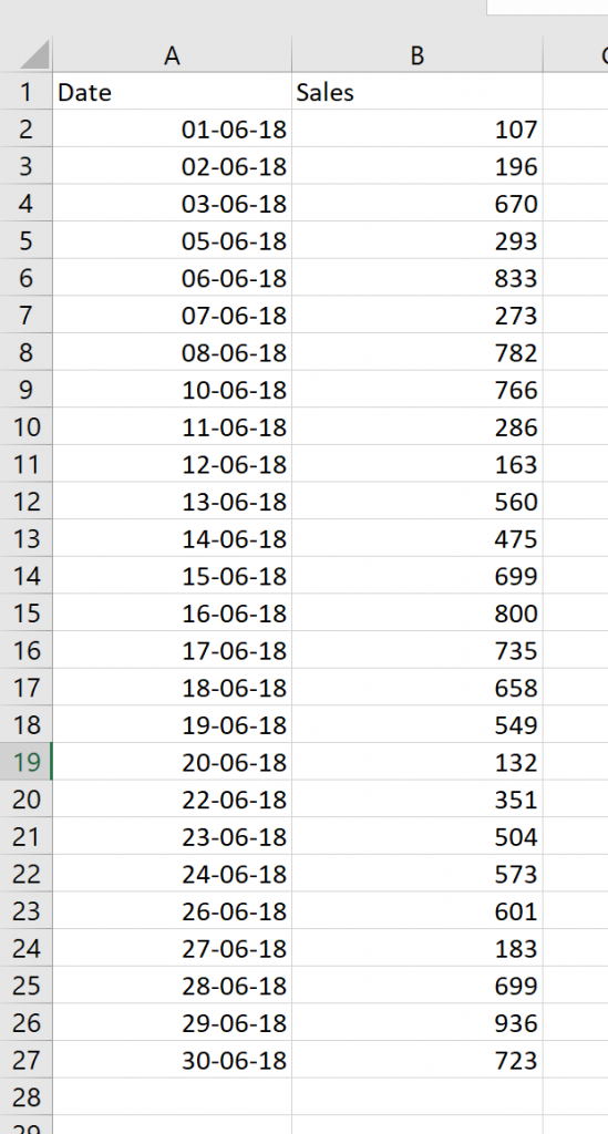
Two things to notice. Firstly, I’m English and live in Australia. Sorry to our U.S. friends, but I can’t bring myself to use your date format without dying inside a little. Secondly, not all dates are populated. We don’t have data against June 9, June 4 and a couple of other dates. So, if we plot this as a line chart in tableau we get:
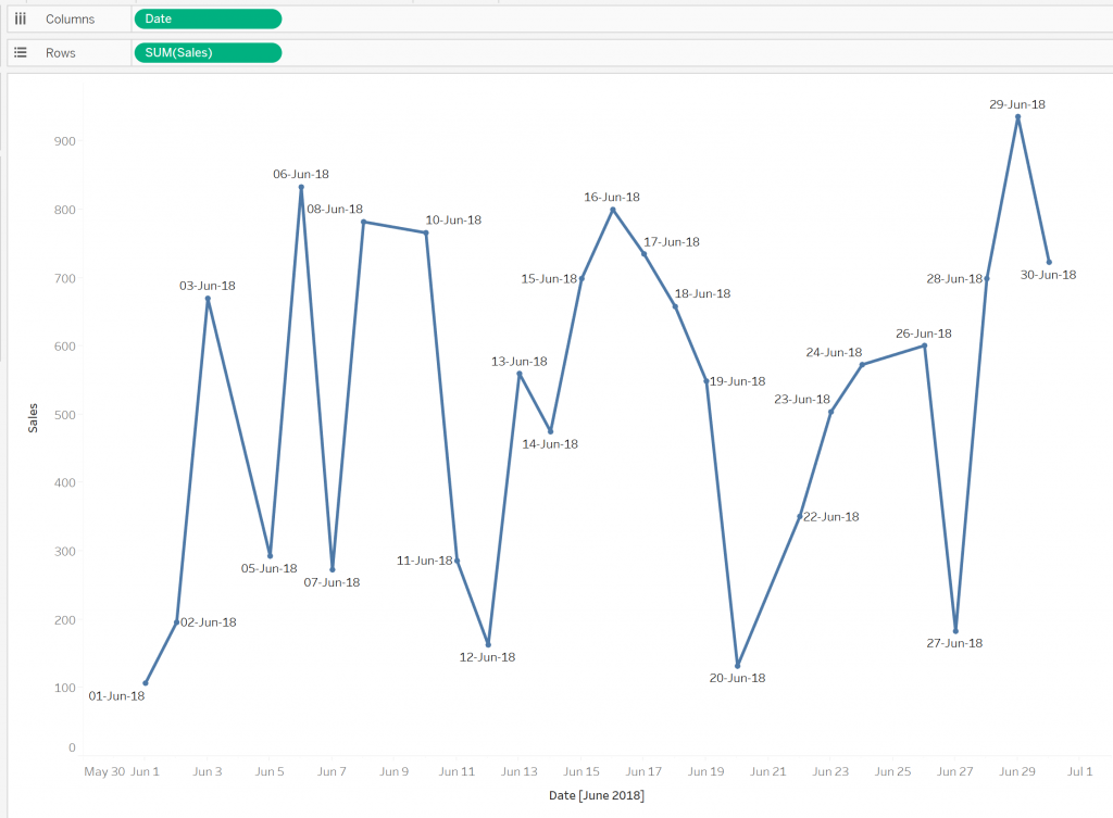
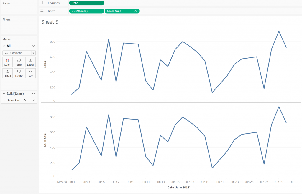
I have added Date to the label for clarity of what is going on. We can see that we have no data points at all for the missing days. This makes sense. Tableau isn’t inventing data, and having no data point is different than having a null value. But this is likely a day where there were possible sales but there happened to be none. In this case, it probably makes sense to consider these days as having $0 in sales, and the line chart should represent this. Looking at the chart above, we’re not seeing an accurate trend for our business.
If we do want to see these dates, even when there is no data, how do we do this? Of course, we can use some ETL tool to update the source data. But if that isn’t an option, can we make this work in Tableau? Yes! The obvious answer is to use the IFNULL function, and this would work great if our data looked like this:
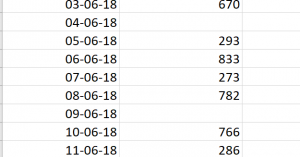
But our data doesn’t look like this, so the IFNULL function won’t work as there are no nulls in the data. As mentioned above, we don’t have null values, we have no data. This is a critical and often misunderstood point.
The Solution
The trick is to use a table calculation, but of course, we don’t want to change any data values. We’ll build a table calculation that pretty much does nothing other than saying to Tableau, “Hey, I’m a table calculation.” The reason for this is that this turns on data densification (where Tableau will essentially “fill in the gaps” in a date/time series). I have built a calculated field:
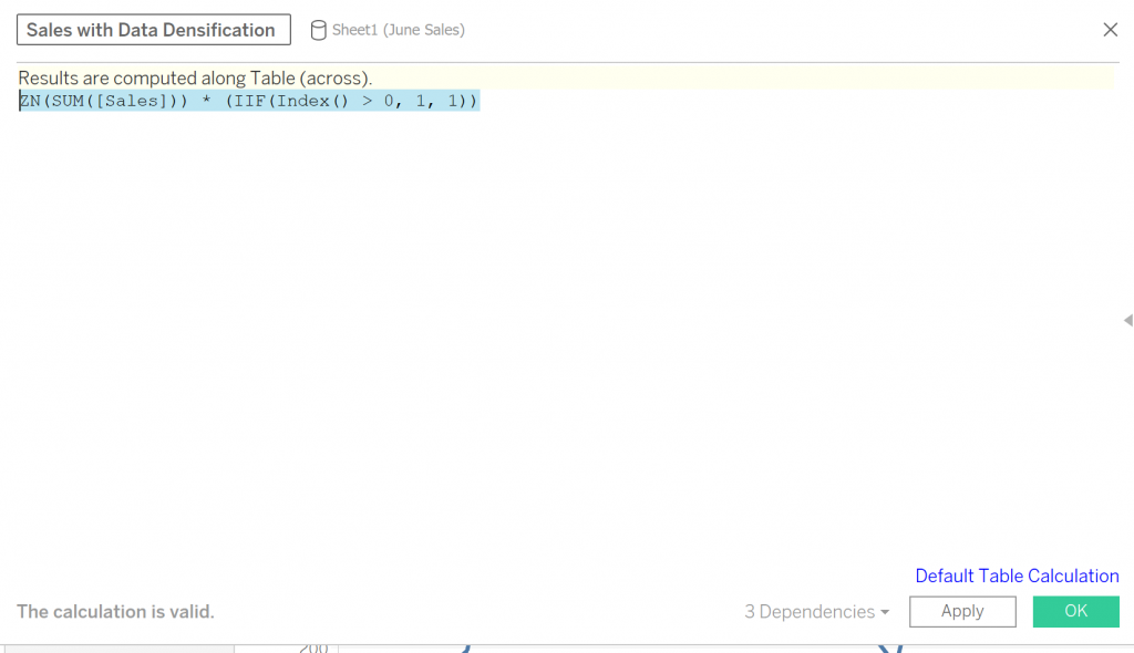
The IIF expression will always return 1. Consequently, the result of this expression is the same as ZN(SUM([Sales])). Now if we add our original Sales field and the new calculated field to our worksheet, we see the same thing:
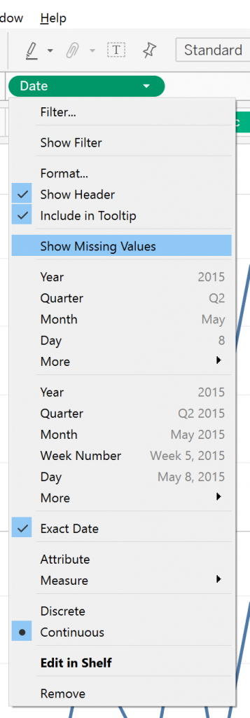
So, what … it doesn’t work? Sorry, it does – stay with me. There’s just one more step. We need to click on the Date pill and select Show Missing Values:
With our new calculated field, we see a nice continuous line as opposed to the stop/start view of the original field:

So, there we have it – a nice, quick and easy way to fill your data out and get a fuller picture of line charts. Of course, this should be used with caution. Sometimes having no data displayed is the right option. For example, if we were a retail outlet that was only open on weekdays we wouldn’t want our chart dropping to zero every weekend.