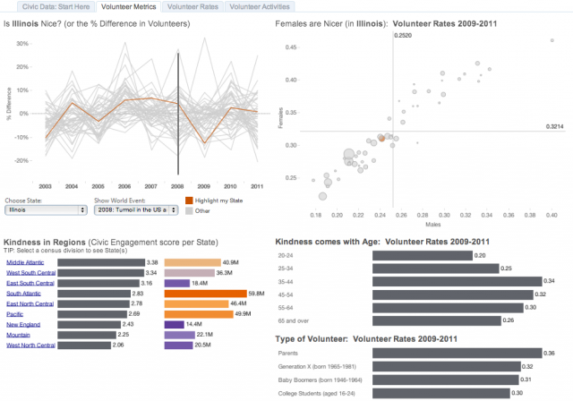
Is data visualized more insightful than data stockpiled? It certainly depends on who you ask but, in some very specific cases, data visualized can shed light on some tightly guarded tribal knowledge. To that end, the team for the Civic Data Challenge has provided numerous datasets on, well, civic data (volunteering, civic engagement, etc.). It’s a worthwhile project and I would encourage everyone to at least understand what it aims to accomplish.
In this example, we wanted to illustrate the path to visualization. From data preparation to data visualization, there are really 5 painless steps. I’ll simply highlight them here and leave you with the visualization. After all, there are mounds of books on ETL, ELT, data analysis and other theoretical methods of visualization. If there are specific questions that arise, please just let us know. Here are the basic steps:
- Understand the data: What do you want to accomplish?
- Prepare the data (we used both SQLite and MySQL)
- Test the data: Is it in the correct format (3NF / Denormalized)?
- Visualize the data: What do you want to accomplish now?
- Repeat (if necessary)
I’d encourage you to explore the visualization on the web and, if you have Tableau 8, please download the workbook.
Big thanks to Andy Kriebel for the insightful feedback on what makes an effective visualization.

