
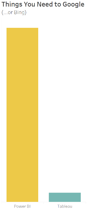
The objective of this comparison exercise was to rebuild the Overview dashboard from the Tableau – Superstore sample dashboard in both Tableau (10.4) and Microsoft Power BI (2.52) with no prior knowledge of the Microsoft analytics package. I decided to conduct this comparison to better understand one of Tableau’s most-talked-about competitors and to gain some knowledge of its feature set. The findings and conclusions taken from this solo exercise are my own and do not reflect – nor were they knowingly influenced by – those of anyone else.
It’s tough to stay objective in this technological age. If not impossible. My tribalistic tendencies towards Tableau is unquestionably significant in this exercise, especially since I began with the market’s common knowledge that Power BI features less functionality, is less usable (Tableau’s flagship characteristic) and looks less pretty. This forced me to stay vigilant, be pragmatic on each issue and explicitly look for the good in Power BI.
Overall, my perception of Power BI before having used it wasn’t far wrong. That said, the exercise did not put me off the Microsoft product – and I won’t be caught in any heated pub debates with Microsoft BI consultants any time soon.
The exercise mainly highlighted how spoiled we are as Tableau users. If we right-click an axis, a menu appears offering all the functionality required to edit that axis exactly as you require. Want to alter the tooltips on this chart? Click the obvious tooltip mark and edit away in a rich text editor! The main takeaway was that Microsoft’s product didn’t have this feeling. It felt like either functionality did not exist (tooltip editing) or the places to access the functionality were hard to locate (axes editing) and required searching the web.
The goal here was not to become an expert in Power BI, so some corners were presumably cut that may have been possible with further searching the web and/or more knowledge. I also did not aim to guinea pig all Power BI functionality, so I imagine there are many good – and potentially not so good – features not touched in this exercise.
The task of reproducing one of Tableau’s example visualisations should also be noted in Power BI’s favour. Connecting to Data
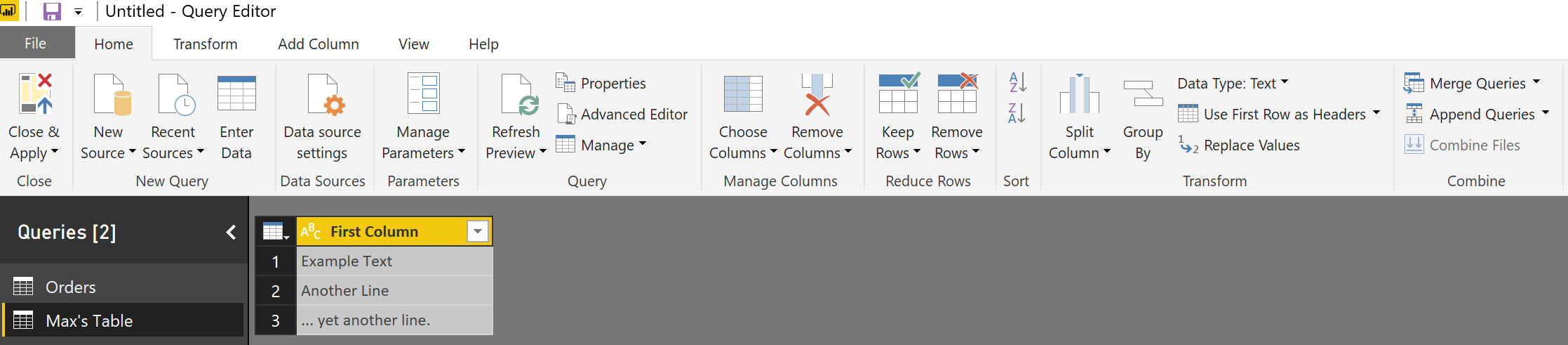
Opening Power BI, you are greeted with a similar interface to Tableau. “What data do you want to use?” Power BI has 45 native connectors, compared to the 69 currently available in Tableau. Since I’m connecting to Excel, I selected it from the top of the list and was greeted with the Navigator. I chose the Orders table (sheet) and could preview the data. All this was in line with Tableau functionality.
Clicking Edit on this page opens the Query Editor page, which I like. Users can add new tables to join to (not discussed in detail here as just looking at one sheet). They can also perform complex transformations such as grouping by values and summarising the data to a defined aggregation, changing data types, removing duplicate rows, pivoting columns, replacing values, etc.
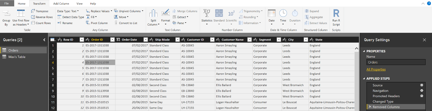
Tables can be added from your data source and combined here. This functionality is an area where arguably Power BI appears to be as strong, if not stronger than Tableau. Microsoft’s Query Editor has pulled from their Excel and Power Pivot functionality back catalogue and added an impressive number of transformation features that don’t appear so front and centre in the Tableau GUI. If you are well accustomed to similar Microsoft products, you are sure to find this experience helpfully designed and generally intuitive. That said, a large number of these features are formatting alterations and features that Tableau displays in subtle drop-downs on the columns themselves or are simple to create in calculations.
If push comes to shove (bias aside), I would say that Power BI’s blunt force approach to showcasing their feature set in the classic ribbon is preferable to Tableau’s hidden options and is far more obvious to a first time user. However, with Project Maestro close to release, Tableau are set to add a powerful and visual data prep tool to their armoury. Maestro will allow for visual data profiling and the construction of data wrangling workflows.
Unfortunately, this exercise didn’t require me to use these features extensively. I merely clicked Load and was shown a blank canvas.
Building the Map
Arguably, I chose the hardest viz to build first. This may be why I found it the most frustrating.
Tableau
- Double-click the Longitude and Latitude fields.
- Create a Profit Ratio field by clicking Create Calculated Field and entering simple formula: SUM([Profit])/SUM([Sales])
- Drag this new field on to Color and Sales on to Size cards.
- Drag the Country, State and City hierarchy onto the Detail card.
- Tweak the Size slider and make the colours stepped with max and min at -50% and 50%. Add halos.
- Alter the map layers to show the objects required and alter the design to be as neat as possible.
Power BI
- Select the map icon in the Visualizations pane.
- Right-click the Fields pane and create a new hierarchy for Country, State and City.
- Drag into the Location card and select City.
- Create a new measure, also in the Field pane, and type the following into the Excel formula box that appears: Profit Ratio = SUM([Profit])/SUM([Sales])
- Drag Sales on to Size and Profit Ratio on the Colour Saturation card.
- Find this icon and click it:

- Expand Data colors and set the minimum and maximum a la Tableau. Set Diverging = Yes.
Number of steps-wise, this wasn’t too painful. However, I have several significant annoyances about the resulting viz:
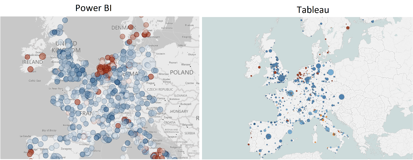
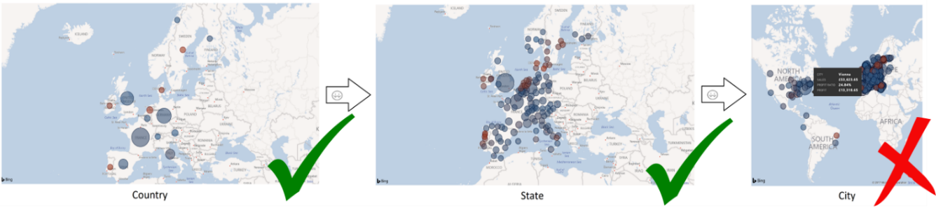
- Vienna is not in the US. I know there is a Vienna in the U.S., but it’s the capital of Austria. I expect Bing to know this and handle it accordingly, especially since we went to the bother of creating a hierarchy for Power BI to use. After wasting 20 minutes trying to fix this using Google, I moved on.
- The minimum size of the marks is massive. Tableau makes a nice-looking map here. The circles don’t need to be large to get noticed as we have applied halos to make them stand out against their competing cities. This makes the viz look really messy and doesn’t highlight large differences in sales values between cities.
- Five map styles. Power BI has a small list of styles such as Dark and Aerial (good name, by the way) with no customisation therein. In my example below – the closest one I could get to Tableau’s – the motorway labels and, oddly, small-town names are apparently mandatory. And if you wanted to know where the Celtic Sea is, this map’s the map for you.
Building the Area Chart
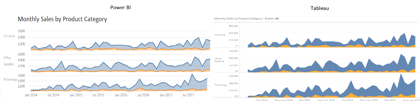
Tableau
- Drag Order Date to Columns and make it a continuous month.
- Drag Sum of Sales to Rows and make the chart Area using the Marks card.
- Drag Category to Rows to expand this axis; one per category.
- Make another calculated field called Order Profitable and use the calculation in the comparison below. Drag this onto Colour and set colours for true and false accordingly.
- Edit the aliases to be Profitable and Unprofitable.
Power BI
- Under Visualizations clicked Stacked Area Chart.
- Tick Order Date. Under Axis, untick Quarter and Day so these can’t be drilled in to.
- Drag Sales onto the Values shelf.
- Create an Order Profitable? column and add it to the Legend shelf.
- Click the
 icon to drill into month and year. The other one just gives you months (discrete).
 - Remove the legend and alter the colours.
- Put the Category on the Filters shelf and select Furniture. Put a text box next to your chart containing the axis label Furniture and repeat the above six times for each Category and Segment. (Copy and paste also works, too).
The number of steps here is infuriating, given that you have to build each one, then size and position it on the canvas. How does Power BI support a productised report that doesn’t know what dimension values will need to be split out? What if there’s a new segment in the data tomorrow? I don’t know.
How does Power BI fit all six dashboards to that they fit the height of the dashboard equally? I don’t know. There is a Distribute Horizontally button, but it didn’t seem to do anything when it was clicked in my scenario.
The Calculation
In the above, it was necessary to provide each tool the complex calculation of providing the total profit per order ID. In Tableau, this is a Level of Detail expression. These aren’t the easiest to get your head around initially, but I find them intuitive enough at this stage. Power BI uses DAX expressions (data analysis expressions), again borrowed from SSAS, Power Pivot, etc.

The ALLEXCEPT in the above throws me off. Both expressions are aimed at making the software perform a calculation outside the data in the viz already by constructing another table of data to aggregate over.
Again, I’m biased, but I believe it boils down to:
- Are you a Microsoft fanboy/fangirl? You’re probably comfortable with DAX already. If not, the syntax is within your wheelhouse.
- New to Tableau? Do a bit of learning. This is “advanced” and not as intuitive as the rest of Tableau, but it’s not that bad. Suck it up and watch a YouTube video for 20 mins. You’ll be fine.
Building the Summary Table
Tableau
- Drag Measure Names on to the Columns shelf.
- Drag Measure Values on to the Text card.
- Right-click and format each element accordingly.
Power BI
- Click Table from the Visualizations pane.
- Tick the columns you’d like to include and aggregate where necessary.
- Format in the
 tab as appropriate.
Let’s be honest here, Tableau’s method of dealing with tabular data is not intuitive. The hack to remove the Abc from the final column is annoying and the clumsiness of the entire interaction could be improved. At this point in Tableau’s roadmap, it’s clear this is a design decision aimed at pushing users away from building big, gross tables. While I understand this, it seems pushy and somewhat naïve.
Power BI’s method is nice. Build out the table by clicking a field and adding it per dimension in there already. It seems pleasingly responsive and does what you’d expect. Make the text large using the “formatting” pane, and then … oh … resize everything manually again. It was going so well …
Also, worth noting, there’s no option to provide a format mask in the viz that isn’t in the data. So, if you want to have a field that holds a percentage with two decimal places, but only show the whole number in the viz, it must be two fields. This is unpleasant and costly in terms of performance and data quantities.
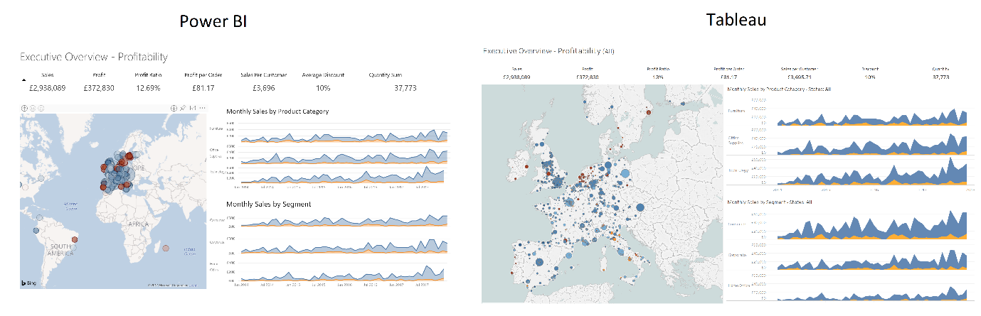
Bringing It All Together
Creating actual dashboards using Power BI was fairly intuitive. Where Tableau’s method of invoking containers to structure the dashboard sometimes feels clunky and frustrating (but in the long run is worth it), Power BI has a basic snap-to, floating approach that feels easy. This did become quite annoying when resizing my six area charts, but it didn’t take me that long to sort this out. I’d worry about the ability to build something intricate with confidence, however, and again building out data sets where you don’t know the dimension values would be tough.
In Tableau, designers make single worksheets and combine them into dashboards. Power BI encourages users to design all their worksheets (or charts) on the same canvas and combine aesthetically – or functionally – as they go. I don’t have any strong feeling about this upon finishing my first Power BI dashboard. As a Tableau user, it’s fine. It works and it’s easy to understand. I’m sure it could be frustrating, but Tableau’s containers are far from perfect. Power BI does allow for overlapping worksheets, which could be useful.
Conclusion
As Tableau users, we’re spoiled. So, it doesn’t do tabular data all that well, and you can’t do major transformations on the data set (yet). As a data visualisation tool, however, it’s the best I’ve used. The ability to imagine how you think it should behave and it actually behaving in line with this almost every time is the big difference between Power BI and Tableau.
In Power BI, I found myself clicking, right-clicking and shift-clicking on elements of my dashboard then nothing happening. It blinked at me. Over and over again. Where Tableau would think “What’s that? You want to make that title bold? Sure, here’s the menu.” In Power BI, you’re expected to trudge the long, arduous journey to the formatting panel and find the element you want before making the alteration.
There are some major functionality flaws mentioned in the above around geo-coding (sorry Bing Maps) and multiplying charts in a particular axis that I believe are enough to justify a low functionality score here. The Show Me pane in Tableau is a sales tool in my opinion, and I regularly tell customers to avoid using this, encouraging them to build up their Tableau chops manually as all these provide are presets of dimension and continuous variables on different shelves. The ability to find a sense of “flow” in the product is what sets it apart and gives the user that feeling of deep satisfaction when they create something neat. In Power BI, the Show Me equivalent seems to be the main way of creating chart types.
If you can think of it, it seems Tableau can do it. I feel Google and Tableau have the skill of making truly intuitive UI experiences that allow you to guess with real accuracy, and later – once you’re more comfortable with the product – allow you to really create rather than simply build. With Microsoft products, you become an expert by trudging through “advanced” controls and ribbons hidden in the “developer” backwaters, and Power BI is no exception. Here are my final scores for Power BI and Tableau respectively:
| Power BI | Tableau | |
|---|---|---|
| Usability | 6 | 8 |
| Aesthetics | 7 | 10 |
| Functionality | 6 | 8 |
| Total | 19 | 26 |