At the beginning of my career with InterWorks, I knew only a fraction of what I do now about the Tableau Desktop tool. One of my very first posts mentioned the new Mac connector in 8.2. Upon the release of Tableau 9.2, I’m back to preview my favorite enhancements in Tableau Desktop!
Connecting to Data
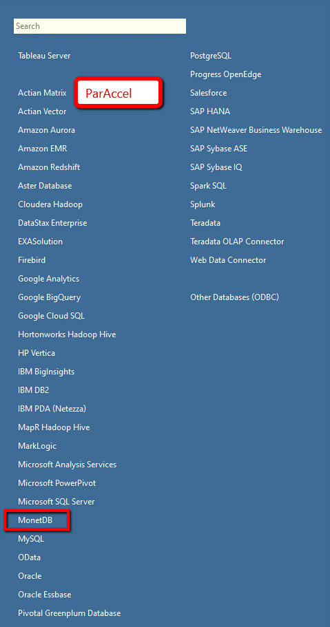
It all starts with the data. We see the addition of MonetDB and a rename of IBM PDA (Netezza). Additionally, my understanding is that ParAccel has been replaced by Actian Matrix:
Once we’ve got our data, it’s time to explore! Need to find all columns that begin with A? We now have the ability to sort columns according to their title. The rows in the data preview can be sorted by any field, as well. In our preview of the Excel Superstore connection, Tableau only shows 1,000 rows instead of the full 9,994: 
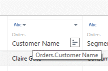
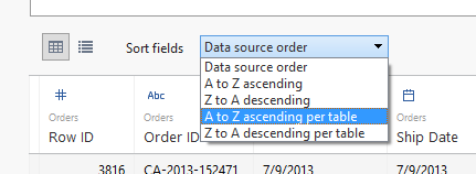
Keeping track of many fields from multiple tables can get a bit tricky. Tableau provides the table name in light gray text below the title of each field as well as the ability to sort fields alphabetically per table.
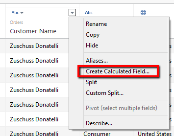
Creating and organizing data for analysis is easier than ever! Double-clicking on the column title allows you to rename the field. Know that you’re going to need an additional field? Calculated fields can be created directly from the data connection screen!
SPOILER ALERT: Our resident ZEN MASTER Robert Rouse has some info to share regarding Tableau 9.2’s improved Data Interpreter. Check out his post here!
The Data Window
The user interface enhancements show that Tableau strives to be as intuitive as possible. You can now click directly on the icon of a field to change its data type or geographic role:
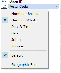
In a similar manner, left-click and hold a field to rename it directly from the Data window:

One dimension and 52 measures? Fear not! Finally, no more lost fields! In 9.2, Tableau automatically readjusts the dimensions, measures, parameters, etc. section to take up only the necessary amount of space.
Mapping
Have you ever needed to plot multiple map layers in one view? Dual-axis maps just aren’t making the cut? The introduction of mapping services like Mapbox are sure to boost the creativity of all Desktop users. I’m excited to see the community’s approach to solving complex problems with customized map layers.
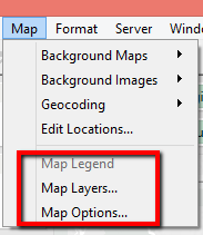
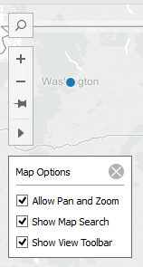
Once you’ve perfected your geographic masterpiece, Tableau now provides the option to control the user’s interactivity. Those of us familiar with Map Options in previous versions will now recognize Map Layers as its replacement. The new Map Options provide the ability to control pan/zoom, map search and the view toolbar. Do you have click-happy users? In maps, you no longer have to worry about the accidental double-click zoom! Unfortunately we’re unable to control this behavior for its sister charts – scatter plots and line graphs.
Map fun fact: When publishing a workbook with a map, Tableau will provide a “current location” selection. We’re familiar with this functionality due to heavy use of smart phones, so users will now be able to analyze information according to their current area.
Labels, Axes and Colors
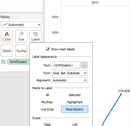
With over 1000 classroom hours as a Tableau Certified Trainer, I feel like I could own and operate the popular, fictitious Superstore. In a perfect world, Sales would increase as time increases. However, our most recent value is not always our largest or smallest value. According to the level of detail in the date field used (the granularity that occurs due to combinations of discrete fields on the sheet), Tableau can now label the most recent observation on the line (e.g. Tableau labels Q4 of 2011):
We’re provided more flexibility than ever with the ability to adjust the start and end points of each continuous axis:
Bonus
As a native Cajun, these last two features are a bit of a lagniappe for “mes amis.” First, totals can be arranged at the beginning of each row or column instead of the end:
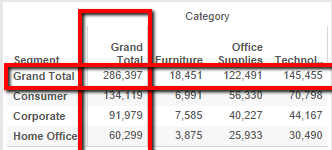
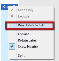
From the analysis menu, select Totals > Row Totals to Left or Column Totals to Top. A quicker version of this can be achieved by simply right-clicking on the Totals column itself.
Last but not least … dashboarding. Static reports can be beautiful on their own, but interactivity helps to tell the entire story. When more than one worksheet is present on a dashboard, the Use as Filter button becomes quickly available. This encourages the creation of dashboard actions and the ability to see data differently:
As the features of the Tableau Desktop tool improve with every release, so do we! Upgrading to Tableau 9.2 may be a great time to discuss your upcoming data strategy. InterWorks can assist on your #datajourney as we strive to do the best work, for the best clients, with the best people!
Drop us a line if you’re interested in learning more about how we can help with your specific needs. We’d love to help.
