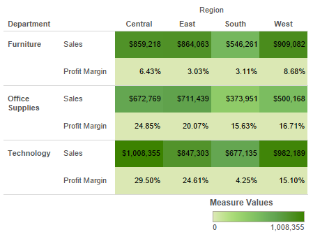
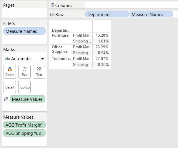
Highlight tables can be a great way to help users quickly spot the most interesting values in a table of numbers. In cases where multiple variables are displayed, Measure Values can be used to apply a single color scheme to all of the values in a table. Unless the variables are very similar, applying the same highlighting to multiple variables is often not helpful and could be misleading.
DISCLAIMER: If you find yourself in a situation where you need to apply unique highlighting to multiple variables in a table, you are most likely trying to force an Excel-based table into Tableau. Take a step back and think if there is another way to display this information that would allow you to place the variables in different tables, or better yet, use a graphic instead of a table. If you are certain that there is no other option for you, proceed with the following method explained below or follow the same steps in the attached workbook.
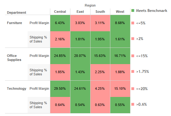
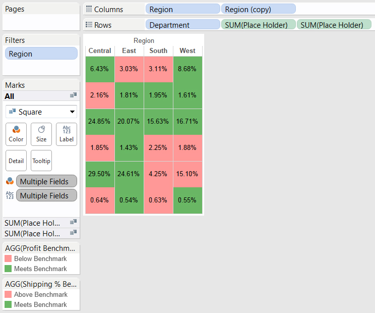
This method walks through creating a scorecard displaying Profit Margin and Shipping % of Sales split by Department and Region. The highlighting is used to call out in red when the profit margin is below or shipping costs are above the departmental benchmark. When creating tables with this method, carefully check that the place holder title matches the variable used and that the highlighting logic is explained. Also included is an optional workaround for the vertical alignment of the row headers.
Below are examples of the same information before and after:
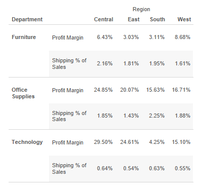
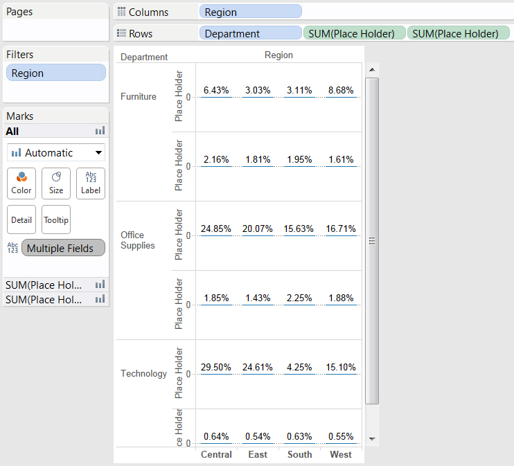
Before Highlighting
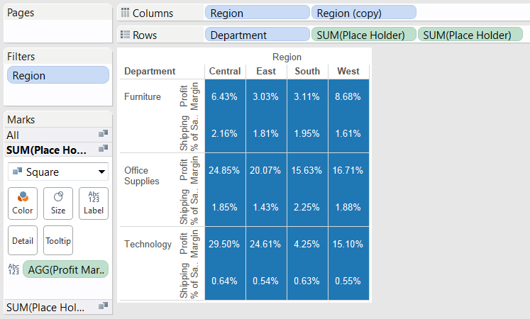
With Row-Level Highlighting

Row-Level Highlighting with Header Adjustment

The Process
Let’s get started by opening up the Sample Superstore Extract. Again, feel free to follow along with the steps below. Or, if it’s easier, you can find the same exact steps explained in the attached workbook.
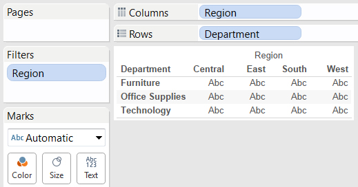
Step 1
1. Place Region on the Filter shelf and exclude International.
2. Place Region on the Columns shelf and Department on the Rows shelf.
3. Create a place holder variable for the Rows Name: Place Holder Formula: 0
Step 2
1. Set two instances of the Place Holder variable on the Rows shelf.
2. Create a new calculated field Name: Profit Margin Formula: SUM([Profit])/SUM([Sales]) (set Default Number Format to Percent)
3. Add Profit Margin as a label for the first place holder variable.
4. Create a new calculated field Name: Shipping % of Sales Formula: SUM([Shipping Cost])/SUM([Sales]) (set Default Number Format to Percent)
5. Add Shipping % of Sales as a label for the second place holder variable.
Step 3
1. Under Marks All, set the type to Square, set the label alignment to Middle Center and size to the second tick mark.
2. Right-click on the first place holder variable and select Edit Axis. Then, set the Title as Profit Margin and Tick Marks to None.
3. Right-click on the second place holder variable and select Edit Axis. Then, set the Title as Shipping % of Sales and Tick Marks to None.
4. Select the dividing line between rows and resize as desired.
Optional: To add Region to the top of the table, create a duplicate of Region and place it beside Region on the Columns shelf. Then, right-click on Region (copy) on the Columns shelf and deselect Show Header.
Step 4
1. Create a new calculated field Name: Profit Benchmark
Formula: IF ATTR([Department])=”Furniture” AND [Profit Margin]>.05 THEN “Meets Benchmark”
ELSEIF ATTR([Department])=”Office Supplies” AND [Profit Margin]>.15 THEN “Meets Benchmark”
ELSEIF ATTR([Department])=”Technology” AND [Profit Margin]>.2 THEN “Meets Benchmark”
ELSE “Below Benchmark” END
(set Default Number Format to Percent)
2. Add Profit Benchmark to the Color tile for the first place holder.
3. Create a new calculated field Name: Shipping % Benchmark
Formula: IF ATTR([Department])=”Furniture” AND [Shipping % of Sales]>.02 THEN “Above Benchmark”
ELSEIF ATTR([Department])=”Office Supplies” AND [Shipping % of Sales]>.0175 THEN “Above Benchmark”
ELSEIF ATTR([Department])=”Technology” AND [Shipping % of Sales]>.006 THEN “Above Benchmark”
ELSE “Meets Benchmark” END
(set Default Number Format to Percent)
4. Add Shipping % Benchmark to the Color tile for the second place holder.
5. Set colors as desired.
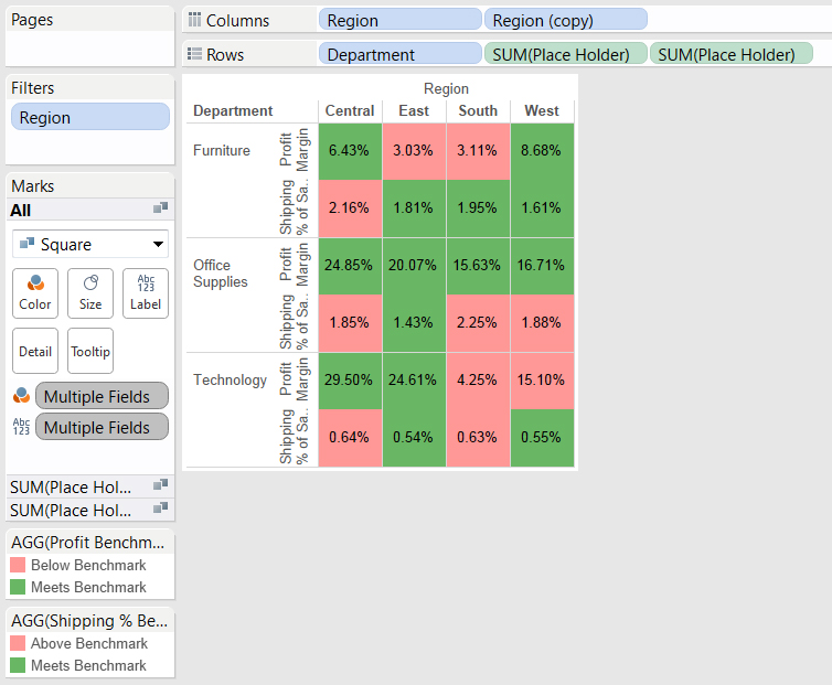
Here is Step 4 with labels added:
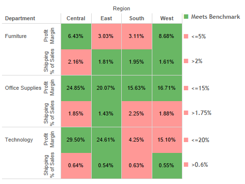
Header Workaround
Now, if you want, you can also make the headers horizontal. You’ll first need to hide the row headers so that the new headers can be used in the dashboard with horizontal alignment.
You’ll then need to create a new sheet with your new row headers. These headers will be used to display labels that are aligned horizontally.
Back to the original table. All that’s left is to apply the new headers. To do this, send the header labels back in the floating order. Then, resize and position them beside the table. Easy! Below is the final product: