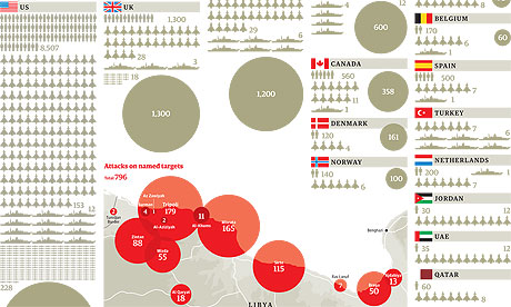
I’m not a great fan of infographics, they don’t assist the viewer in understanding the core story being told, so here’s my alternative version of a Guardian produced infographic. See below for the original:
Although pretty and colourful does it make it easy to understand the purpose of the data and compare the various countries involved? Here’s my take on it: Note: Click on the country names to highlight the other charts in the dashboard. Hover over the bars or circles to see the exact numbers.
Let me know what you think: kevin@interworks.co.uk

