During a recent Google search for elegant dashboards, I discovered a great example from Sharon Faber. I really like how Sharon incorporated icons that users can select to change the chart type. This gives users options without wasting space. Rather than burying alternative displays further down the page or on another tab, all the options are right there in the first view. Simple, elegant design.
I wanted to mimic that user experience in Tableau. Thanks to an old technique (sheet-swapping) and a new feature (parameter actions), it’s now possible. In this post, I’ll walk you through the steps I used to do it, but first, here’s a look at where we’re going:
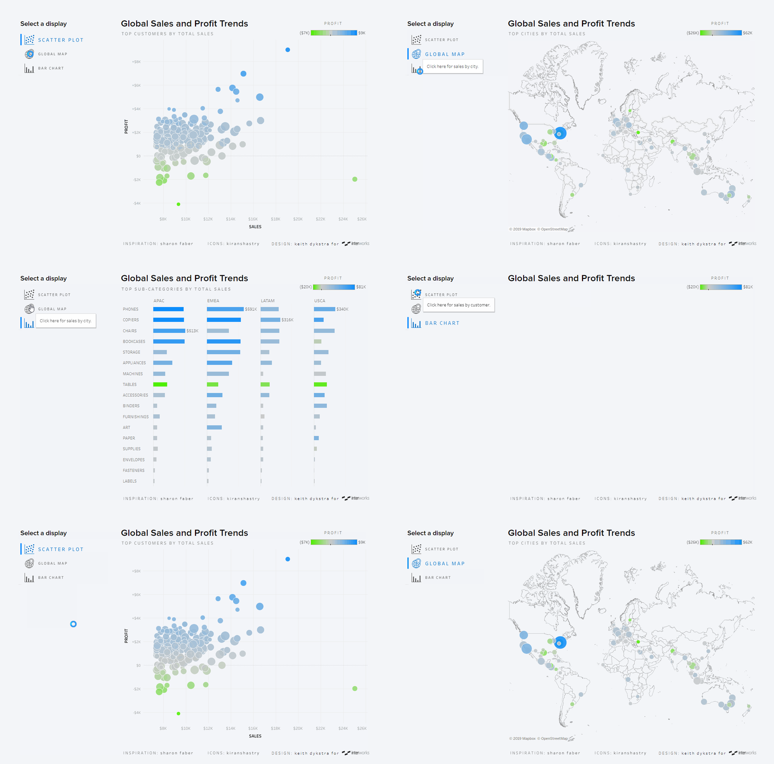
Before I dive into steps, let me give you some background on the two techniques we’ll be using. Sheet swapping involves using a parameter to let users pick which sheet they want to display. If you’ve never done sheet swapping, the Data School has an excellent step-by-step guide. While the basic method of interacting with a parameter (picking something from a drop-down menu) is fine, sometimes users overlook drop-down filters, and you don’t have much control over the way they display. So, we’ll take things a bit further and replace the traditional drop-down with selectable icons.
Elevating Sheet Swapping with Parameter Actions
In order to make that magic happen, we’ll need to use a parameter action as well. At the most basic level, parameter actions allow users to change the value of a parameter by selecting something in a dashboard. Kevin Flerlage has an excellent article exploring many ways to use parameter actions, including this chart-changing use case, but I’ll go into a little more detail about formatting it for a good user experience.
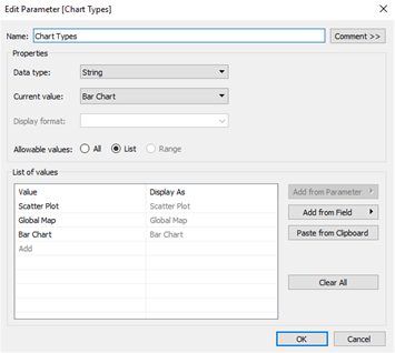
In order to execute this slightly more polished form of sheet swapping, you’ll just need a parameter with the options for your different sheets and a field with values that match the options in your parameter. In my case, I’m using the parameter to show three different views of the same data, so I set up a parameter with my three chart types, though you can certainly add more options if you’d like:
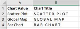
Then I created a separate data source in Excel with a Chart Value field that matched my parameter values (the values are case sensitive, so be sure to match your capitalization). The Chart Title column is just there to add some formatting to the label:
If you’re thinking, “Separate data source?! This is getting complicated,” no need to fear. The great thing about parameter actions is that they work across data sources, so we won’t need to worry about blending or joining to the rest of our data. So, add that Excel sheet as a separate data source. Now that we’ve got data values that connect to our parameter, we just need to build a few sheets before we can set up our parameter action.
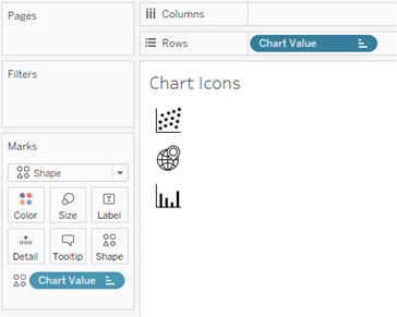
First, build a sheet with icons (I found mine on Flaticon) for each chart type. Set your rows with your Chart Value field, sort them in the order you want, change your mark type to Shape, and add that same field to Shape on your Marks card. Assuming you’ve already added your icons to your Tableau repository, you can assign them to your different chart type values:
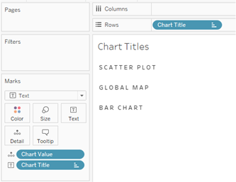
I duplicated this sheet and swapped in my Chart Title field because I was having trouble aligning the text with the icons when I tried to put them on the same sheet. If you’re not a formatting freak—which, if you’re reading this article, you probably are—you can ignore this and just add a label to your previous sheet:
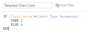
Next, create a field to add color to indicate which chart type the user has selected. Here’s where we start to connect our data with our parameter. This field just distinguishes whichever chart is selected from the two non-selected charts:
Drop that field on Color and pick your colors. I also put that field on Size for the chart title sheet to give the selected chart text a little extra emphasis. Here’s what we’ve got so far:
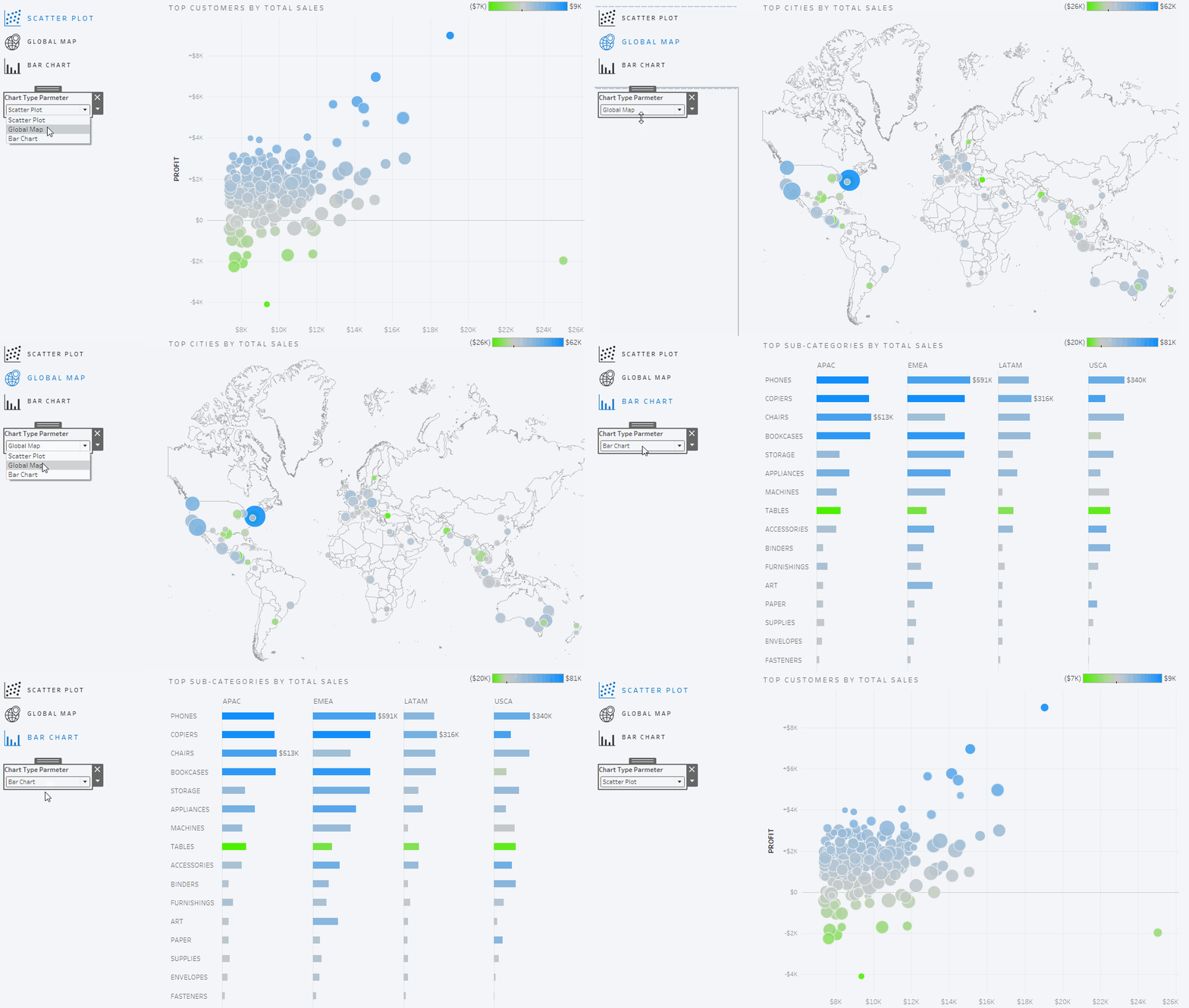
Now, let’s get to what we set out to do in the first place: getting rid of that drop-down menu. We can set up a dashboard action to control our parameter when we click on a chart icon. From the Dashboard menu, select Actions, click the Add Action button, then choose Change Parameter. On the next screen, choose the sheets you want to click on to change the chart type (I’m including both the Chart Icons and Chart Titles sheets so that users can click on either one), and target your Chart Type Parameter with your Chart Value field:
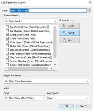
Now when users click on, for example, the Bar Chart icon or title, it will pass the value Bar Chart to our parameter, changing our parameter selection to Bar Chart and swapping in the bar chart view:
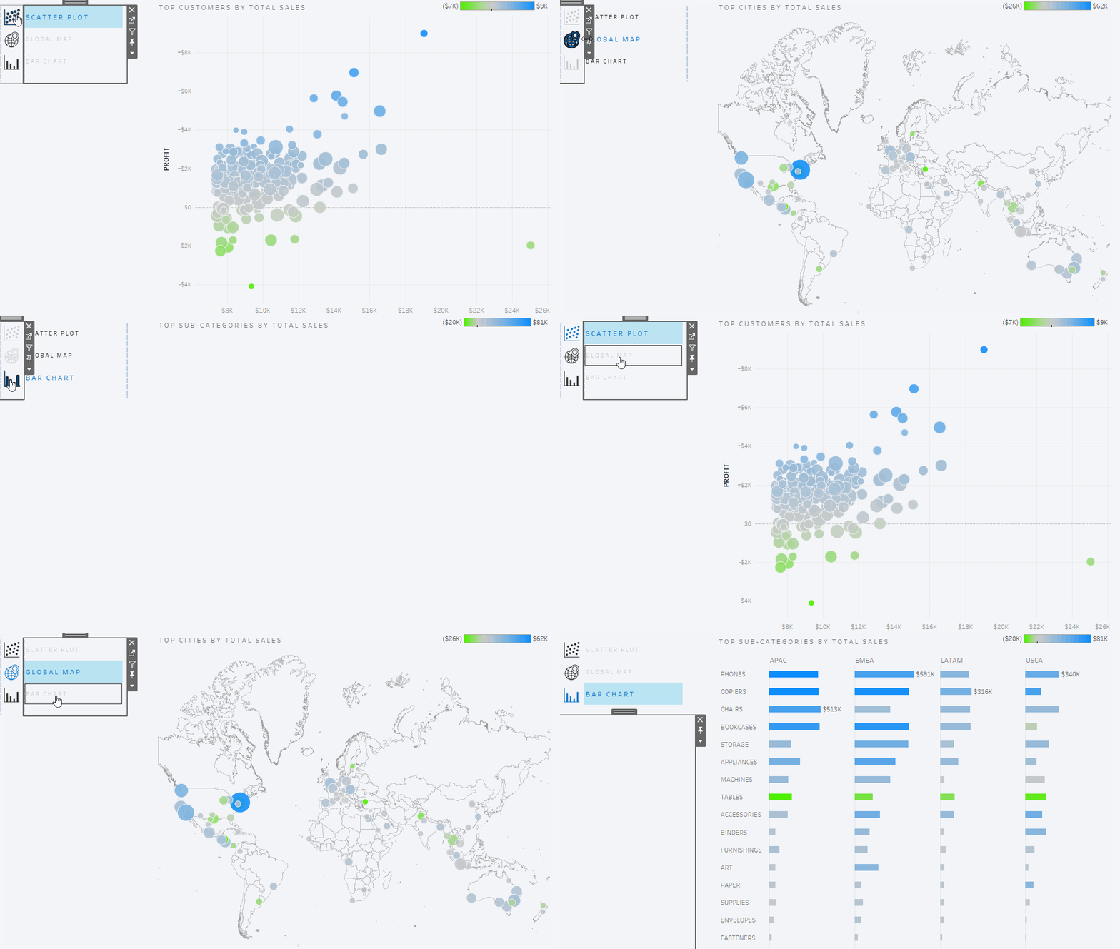
Although it’s a little extra work to set this up, I think the icons provide a more intuitive user experience. Feel free to explore this dashboard on Tableau Public, and if you want to take things a step further and add a side bar to further emphasize your selection and eliminate the black outline Tableau adds to your selected icon, check out the second part of this blog.
