The #makeovermonday project, led by Andy Kriebel and Eva Murray, puts out a public data set each week, challenging data vizzers to find a different way to present the data. It’s a great way to practice your visualization skills and force yourself to work with new types of data. They recommend time-boxing yourself and only spending about an hour on it. I never quite make that time limit: I usually come up with my chart types pretty quickly, but then I get to formatting and end up several hours deep on the project. This past week’s project, which involved data about the NBA’s salary cap and historical spending against it, was no exception.
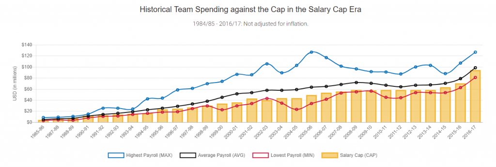
The data was originally presented like this:
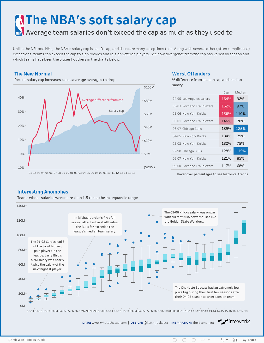
When I first looked at the data, I wondered, “What’s the point of a salary cap if the average team salary is consistently trending above it?” And then, “What’s an easy way to normalize the data to account for inflation.” So, I set off to make my own spin-off, focusing on these two things.
Tackling the harder problem first, I chose to show average team salaries each season as a percent difference from the salary cap. It was kind of a lazy way of accounting for inflation (remember that one-hour limit thing?). Showing a percent difference forces us to look at each season’s comparison to the salary cap that year rather than, say, comparing 1990-91’s average salary to 2016-17’s average salary.
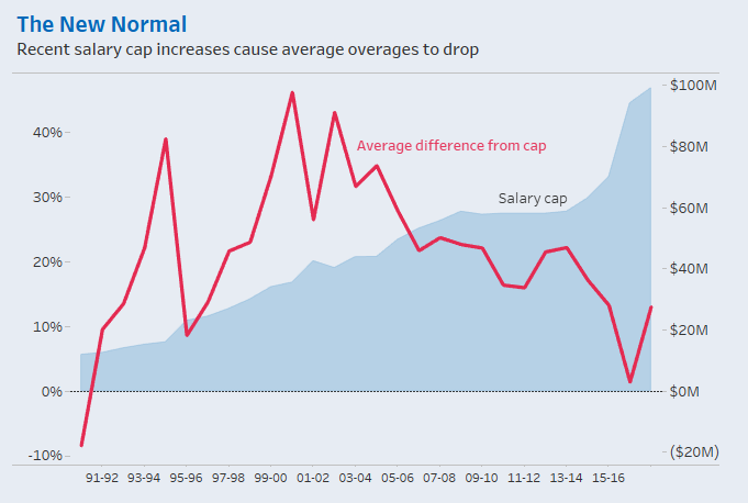
After noticing that average spending hasn’t exceeded the cap as much in recent years, I added the salary cap in the background as a dual-axis chart. I thought it was interesting to note the correlation between salary cap increases and changes in the average percent difference. I also added a percent difference from the median team salary in a separate chart to provide a second comparison point that skirted the inflation issue.
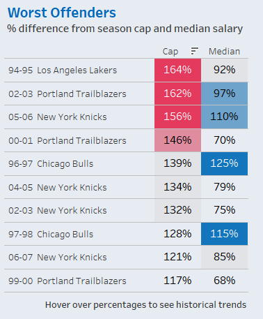
After some quick research about NBA salary cap exceptions, I added some context to the top of the dashboard in case anyone else was wondering why so many teams were allowed to spend significantly over the cap. Lastly, I added a box-and-whisker plot at the bottom with a few annotations to call out interesting outliers. And voila! Not even close to my hour limit this time, but here’s what I came up with: