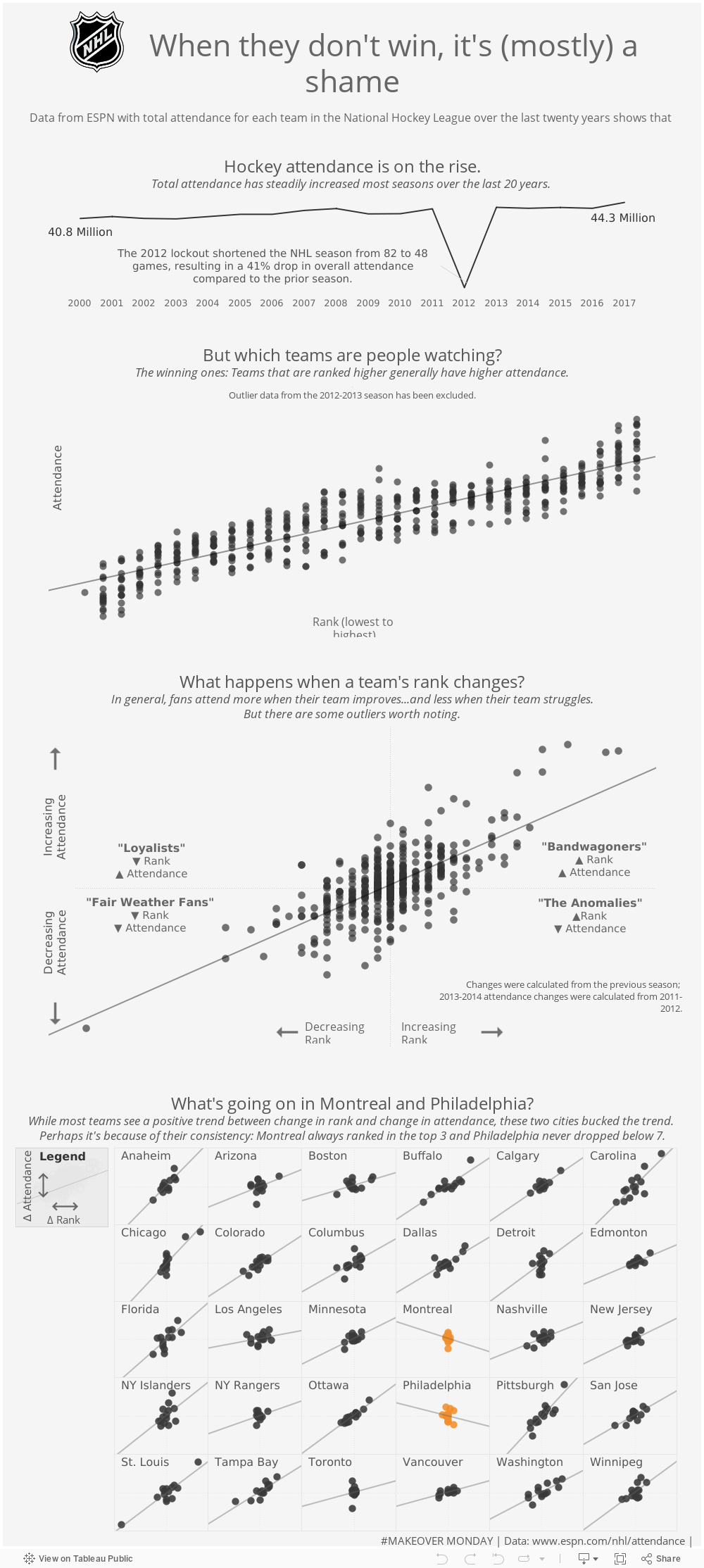
New Year, New Year’s Resolution. I’m not a huge believer in resolutions, but I do have a list of to-dos on my desk, and now seems as good a time as any to get things going. One of those things I’ve been meaning to do more of is Makeover Monday.
I’ve tinkered around with it before, downloading datasets and playing around with the data, but I’ve never committed—never published it to my Tableau Public profile or shared it with others. So, this year, I’m going to try to stop keeping my ideas inside of my computer and get them out into the world.
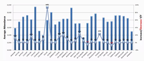
The data for December 31 was from the NHL, and the original chart looked as follows:
Visual Analytics
First, what’s the question? That’s right; there’s no title here. Issue one. Also, many of the numbers are hard to read with a black font against a dark-blue bar. The chart also looks cluttered with all the lines in the chart, the 3D bars and the team names all crammed together.
But back to the question: how has overall attendance changed year over year? We’re looking at both the number of attendees, as well as the percent change, so the scales of the axes are different (% and numbers).
However, the real problem is that the ranges of these axes are different. Notice 10,000-22,000 on the average attendance and -20% to 100% on the increase/decrease. This means one axis could be negative while the other is positive, and that makes it a bit hard for our brain to remember both numbers and how they’re related. In short, don’t truncate your axes.
Choosing the Best Sorting Method
Next, perhaps the author thinks that the bigger the team, the higher % increase we would see. It’s an interesting question, but if that’s what we’re interested in, we should sort by total attendance (or even by percent change). Here, with all the teams on the same chart, the alphabetical sort order makes it hard to figure out which team actually had the highest attendance or change in attendance.
Choosing the Best Chart Representation
Lastly, we have a line chart where there seems to be a spike about 1/3 of the way through … but it’s the team names on the axis, not something continuous. It looks like these teams are in some way related when really they aren’t. Line charts are best for time, not for discrete fields.
So, if I were to make a chart that answered the same initial question as this chart—how has NHL attendance changed for each team—I’d do something like the following:
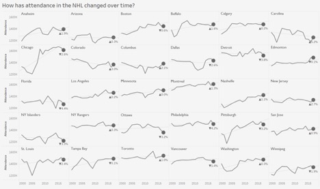
A Process of Improvement
Why do I think this is better? We have each team split up into its own cell, so we don’t get confused or think they’re related. We’re able to see how their attendance has changed not just in the past year but in the past 10, while still calling out the last year with the final point on our spark line. Our x-axis is now something that is continuous: dates. We’ve cleaned up some of the clutter, eliminated some of the color and added a title.
One thing to mention: some folks may say that we’re showing the total attendance change over time, not the percent change (the percent change is only in the tooltip). No worries! If we wanted, we could make a parameter that swapped our columns between overall attendance and percent change in attendance and let our users choose which one they wanted to see. Also, my numbers are a little different than the original chart because I chose to look at total attendance, not an average for home or away games.
Getting to the Root of the Issue
Now, my big “problem” with this experiment is that I often don’t think the question at hand is that interesting. Because I always want to know WHY. I’m not a hockey fan, but I went really deep down a Google rabbit hole regarding the 2012-2013 lockout because it was really messing up my data (it was excluded in the chart above). And yes, it’s nice to see that attendance may be going up for most teams, but how does that help us prepare for business next year?
In an effort to explain why, I had an idea: maybe these teams were improving, and fans were more likely to attend if they felt their team would win. Maybe they were being ranked higher, and thus fans were more excited to go watch them. So I decided to look at a slightly different question: how does the change of a team’s rank impact the total attendance to their games?
To start off, I did want to call out the biggest issue with the data, which was that if I was going to look at change in attendance, 2012-2013 needed to be excluded due to the lockout:
Next, I introduce my theory:
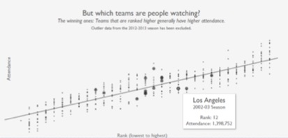
So, my idea has some merit. There is a positive relationship between rank and total attendance.
Note: This was the first chance I had to try out set actions. As you can see from above, they work well for highlighting a team over time.
Next, what happens as this rank changes? Do we also see the attendance change? And what does that say about the fans?
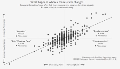
Overall, it does seem that as a team gets better, they gain fans (or at least more fans start coming to the games). Thinking back to my statistics days, we may not be able to accept a correlation yet, but we definitely can’t reject it (I’d be interested in controlling for time, weather, size of stadium and several other variables).
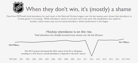
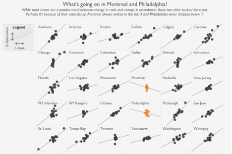
Lastly, I took a look at how the change in a team’s rank is related to their overall change in attendance by team:
Incorporating Tableau Tooltips
Here, I added some tooltips that allow the user to see how the rank and attendance changed each season. While most teams see a positive trend between change in rank and change in attendance, Montreal and Philadelphia bucked the trend. Perhaps it’s because of their consistency: Montreal always ranked in the top three, and Philadelphia never dropped below #7. Which begs the next question: what could a really high-performing team do to maintain attendance? If a team hits number one, are they bound to see a decrease in performance the following year? Should managers strategize for a bad season to then have a comeback? And this doesn’t even touch the questions around different attendance for home vs. away games.
Well … those are all interesting questions. But for now, I’m going to hit publish.
I’m sure I’ll revisit this, want to make a few changes and dive in again, but for now, you can find this viz below or on my Tableau Public page: