I haven’t blogged much recently, but I wanted to quickly share a really great moment.
Onsite with one of our long-term and larger NYC clients, I recently had the pleasure of “judging” an internal Iron Viz competition. This competition was part of a day-long Tableau and analytics focused event lineup that included amazing internal hosts, guest speakers (like yours truly discussing the rise of Mobile Analytics), internal case studies and a great team from Tableau.
The Viz-Off
If you aren’t familiar with the Iron Viz format, it’s a live viz-off. Three competitors are given a dataset 24-48 hours ahead of show time and asked to build a winning dashboard live on the big screen. InterWorks’ Robert Rouse won the Politics Viz Contest last year and competed on TC16’s Austin, TX stage. Ultimately, Curtis Harris’ viz won last year’s national competition. You can listen to their great behind-the-scenes podcast here. Our London lead, David Pires, will also be competing on stage in London next Wednesday at the Tableau on Tour Conference. I’m looking forward to cheering him on there! His winning viz can be viewed here.
Back to NYC. It’s always gratifying to see a client dive deeper into a culture of analytics, and I love participating in these day-long analytic events. All the competitors did a great job walking through the data and showcasing some extremely advanced dashboards built under real pressure. The internal Iron Viz competition is a great way to add some fun to the day, and the winning viz did just that.
The Joy of Experiencing Design
We have an entire practice called Experience Design, built to add joy to our analytics. It adds that special something that makes a dashboard pop and the user say, “Check this out!” David Duncan and Will Jones work tirelessly to integrate graphic design, U/X and joy into every analytics project. I can’t say enough about how much joy matters.
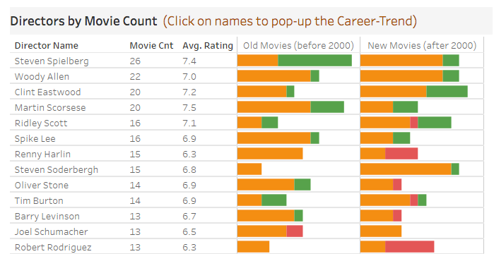
Joy isn’t just about beauty, though. Sometimes it’s about the unexpected, and Gerald Zhou’s winning dashboard caught me by surprise. He built an unassuming dashboard about IMDB movie ratings that wasn’t the most beautiful on the stage. It wasn’t the most complex either, but it did make the audience and I laugh. I really enjoyed the surprise of seeing his time-series chart appearing when you select an actor, and the story that it told. Just click on Nicolas Cage if you want to see what got us grinning. Before anyone chimes in, the answer is “yes.” Yes, there are a number of best practices that he could apply to make the dashboard better. Yes, it could use more explanation, but the Iron Viz format forces those compromises due to time constraints, and this is his unaltered entry, built live!
I asked Gerald if we could share his dashboard on our blog and he graciously obliged. Below is a quick intro from Gerald followed by the dashboard. Enjoy.
The Dashboard Explained
by Gerald Zhou
The primary purpose of this dashboard is to help people find the actors and directors who make good or bad movies, respectively. The hope is that it will help them make better movie choices in line with their tastes. The dashboard is action-driven, so click on the different fields to filter through the data (more detailed instructions are given on the dashboard). Be sure to find your favorite or least favorite actors and directors in the list and click on their names. You’ll enjoy the surprise pop-up chart for each. Hopefully, this dashboard gives you some fun new insights to consider when picking out your next movie.

