
Have you ever wanted to know…
“How far above the trend is that?”
or
“If I have a new client, what can I expect based on the current trend?”
I have. InterWorks has clients who want to know and it crops up in many of my Tableau training classes. I finally had some time to figure it out and thought I would share it so you too can do ‘What If’ analysis based on the trend, or show how far above or below the trend a data point is (like in the view below). It doesn’t look much but it hasn’t been possible before, it’s tough but REALLY useful. Ready?

Tableau makes trend lines really easy to add (that’s the grey dotted line above). It’s just a right click away. Most of the time simply visualising the trend line is the end goal so job done. But if you want to ‘use’ the trend line, interact with it and get real answers out you’re pretty stuck. Hovering your mouse over the correct bit of the line and getting a confusing P value is not exactly useful, user friendly or slick. But there is a solution…
OK this can get a little bit mathematical so I’ll keep it as light as I can.
Step 1 – The Nasty Bit – Calculate the trend line in Tableau
A linear progression (linear trend line) is based on the calculation:
y = ?x + ? (Hover your mouse over the trend line above and you’ll see Tableau doing this calculation)
Where ? = (n?(xy) -?x ?y) / (n?x^2 -(?x)^2 ) and ? = (?y-??x) / n
Sorry about that bit. An example of this calculation is in the workbook but below is a brief explanation of how the annotation above can be written in Tableau calculated fields.
Generally speaking when you create a scatter plot in Tableau you are plotting SUM(X) against SUM(Y) rather than x against y. Just look at the Columns and Rows shelves to see this. So if we start to break the formula down then everywhere you see an x you are going to be using SUM(X) and y as SUM(Y). Hopefully you are with me so far.
The next step is to get the ?x part which means the sum of x. This would be SUM( SUM(X) ) but this will throw up an error so for Tableau it can be written as WINDOW_SUM( SUM(X) ). This does bring us into table calc territory I’m afraid so later on we are going to have to consider what the ‘compute using’ is going to be or in other words what is the WINDOW that we are summing.
So parts like ?x ?y would be calculated in Tableau with
WINDOW_SUM( SUM(X) ) * WINDOW_SUM( SUM(Y) )
The other piece to the puzzle is what to use for the n in this equation. n stands for the number of data points which in Tableau becomes the calculated field SIZE(). So n?(xy) becomes
SIZE() * WINDOW_SUM( SUM(X) * SUM(Y) )
Easy eh!!! I did say this is the nasty bit. The way I have gone about this is by using a different calculation for each of the little elements of this equation.

The only other thing to do which may be new to you is to set the Default Table Calculation. In my case to Country/Region but the important thing is to keep this consistent in all the calculations. If you are going to be plotting customers then put in customers, if plotting products then compute using products etc. I have a data point for each Country/Region so that’s what I’m using. This is far more solid than ‘Compute using Table Across’.
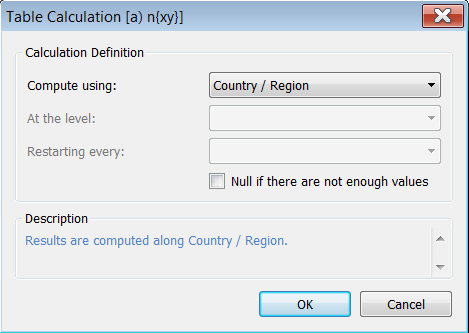
This is a really good habit to get into when writing table calculations in Tableau.
And here’s how it looks – Red line is my bit, dotted grey is Tableau’s. Snap.
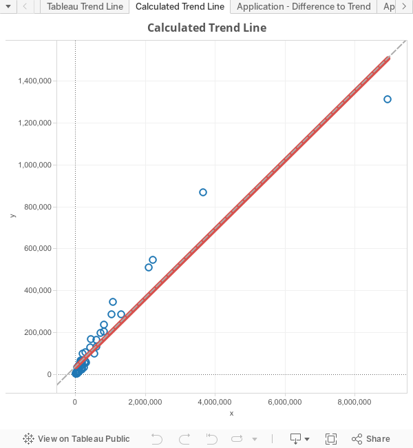
This has been created with a Dual axis chart of SUM(y) and Trend Line on the rows shelf. The only real purpose of this graph is to show that the figures match Tableau’s. No practical use as you could just turn on Tableau’s own trend line.
Step 2 – Practical applications
Answering the question “how far above the trend is that”
Now we’ve done the hard bit, calculating the difference is a pretty simple calculation of SUM(Y) – [Trend Line].
I’ve plotted this again as a dual axis using a Gantt bar to get the red line. See chart at the top of this blog.
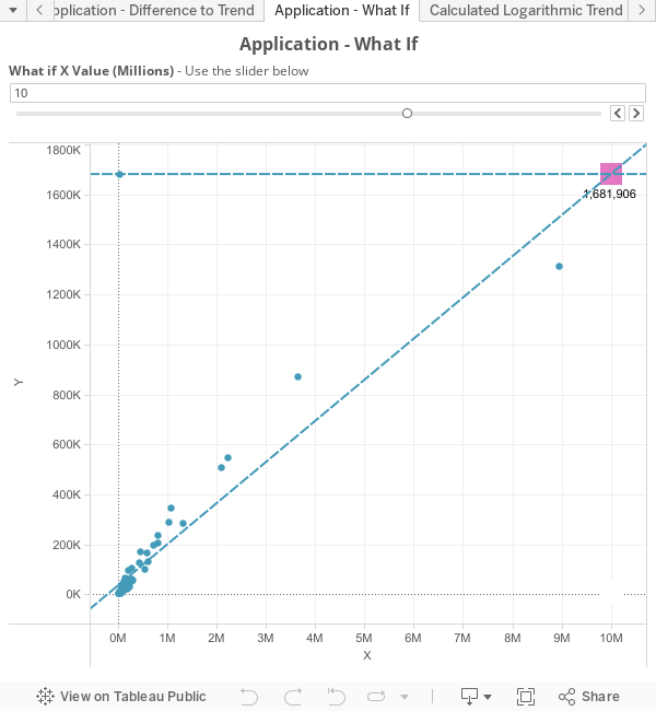
Answering the question “If I have a new client, what can I expect based on the current trend?” If you’ve got this far then well done as this is the most useful bit!
To get a single figure for this question is not too hard, unfortunately visualising it is a bit tougher. The calculation works by using a parameter to allow the user to enter their own x value. Then we use a version of the trend line calculation to output the value for the y. Tableau doesn’t make it easy to add an imaginary data point to a viz so this view is a bit awkward to build. However, play around with the slider below and you’ll see that the square moves up and down the trend line.
And….relax! Feel free to reach out to me if you need a fuller explanation on any of these elements.