
Histograms are yet another example of an efficient statistical tool that Tableau can create for you with ease. Created by well-known Statistician Karl Pearson, a histogram also functions as an effective approximation to a variable’s probability distribution function.
A histogram is a frequency plot: it will illustrate the number of times a particular result occurred in a data set and does so in the form of a bar chart. It is always a good idea to have an overview of the entire distribution of a variable, and histograms are another great way to gain that perspective.
As with many things, Tableau makes creating a histogram an easy process. I start by examining a distribution by using Tableau’s Gantt Bar visualizations. I’ll be using the shipping cost variable from the Superstore Sales (Excel) sample data set. Placing that measure into Rows and then converting from an aggregate measure to dimension will automatically adjust from a bar graph to a Gantt Bar chart detailing every instance of the shipping cost in the data set.
This particular Gantt chart looks like a bar graph that was sheared off in certain places. This is not unexpected; the chart shows every single cost value for every item shipped in this data source. Those sections in which the graph is densely packed indicates that there were many occurrences in that range (consider the $0 to $20 range) In contrast, from $100 up to the max of $165, items were shipped at only a select few costs.
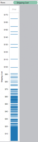
This visualization only shows us what values of the variable were used; it does not indicate how many times each cost occurred. To see the frequency of each cost, employ a histogram.
Creating histograms in Tableau require the use of bins. Bins, or binned data sets, are groupings of measures of a variable. In this particular example, we could bin together certain shipping costs, such as those who are sparsely distributed in the Gantt Chart. It might be useful to create a bin with the values from $100 up to $165. You can create bins of uniform or varying size; the former is simple, while the latter is somewhat more complex.
Bins with Uniform Size
Creating a uniformly sized bin is a simple process.
-First, right click on the variable you want to group (shipping cost in this case). Select “Create Bins…” and you should see a window like below:
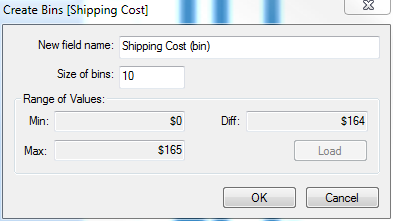
-The field name will default to your variable’s name followed by (bin). Adjust to your liking.
-The size of bin defaults to 1; I’m going to look at bin sizes that are $10 each. Again, adjust to your liking.
-Finally, the range of values is blank to start. Clicking load establishes the range of applicable values for your variable.
-Click ok, and you’ll create a binned dimension for your variable.
To create the histogram:
-Take the binned dimension – Shipping Cost(bin) and place it in Columns
-Place your corresponding measure – Shipping Cost (from Measures) in Rows.
-Convert from the default aggregation of SUM to COUNT by right-clicking and selecting CNT from measures. Doing so results in the histogram.
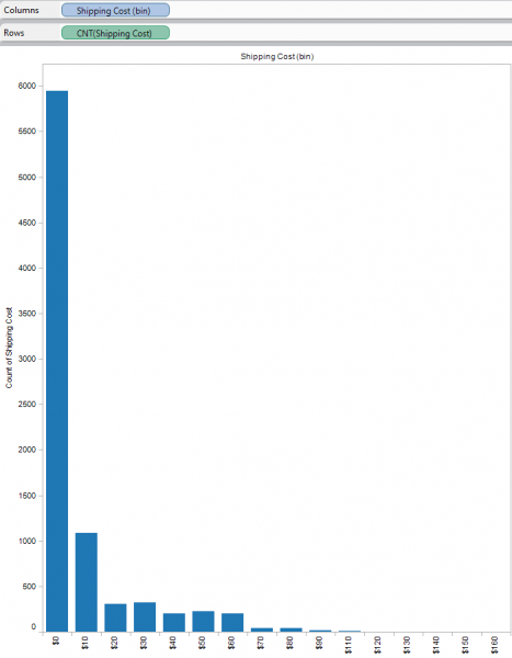
The histogram shows that this particular group makes most of its shipments at a cost between $0 and $10, with just under 6,000 shipments in that range. From $10 to $20, just over 1000 shipments occurred. Clearly, this superstore is not making very many high costs shipments; it is doing a very good job of keeping its shipping costs low.
This is a very simple example of the creation of a histogram. Other variables will affect how you create your histogram. You may find that you need to adjust your bin size differently. There are many algorithms designed to pick bin size depending on the sample size. For example, a common choice for the number of bins is sqrt(n) where n is the number of items in your data set. For very large datasets, some choose the Sturges’ formula, which calculates the number of bins as 1+(log(n)/log(2)). Of course, Tableau asks for the size of each bin, which is simply calculated by the difference between the maximum and minimum values divided by the number of bins. How to calculate the appropriate number of bins for your distribution depends ultimately on what you plan to do with your histogram, and there are many schools of thought on how to do that. That discussion is better left for a different post, however.
This is a simple introduction; in another post, we’ll walk through how to create custom size bins. Again, Tableau’s power makes this a straight forward process.