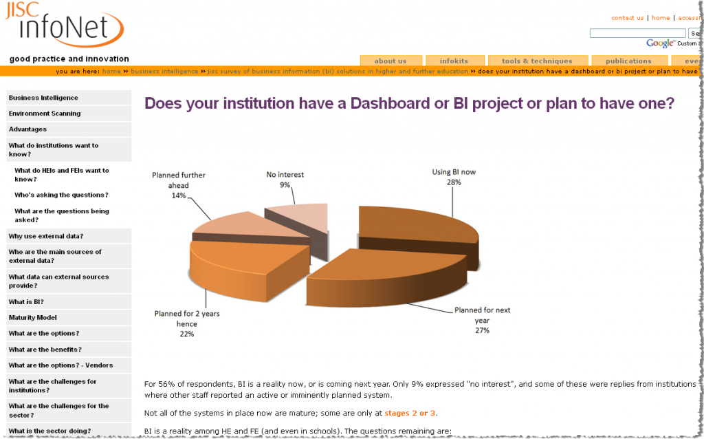
Back in November, JISC InfoNet published the results of its survey of BI solutions in Higher- and Further- education. A snaphot is below. 
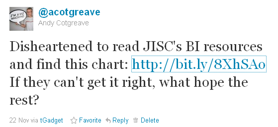
Being someone who is passionate about good quality visualisations, I rattled off a couple of less than complimentary tweets about this. Here’s one:  JISC got in touch with me privately and they were rather upset at my offensive comments. I apologised on twitter the following day, but behind the scenes, we explained why 3-D exploded pies are not a good idea, pointed them to some books (Stephen Few, Tufte, etc) and suggested that Tableau could achieve better, cleaner results. That cleared the air, and was the last I heard about it. Until a couple of days ago. JISC got back in touch to say they are now using Tableau for their visualisations (click here to see their first workbooks) I am absolutely delighted about this result. They have come up with some great visualisations, and have even blogged about the experience here. I feel totally relieved, too, that what started with a dodgy tweet has ended up with more converts to the ways of better data visualisation!