Gallup-Healthways Well-Being Index Visualized in Tableau

Data

Gallup-Healthways Well-Being Index Visualized in Tableau

//

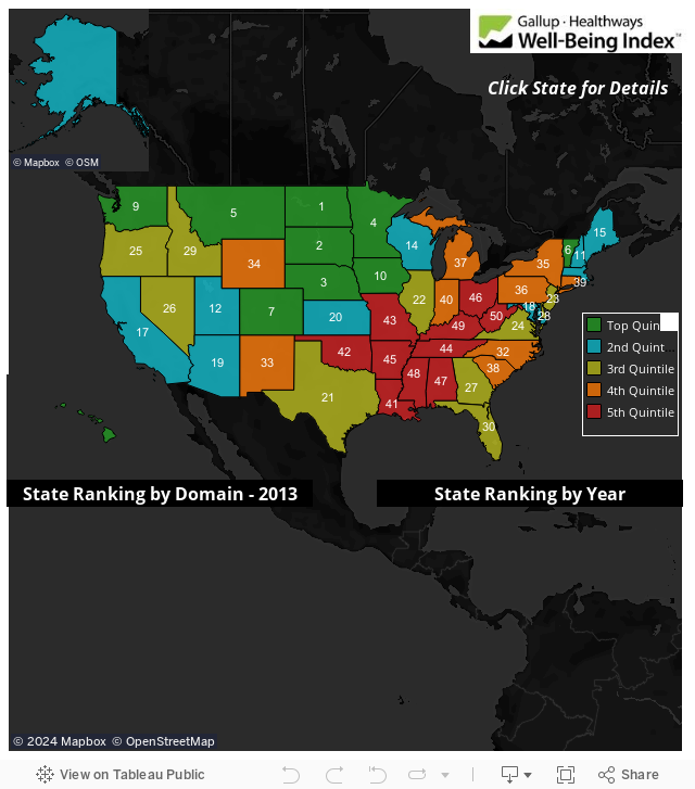
Are you happy where you live? Have you thought about moving to another state? Gallup-Healthways recently released their latest Well-Being Index report, outlining well-being across every state in America. The report is a downloadable PDF, available here. It takes some effort to filter through, which is why I came up with a better way to look at the data.

Since I wanted to dive into information quickly and effortlessly, I decided to turn part of this report into a Tableau dashboard for fun. Finding my state in the PDF list took a little time, so I made it to where my dashboard lets you click on your state, or any state you desire, to see how that state stacks up for the current year. You can also see a trend from previous years.

More About the Author

Dustin Wyers

Support Lead, Americas
Tableau Conference 2021: Devs on Stage in Review As always, the keynotes from the Tableau Conference, even virtually, are always an exciting highlight, and I love getting to write ...
Advance with Assist: Finding Max Date and More Question: I have a need to determine my Current Opportunity amount and the change from whatever date was listed prior. It could be the ...

See more from this author →

InterWorks uses cookies to allow us to better understand how the site is used. By continuing to use this site, you consent to this policy. Review Policy OK

×

Interworks GmbH
Ratinger Straße 9
40213 Düsseldorf
Germany
Geschäftsführer: Mel Stephenson

Kontaktaufnahme: markus@interworks.eu
Telefon: +49 (0)211 5408 5301

Amtsgericht Düsseldorf HRB 79752
UstldNr: DE 313 353 072

×

Love our blog? You should see our emails. Sign up for our newsletter!