
Visualizing financial statements is hard. While not inherently a difficult task, when I speak with many of my clients’ financial teams, their data tends to be some of the most sensitive that the company possesses, and for that reason, its presentation is very particularly curated. Because of the clearly defined ways companies must disseminate this information, straying from these established norms is not a simple task. So, while other non-financial teams might have room to take risks and modernize their top-down reporting structure, oftentimes financial groups get left behind.
Visual Analytics for Financial Reporting
As methods for aggregating data continue to improve, so does the reporting of that data. However, while adoption of visual analytics has skyrocketed in recent years, many of the new styles for visualizing data simply do not mesh with the recognized guidelines of financial statements, i.e. balance sheets, income statements, statements of cash flow, etc.
So, instead of neglecting finance teams, I’ve found that finding a middle ground in how we approach visual analytics for groups that have less leeway in how they can display their data can have powerful effects. By using custom graphics, layout containers and padding, we can create a fairly simple visualization in Tableau that allows financially-minded people to meet visually-minded people halfway and bring financial statements into the modern analytics space in a way that appeals to both reporting traditionalists and innovators.
Step 1: Create Worksheets
Break up your financial statements into chunks and make individual worksheets for each chunk. For example, Current Assets might be made up of five line items, so those five line items can make up one worksheet. Depending on how large your financial statements are, you may have a fairly high number of worksheets to keep track of, so it’s important to give each sheet a proper title.
Step 2: Add Layout Graphics
After finishing your worksheets, create a new dashboard. Next, add a layout graphic onto the dashboard, floated on as a visual document. In my example, a layout graphic that has a blank-notebook feel with rounded, shadowy edges is being used. Once the graphic has been properly placed onto the dashboard, make sure you set the floating order to Send to back in the options for the graphic: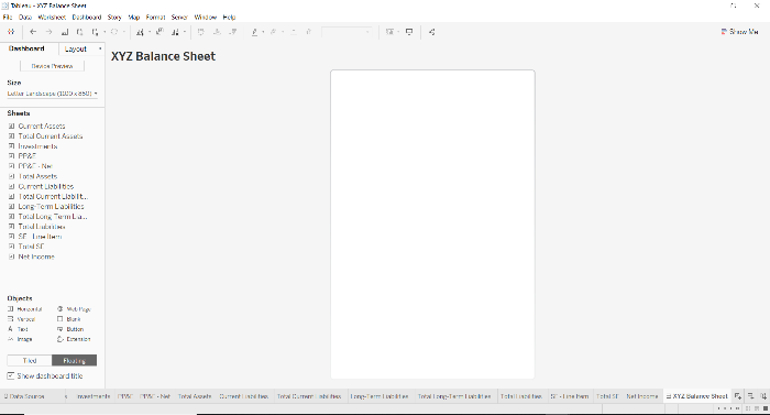
Step 3: Layout Container
In a vertical layout container, place all of your chunked worksheets in their correct order. It can be helpful to add text boxes into the layout container to help identify the important sections (i.e. Assets/Liabilities/Stockholder’s Equity). Then, place the layout container as a whole on top of the layout graphic on the dashboard.
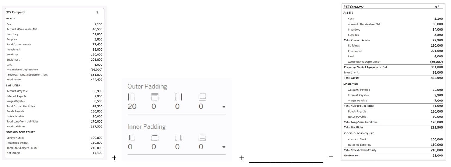
Step 4: Visual Enhancements
Using many copies of a custom line graphic (attached below), float horizontal lines onto the financial statement to help create the feel of sectioned-off data. Here is also where you can choose to add indentation to your reports, a feature commonly sought after in financial statements. To accomplish this, use the padding feature within Tableau to add left-side indentation for the applicable worksheets. Finally, use bolding to drive home the importance of specific line-items:
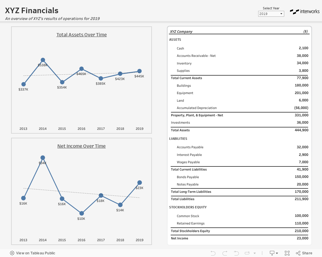
Step 5: Add Visuals for the Most Important Metrics
Lastly, if possible, add in simple visuals for your most important metrics. Here, I’ve added in two line charts to track Total Assets and Net Income over time to see if, how and to what extent they have changed. The inclusion of these visuals, complemented by a more traditional-looking financial statement, can help begin breaking down the barriers between visual analytics and traditional financial reporting. Over time, you may even start to see that the additional visuals are not simply tolerated but relied upon and requested.
I’ve attached some of the key visual elements from this post for you to download and incorporate into your own financial reporting. I hope this proves helpful and makes visual analysis for finance more accessible and engaging.