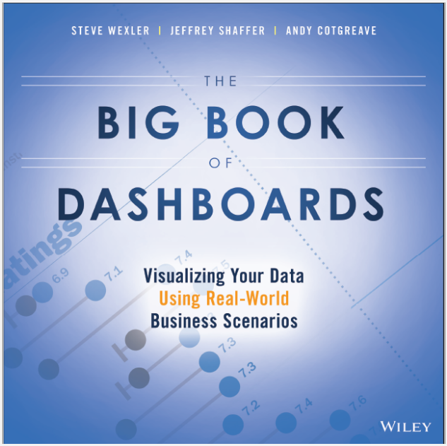
I’ve known the authors of The Big Book of Dashboards for quite a while. They are all skilled users of Tableau who started as customers and evolved into experts over time. Steve, Jeffrey and Andy provide insight gained from years of dashboard-building experience in this book.
Organization
There are three major sections in the book. The authors introduce basic data visualization concepts in the first section. Section two includes 28 different dashboard examples covering a wide variety of scenarios. The last section provides guidance on how to make your dashboards more compelling through personalization, using a visually-engaging style and utilizing more advanced techniques.
Useful Teachings
Chapter 33 titled, “The Allure of Red and Green” provides details regarding color-blindness that every analyst should know. The book aggregates information from many different sources to concisely give you the tools for communicating data using color in a way that won’t leave your color-blind audience (7% of the male population) at a disadvantage.
The Dashboard Examples
Each of the authors and other contributors provide dashboard examples to walk you through: the goals of the dashboard, related scenarios, how the dashboard was intended to be used, why the dashboard works and what the shortcomings of each dashboard might be.
No dashboard is perfect. The art of dashboard building is the art of compromise. It’s a battle between the need to communicate the data effectively within a constrained space. They give you the tools to effectively balance your desire to include as much information as possible while fitting the information effectively into limited space.
Conclusion
Steve, Jeffrey and Andy do a great job of providing options for improving your dashboard designs. The examples include contributions from many experienced practitioners. If you’ve been building dashboards for awhile and want to improve your own work, I highly recommend you pick up a copy of The Big Book of Dashboards.

