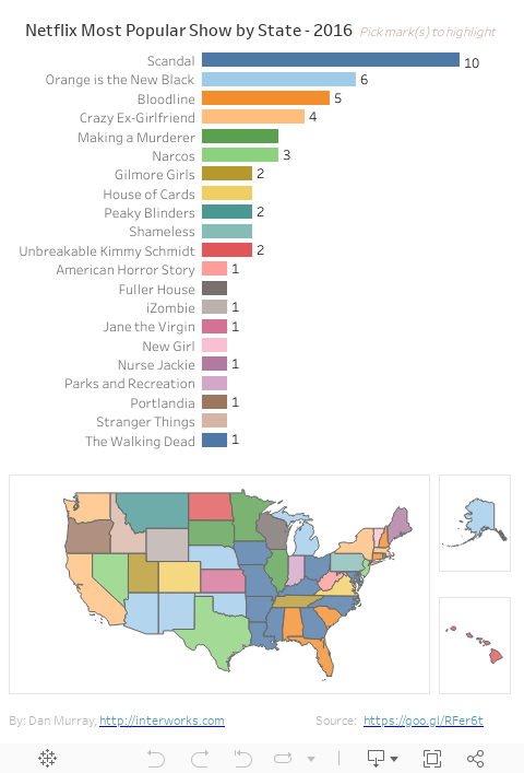
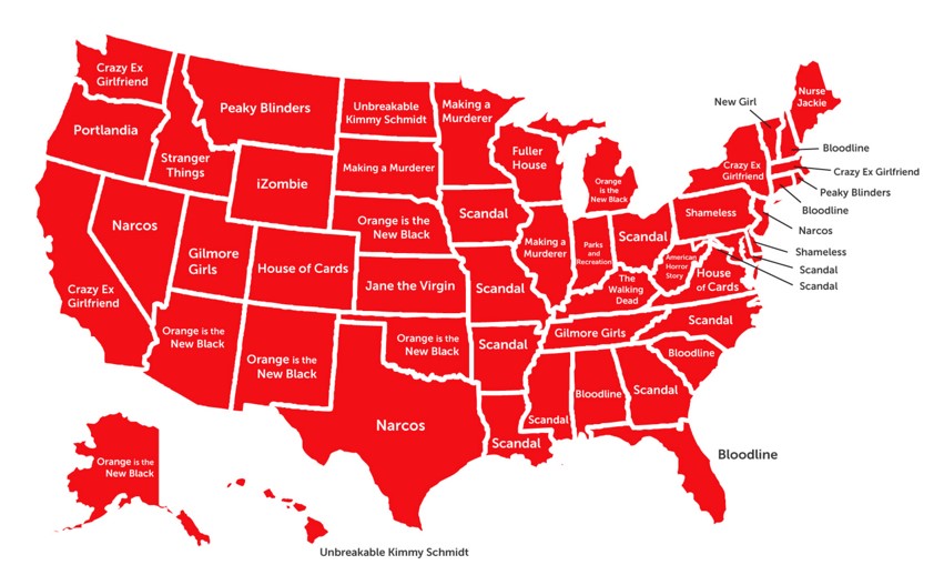
This morning, while reading my RSS feeds, there was an interesting map showing Netflix streaming activity by state published by HSI.
The visual didn’t make it easy to see the most popular show incidence. In a few minutes, I created this view in Tableau that does: