
At InterWorks, we try to deliver the best in data and technical solutions, which heavily emphasizes the user experience. My job in this process requires me to utilize every aspect from my design training to add value to our offerings and produce valuable prototypes. As I’ve become more entrenched in dashboard review, critique and chart usage discussions, I find many of the same important elements stand out. As you’ll see below, I’ve put together a list of elements I check for most often when a dashboard review comes my way. The goal is to raise design standards, produce better-looking dashboards and create an experience that elevates the content.
Text
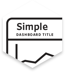
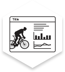
Simple Dashboard Title
This should be a to-the-point description of what the dashboard is presenting to the user. Try to keep the title brief. This is something the user can glance at to remind themselves where they’re at within your user interface.
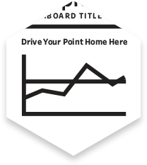
Descriptive Title Above Chart
This provides a synopsis of what the chart is showing the user. Instead of labeling your chart “Top Destinations,” consider labeling it “Portugal Is the Top Destination for Europeans.” Let your chart support the insight you’ve pulled from the data. Utilize the subhead to provide takeaway messages when possible.
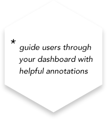
Annotations and Subtitles Provide Additional Information
Annotations can add explanatory and vital assistance to inform your users. Practice showing your dashboards to others and record the things you found difficult to convey. Additionaly, subtitles can be parameterized and can contain critical details to the comprehension of the data. Use annotations with subtitles to answer questions your users may have.
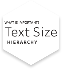
Text Size Is Hierarchical and Readable
Pay attention to your text sizes. If you use all-caps text, use a smaller type size than your normal-caps text. If using black text, consider using shades of gray on other text to push/pull text into the foreground or background. Take a step back from your dashboard. Where do your eyes go first? Do you want your user to have the same experience you just did?
Data Is Labeled Correctly
Label points clearly and don’t leave guesswork to the user. Label columns appropriately and color if needed to designate a legend for use throughout your dashboard. Be clear and efficient. Consider testing your dashboard on someone to conduct light user testing. Check if any of the data is confusing to someone unfamiliar with the project.
Layout
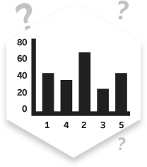
Axes Are Accurate
Don’t mislead viewers with skewed axes. If a chart is lopsided because data is heavy on one end of the spectrum, don’t manipulate to fill the space. The lack of content in a space is as powerful as if there was data to show. Absence still indicates valuable information.
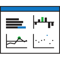
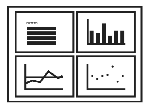
Logical Chart Placement
Related data should be grouped when possible. Just because a chart functions the same way as another doesn’t mean it should be grouped. Think practically about which data correlates with each other and draw connections that way. You want to lead your user’s eye around the page naturally, so organize your most important chart to be the most prominent, with supporting data and charts backing up your focus.
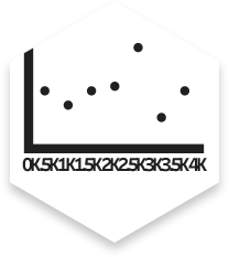
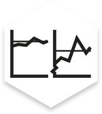
Axis Intervals Are Organized
You don’t have to fill up your axes with labels. If labels start overlapping each other, they become useless. Use labels sparingly so the user can identify the scale of the axis clearly.
Use Control When Placing Graphics
Icons are great at communicating complex ideas in a small amount of space. However, extraneous graphics that merely look “cool” should be left to supporting material. Save your limited dashboard space for functionality and practical uses.
Color
Intentional Color
Color can be difficult to get right. Start by sketching your dashboard in black and white to figure out your base charts and the general form your dashboard will take. When you begin production in Tableau, add color carefully and use it to emphasize, designate or distinguish. Consider using the client’s brand colors as highlights or accents, but don’t overdo it. You want your color to be controlled and serve a purpose, and the overall feeling of the dashboard should not be overwhelming.
Accessibility
Good contrast can help guide your viewer’s eye. Be sure your important pieces have high contrast and will print well on a black and white printer. Be aware of colorblindness and consider using tools, such as this one, to find effective coordinating color relationships. If a chart relies solely on color to decipher a story, use text to help support the story you are trying to tell with a chart. Avoid red-green and yellow-blue combinations near each other, because they are colorblind pitfalls. Consider using different shapes on data points to allow for color-free worries.
Overall
Gridlines
Excessive lines such as gridlines, borders, tick marks and axes add clutter to a dashboard. Feel free to eliminate them and only add the necessary elements back in. They should provide guiding lines for the eye, divide content or connect to disparate marks. Let your charts bleed into whitespace if possible.

Chart Highlights Significant Finding or Conclusion
Your charts should be valuable. What is the purpose of this project? Make sure your charts are easy to comprehend, provide value to the story you need to tell and answer an important question to the end user. If no valuable distinctions can be made from a chart, consider putting your time and energy into another visualization to increase value there instead.

Contextualized or Comparison Data Is Present
Comparisons over time, across categories or between geographic regions help the viewer understand the significance of the data. This is the beginning of storytelling with your data; the added context can help highlight key takeaways from your dashboard.
The Takeaway
Aim for useful and user-friendly. Take a step away from your dashboard and come back to it a few minutes later. Do you enjoy the experience you’re creating for your users? Use this UI checklist (which is also attached below in PDF format) as a lite guide to building better dashboards. Always be on the lookout for well-designed dashboards and use them as inspiration for your own. The better your user interface, the more value you and your users will gain from all the hard work that went into the data behind it.
Questions? Ask me on twitter: @davidandstuff