I went to the University of North Carolina at Chapel Hill for my undergraduate degree, and it was one of the most rewarding experiences I’ve ever had. However, it’s surprising to me that I ended up in North Carolina, having grown up in New Jersey. When it came time for college, I really had no idea where I wanted to go or what I wanted to study. I didn’t particularly care about how beautiful any campus was, its proximity to home or even what types of classes were offered. Due to my lack of enthusiasm for any particular school, I ended up applying to nine—that’s a lot of essays—and was accepted to seven. I narrowed it down to three, then two, then off to North Carolina I went.
Lost on the Road to College?
Fast forward to a few months ago when I was thinking about how I had never actually plotted all my college choices on a map before. I didn’t really have anything more than a vague image of how they compared in terms of the factors I had been interested in. I searched online for what I imagined would be a myriad of new tools for college-hopefuls to find and compare schools and was entirely let down. Everything I found was clunky or had no usage appeal to me. I had been looking for another personal project anyway and figured creating a tool like this myself might be beneficial to someone.
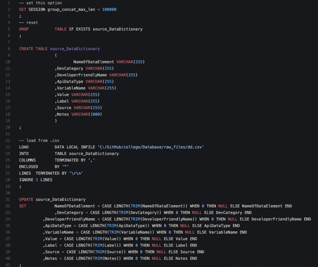
I was able to source some public data from the Department of Education. Their College Scorecard dataset was rich with metrics and dimensions, many of which could be pruned and had no impact on my personal curiosities. I developed a SQL script that would import the data and then started wiring up some scripting to retrieve values via browser:
I let it sit for a couple months but came back to it after playing around with my old friend Tableau. I decided I could at least proof-of-concept the idea with Tableau and knew it would be easy.
First, I didn’t have to worry about importing the data to some intermediary source. I could take the delimited value file and have Tableau consume. Tableau handled the file well and even better once I hid the columns I wasn’t interested in. After connecting to the file, I had to decipher the column names with a data dictionary (also provided by the Department of Education, thankfully), which allowed me to figure out what was relevant and what wasn’t. This also let me narrow down the dataset to the continental United States and four-year programs and institutions that offered an undergraduate degree.
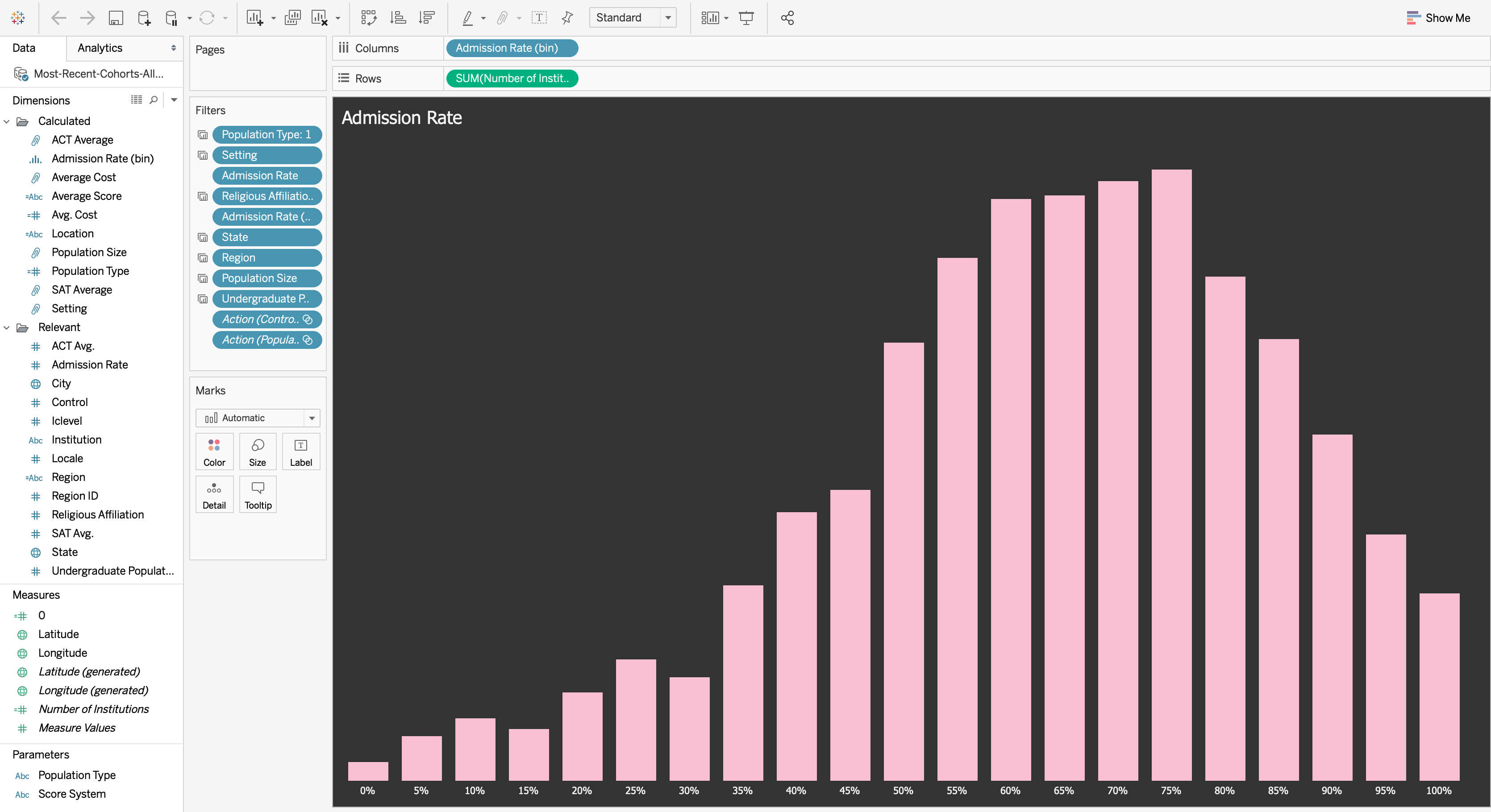
From Abstract Concept to Tableau Viz
I then sketched out the broad categories of what data I was interested in for user filtering. These included factors like location, test scores, yearly or program expenses and average population sizes. I also included religious and student population type filters for those interested. I ended up creating groups, or bins, for various dimensions for better viewing based on what I thought might be easy-to-digest sizes. Because the population types were represented as Boolean flags, I ended up creating a single parameter and calculated field to filter on, which explains why it’s a single-select, and the options are seemingly mutually exclusive.
Once I had an idea of what I wanted to show, I started experimenting with visualizations. The most important visualization, I knew, would be to show the schools on a map—at least, that’s what I was most interested in. Because this particular dashboard was exploratory and intended for users to filter toward a subset, I figured it would make sense to show the number of institutions by the groupings/bins of various dimensions below the map. This would allow users to see what options they had and how this would affect subsequent filter decisions. I also figured I would add a total number of institutions the users had filtered to for an at-a-glance total at the bottom of the dashboard.
Following that, I wanted a nice design. I’m particularly fond of dark themes, high-value hues and pastel tints, so I used these types of colors against a darker background, allowing the visualizations to contrast the way I wanted. I wanted the title to stand out as relating to college, so I searched for a college-like title typeset, and found a good one by Matthew Welsch, appropriately named College. I used this to create an image, so it would be supported whenever viewed without needing the font installed everywhere.
I got some great feedback from colleagues: an alternative story flow, differentiating certain colors more widely, adding dividers, removing borders and correcting some uncaught filtering weirdness. I published to Tableau Public and adjusted for the visual differences between Server and Desktop but not after implementing through several iterations:
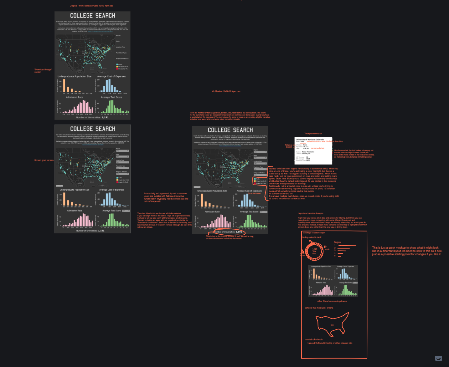
Once all was resolved, I was pretty happy with the outcome.
I think Tableau did an excellent job taking my idea from proof-of-concept and beyond. The dashboard is functional and hopefully helpful for prospective college students. If this tool had been available when I was searching for a university, it would’ve saved me several applications, but I believe I would still have chosen UNC: it’s the best university in the world. I’ll certainly be iterating on this dashboard as I have time, and I hope it may help someone else on the college hunt.