Washington, D.C. is packed with incredible places to visit. As someone who didn’t grow up near the U.S. capital, I am constantly amazed during each visit by the access to museums, culture and history I could only read about while growing up in Colorado.
The trouble with having so many amazing sights to visit is trying to choose which to see first. A few weeks ago, I decided to try and map out all the major museums in D.C., as well as provide information on when they were open to build a quasi-trip planner. For a self-proclaimed history nerd and data geek, the chance to try and answer this question using Tableau proved irresistible.
Building the Data Set
After researching, I found a few websites that offered lists of museums in D.C., but none provided an all-inclusive list of the information I was looking for. I also ran into the fun difficulty of trying to decide what constitutes a museum. In the end, I settled on crowdsourcing the definition with help from Wikipedia. The Wikipedia page listed 77 of the more popular museums and I added a few of my own as well.

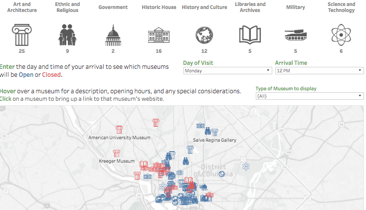
Above: My Washington, D.C. dashboard.
After a simple copy, paste and basic cleaning, I had my list of museums, but I still didn’t have information on exact geolocations, visiting times and official websites. Fortunately, I knew of a source that had these values all in one place: Google Maps.
When you look up a specific location on Google Maps, Google helpfully provides the opening and closing times for that institution. Plus, if you look at the first half of the URL, you can find the exact latitude and longitude coordinates for that specific address.
Unfortunately, I am a novice programmer at best. What followed was a long process of googling every location, manually inputting the hours into an Excel file, copying the websites and URLs, and then extracting the latitude and longitude values.
Thankfully, I use Excel 2016, so Flash Fill helped automatically retrieve the correct numbers from the long URLs. I am 99% confident this data is easily accessible via the Google Maps APIs. After I wrap my brain around more APIs, I’ll have a much more elegant way of handling this. However, it did give me a chance to work while listening to my backlog of podcasts, such as Silver Linings.
Visualizing the Data in Tableau
Once I had my Excel file set up, I connected it to Tableau to build my dashboard. Rather than creating everything using dropdown filters, I opted to use dashboard actions and icons to do the high-level filtering on museum types. This required putting together a quick, custom shape palette, but in the end I really liked the simplicity and visual cues they provided.
There were a few more complex calculations that allowed for the dynamic, parameter-driven Is Open flag, as well properly formatting the Open and Close time labels. Overall, having control over the data set from the beginning allowed for a relatively smooth development process, resulting in a fun and interactive way to explore the museum offerings of Washington, D.C. You can see my final viz below. I hope you enjoy!
