
It’s no secret that I’m a math nerd. Or that I’m raising a math nerd. For his birthday, my son Judah got a Curiosity Box that contained a cool looking t-shirt. I spent some time explaining what was going on in this magical circle, but realized it would be easier to make something interactive for him to explore. Thus began my excited descent into exploring multiplication circles.
As I do with many of my projects, I brought an initial design to our lead Experience Consultant and Designer, David Duncan, for some feedback. Later that afternoon, I was surprised to find this beauty on my desk.
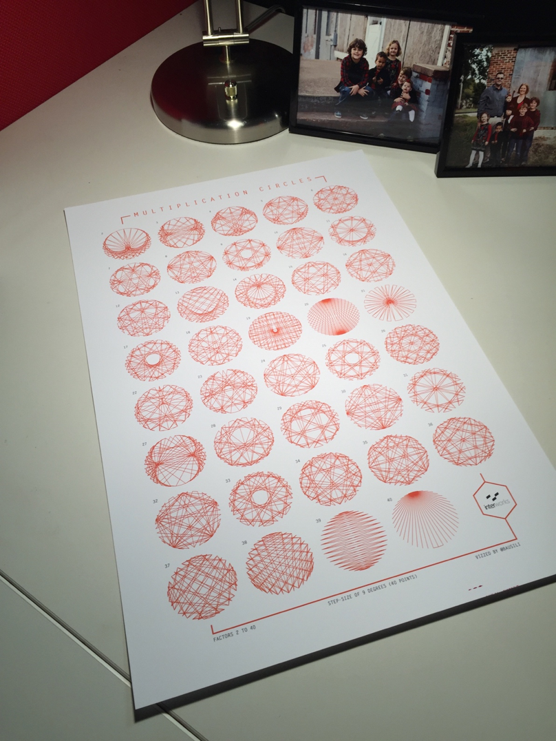
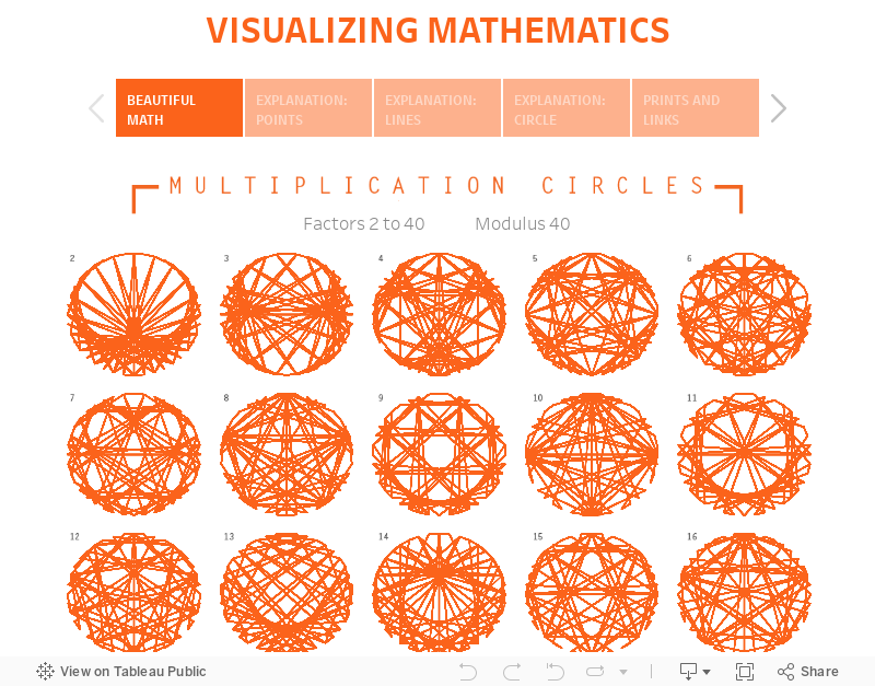
You can download a copy below, but before that let’s dive into this a bit further.
What’s the Deal with This Circle?
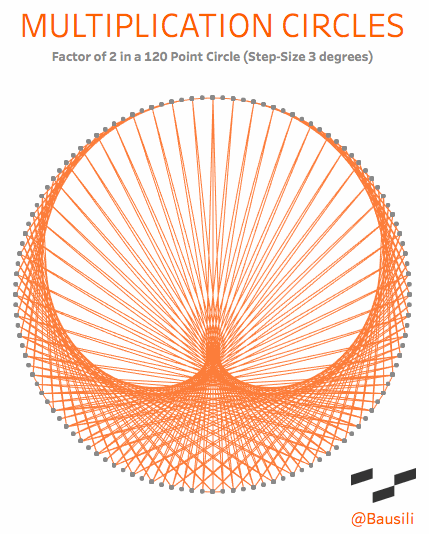
Academically, they are known as “circular modulation multiplication tables,” which goes to show you that mathematicians need a marketing department. To me, however, they are a simple and beautiful way to visualize the patterns that emerge in multiplication. Each circle has two elements that define the shape. The first is the number of dots in the circle, called the modulus. If we choose the number 12, we end up with something that acts exactly like a 12-hour clock. You start at the top of the circle and count around the face (0, 1, 2 to 12). Just like a 12-hour clock, the numbers reset once we reach the top a second time. This may sound complicated, but you see this concept daily when you tell time on a 12-hour clock. When a 12-hour clock goes past 12 hours it “resets” back to 1 o’clock. We even use modulus arithmetic to determine that five hours from 10 o’clock is 3 o’clock.
The lines are drawn from one point to another based on the multiplication factor that’s been chosen. If you choose a multiplier of 4, then a line connects points 1 and 4 (1×4=4), 2 and 8, (2×4=8), 3 and 12 (3×4=12); and so forth around the entire circle. Check out the explanation tab on this viz for a more interactive explanation.
How Do You Do That in Tableau?
There’s a lot going on in this simple visualization. The data source is straightforward enough, it’s just three lists of numbers. One list acts as the multipliers, the next acts as the starting point of the line and the last acts as the end point of the line. To place the points in Tableau, I’m employing a bit of trigonometry (holla for SOHCAHTOA). Finally, displaying the visualizations in a grid require that we do some modular math in the background to determine what row and column a particular viz would belong to.