In the following example, users can switch between a line chart displaying Sales by Month and a bar chart for Sales by Region by clicking a button:
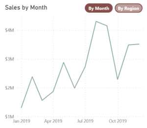
This interactive feature was developed in Power BI. The same functionality can be accomplished in Tableau by combining techniques such as sheet-swapping, show/hide states, and parameter actions (along with incorporating custom shapes for rounded buttons). In this post, I’ll demonstrate how to leverage Power BI Buttons and Bookmarks to achieve this effect.
Buttons are a powerful and versatile tool in Power BI, facilitating a key link between user interactivity and data discovery. In this post, we’ll learn how to create these objects and cover the various types available to us. We’ll also discuss creating bookmarks and assigning them to buttons.
Creating and Formatting Buttons
Creating a button in Power BI is straightforward. We navigate to the Elements section of the Insert Ribbon and click on “Buttons.” In the dropdown menu we see multiple button type options:
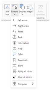 Actions (which we’ll discuss shortly) have already been preassigned to the “Back,” “Q&A,” “Bookmark,” “Apply all slicers” and “Clear all slicers” button types. Actions have not been assigned to the other types.
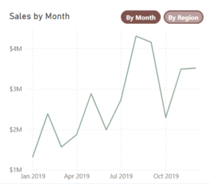
For our example, we’ll create buttons that allow us to toggle between the two charts below:
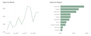
Each chart will have its own associated buttons. The “Sales by Month” chart will be displayed with an active-state “By Month” button and an inactive-state “By Region” button. Conversely, the “Sales by Region” chart will have an inactive-state “By Month” button and an active state “By Region” button. The inactive-state buttons will be clickable and serve as the means for swapping between charts.
First, we’ll create the active-state “By Month” button. From the dropdown menu, we select the “Blank” button type, and a new button is added to the canvas. To modify the appearance and functionality of our buttons, we right-click and select “Format.” We can control various settings here, but we’ll focus on the essentials needed for interactivity. Let’s begin by discussing an important feature of buttons: States.
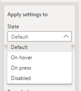
- Default: Indicates the state of the button when it is not being interacted with.
- On hover: Refers to the button state when the mouse is hovered over the button.
- On press: Refers to how the button appears when a user clicks on it.
- Disabled: References the state when a button cannot be selected or interacted with.
Let’s work with our default state first. Still in the “Button style” section, we leave our shape as “Rectangle” and set our rounded corners to 30px. In the “Text” subsection, we enter “By Month” into the “Text” box. To indicate that the button is active-state, a dark fill color is chosen, the transparency is set to 45% and the Font color is set to white:

The resulting button should resemble the image below:
To create our inactive-state “By Region” button, we can simply copy and paste this button, update the text and increase the transparency:
Adjusting the transparency to 75% for the button’s “On hover” state is a nice touch that helps confirm the interactivity for users as they mouse over the button:
As previously mentioned, these initial two buttons will only be visible when the “Sales by Month” chart is displayed. Next, we’ll create the buttons to be shown with the “Sales by Region” chart.
- We duplicate the “By Month” and “By Region” buttons.
- We select the newly created “By Month” button, and from the Format pane, set its state to “Default” and update its text from “By Month” to “By Region.”
- We select the “By Region” button that was created step one of this section, and, from the Format pane, set the button state to “Default” and update its text to “By Month.”
- We confirm that this button changes color when hovered over, and we update the text to “By Month” if, in its hover state, it reverts to “By Region.”
The resulting second pair should resemble the image below:

Our buttons are created! Next, we’ll position them with our charts, starting with the “Sales by Month” line chart.
- We place the inactive-state “By Month” and active-state “By Region” buttons side-by-side in the upper right corner of the “Sales by Month” chart. Note the exact vertical and horizontal positions for each. (This can be found in the Format pane in the “Size and position” subsection of “Size and style.”)
- We open the Selection pane, select these three items (the line chart and two buttons), right-click the group and select Group > Group:
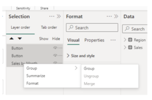
- We name this group “Sales by Month.”
- We position the “Sales by Region” chart directly over the “Sales by Month” chart and match its height and width precisely. In the upper right corner of this view, we position the inactive-state “By Month” button in the same vertical and horizontal position as its counterpart from “Sales by Month” and repeat the same for the active-state “By Region” button in relation to its counterpart:
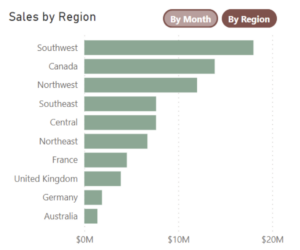
- We select these three items in the Selection pane and, as we did in step 2, group them together.
- We name this new group “Sales by Region.”
Now that we’ve created our buttons and groups, we need to add functionality to them. We’re going to use the buttons to swap various states of our report – one with the Sales by Month group shown, the other with the Sales by Region group shown – which we’ll do by bookmarking different combinations of shown and hidden items.
Bookmarks
Bookmarks are used to restore a previously saved state of our report. We’re going to create two of them, the first of which will be used to display the “Sales by Month” group while hiding “Sales by Region.”
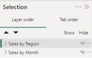
From the Selection Pane (View > Selection), we can control whether items are shown or hidden. This is accomplished by selecting the eyeball icon next to different objects:

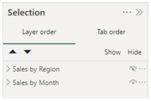
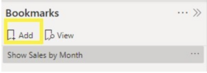
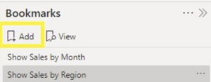
Once we have our Sales by Month settings, we can bookmark this state (View > Bookmark > Add) and give it an intuitive name ( ‘…’ > Rename):

 For the Sales by Region view, we’ll just reverse which items are shown and hidden and add another bookmark:
Assigning Bookmarks to Buttons
Next, we’ll assign these Bookmarks to our buttons.
- We select the “Show Sales by Month” bookmark and double-click the “By Region” button in the canvas. (Note: It’s necessary to click on the button twice since it’s now part of a group.)
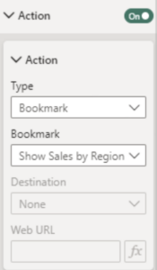
- We navigate to the “Actions” section of the Format pane, toggle the “Action” switch to the “On” position and expand this section.
- From the “Type” dropdown menu in the “Actions” subsection, we select “Bookmark.”
- We select “Show Sales by Region.”
Now, while viewing the “Sales by Month” chart, we can switch to “Sales by Region” by clicking the “By Region” button. (Note: To trigger a button action while in development mode, we must hold the Alt key while clicking on it.)
We can similarly assign the “Show Sales by Month” bookmark to the “By Month” button from the “Sales by Region” group.
That’s it! With this final bookmark assignment in place, we have successfully created our interactive buttons, allowing us to toggle back and forth between our “Sales by Month” and “Sales by Region” charts!
Conclusion
Indeed, buttons are an incredibly versatile tool in Power BI, enabling the creation of interactive, web-like experiences for end-users to explore their own data autonomously. With such flexibility in button design, function and application, developers are only restricted by their own imaginations.
