
In the business intelligence space, the main medium used up until very recently to interact with data was that of a compilation of data points, often visualised, that have been intentionally selected to convey an insight by being presented together in a defined space – what some call a dashboard, report or liveboard. As the technology has evolved and the possibilities skyrocketed, the way we now interact with data is very different. An example of that, and the topic of this article, is Tableau Pulse, a recently released medium available on Tableau Cloud. I am sure you have heard about it, but if you haven’t, you can find a number of interesting articles written by my colleagues about it. For the purposes of this article, I’ll assume you have had some exposure to it.
But with dashboards being an established method of data consumption, one wonders: is Tableau Pulse capable of simply deprecating the traditional experience of interacting with reports? In other words, can Tableau Pulse replace the dashboard as we know it?
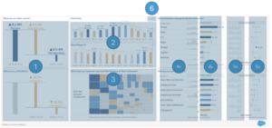
These are indeed big questions. In this article we’ll bring them to a specific scenario: what aspects of a dashboard could be delivered by Tableau Pulse? Here, you can find a workbook created by Tableau as part of their Accelerators initiative. This is the dashboard that we’ll try to replace. Note: We are only focusing on the Executive Summary dashboard and its key visualisations.
For the purpose of this article, I have not created any calculated fields to specifically support Tableau Pulse. The only change I made was to update the date field to be anchored to the present so that we always have data through the current day.
Recreating a Dashboard with Tableau Pulse
Let’s look at this dashboard example, which boils down to:
- Eight components – some are used more than once. One of them (#6) renders on click only.
- Three main measures:
- Total sales, total cost and the difference between the two: margin.
- Sales is expressed as actual ($) and margin as a percentage.
- Some components include percent change when compared to a previous period.
- A whole raft of filters allows users to change the date and the comparison period.
In Tableau Pulse, I have created four metrics: Total Sales, Total Sales Costs, and two versions of Sales Margin (% and $). With just that — no custom logic nor table calculations — let’s try to see what Tableau Pulse can do and better understand its possibilities. Throughout this article, we’ll be interacting with each of these metrics to obtain the results we need:
Let’s go component by component, starting with the one on the far left. With just a few clicks, the metric can provide the very same data with a different visualisation.
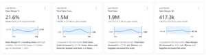
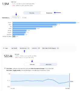
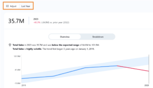
Component 1: KPI Overview
Tableau Dashboard:
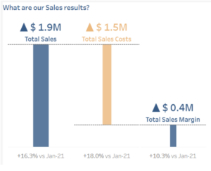
Tableau Pulse equivalent:
So far, Tableau Pulse is able to deliver all the values the dashboards, and it’s even providing additional period comparisons metrics. So far so good.
Component 2: Sales and Percent Change Month on Month
Tableau Dashboard:
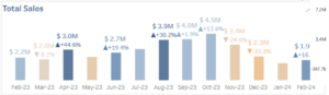
Tableau Pulse equivalent:
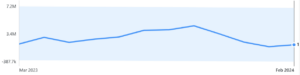
Here, we are presented with total sales and percent change month on month. Tableau Pulse can easily recreate that for one measure only: I can mouse over the line to reveal the total sales for each month, but I cannot add a percent change measure (Tableau Pulse does not currently support table calculations in advanced metric definitions) nor alter its format — e.g. display verticals bars instead of a line, expose the labels or adding a color scale.
Component 3: Sales by Customer Name and Group
Tableau Dashboard:
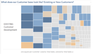
Tableau Pulse equivalent:
N/A — Time dimensions are a must:
Next up, a component that displays sales by customer name and type (existing or new acquisition). As things stand, however, metrics must be anchored to a time dimension. So a visualisation like this cannot be recreated.
However, Tableau Pulse provides off-the-shelf options to create a visualisation that breaks down sales by customer, which does not answer the same question but it gets fairly close:
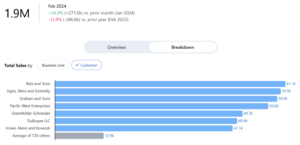
Components 4 and 5: Business Line – Total and 12-month Trend for Sales and Margin Percent
Tableau Dashboard:
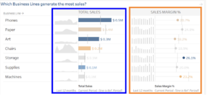
Tableau Pulse equivalent:
Here, we find the best performing business lines. For each of them, we are presented with a small sparkline that represents its sales over the last 12 months as well as its total ($) compared to a previous period in the form of a bar chart (in blue above). Both elements are displayed then again for margin percent (in orange above) with small modifications to the visualisation.
With two clicks, my total sales metric will reveal the top best performing lines (but with no references lines). To recreate the sparkline, I can simply filter one of the business lines. In the screenshot above, for example, we see the total sales for Phones. Sadly, I cannot display all business lines together — only one at a time. To recreate the Sales Margin percent section, I could repeat the same steps in my Margin % metric.
Component 6: Monthly Sales Breakdown by Year
Tableau Dashboard:
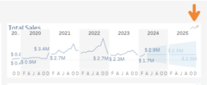
Tableau Pulse equivalent:
The last component only renders on demand in the dashboard: When users click on an icon a view of the sales trend is displayed month on month for all years, including a projection. This implies visualising the data by month and by year. As it stands, however, Tableau Pulse can only replicate this month-by-month visualisation for the last year, not across a 5-year period.
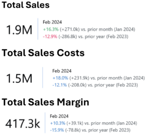
Recap: Recreating the Dashboard with Tableau Pulse
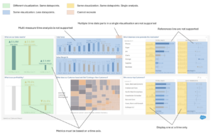
As you can see from the image above, Tableau Pulse cannot just recreate the dashboards that we’re accustomed to. But Pulse also offers some advantages over traditional dashboard development. So, how should we decide when it makes sense to build a dashboard and when it makes more sense to rely on Pulse metrics? Here are a few key considerations:
- Use Pulse for established metrics that users want to track over a variety of time periods. Tableau Pulse offers ten pre-built date filtering options and two period comparison options to users right out of the box — something that would be time consuming to develop (and require maintenance) in a dashboard. Although Pulse has limitiations on the metrics it can support and the visualizations it can deliver, this is just the initial release of Pulse. Tableau is putting a huge emphasis on GenAI. That’s a lot of horsepower that will likely lead to additional iterations and enhancements to this product over the next coming months and, with it, the lines between what you can do in Pulse vs. Tableau Desktop will continue to blur.
- Use Pulse to focus on a single metric. Use dashboards to show metrics within the context of other metrics. With Pulse, users mostly consume information piece by piece. While you can see multiple metrics on your home page, Pulse is primarily designed to dig into a single metric at a time. Dashboards, on the other hand, offer a way to view all those pieces on a single screen, allowing users to consider metrics and trends within the context of other metrics and trends. Dashboards can also be designed to answer a set of related questions when there is a specific pattern of analysis that users typically follow.
- Pulse is great for users who want AI to surface insights for them. Dashboards are great for users who need to do their own exploration. One of the key and most appealing features of Tableau Pulse is something we have not covered in this article: its capacity to generate insights via natural language. Users can ask pre-generated questions of a Pulse metric and Tableau’s AI will do the heavy lifting for them. While Tableau’s AI is great at identifying underlying changes impacting trends, users may occasionally want to take their analysis in a different direction or may have anecdotal context that Tableau is unaware of. In instances like this, dashboards are still helpful tools that give users the flexibility to do their own analysis.
In conclusion, Tableau Pulse will not fully replace your need for dashboards, but it’s also not intended to. Both Pulse and dashboards offer valid user experiences. Pulse detects insights for you and allows you to dig deep on a single metric. Dashboards can provide a broader view of multiple metrics and more control over the analysis, but they require more work from the user. Because both experiences have their merits, we anticipate that Tableau will develop ways to integrate metrics and dashboards (like metrics as a component of a dashboard) to provide users with the best of both worlds.