Note: InterWorks is not a financial institution. This is not financial advice. Please consult a financial expert before making any major financial decision.
If you’re like me, you enjoy both financial assets and data analytics in Tableau. Have you ever thought about combining both? Let’s do it. I’ve already created a long-term stock investing blog using Tableau, so this time I’d like to do analysis on short term day trading strategies using Tableau.
For this blog, we will be trading the E-Mini S&P 500 futures contract. Moving froward, I will refer to this as “the ES” This is a leveraged derivative security that tracks the S&P 500 on the New York Stock Exchange (NYSE). The benefits of ES trading are as follows:
- Improved buying power efficiency
- Better liquidity
- Better day trading regulatory requirements
- Wide market correlation
This is a chart of the ES on a trading platform called Think or Swim. You can use any broker/platform but this one is my favorite:
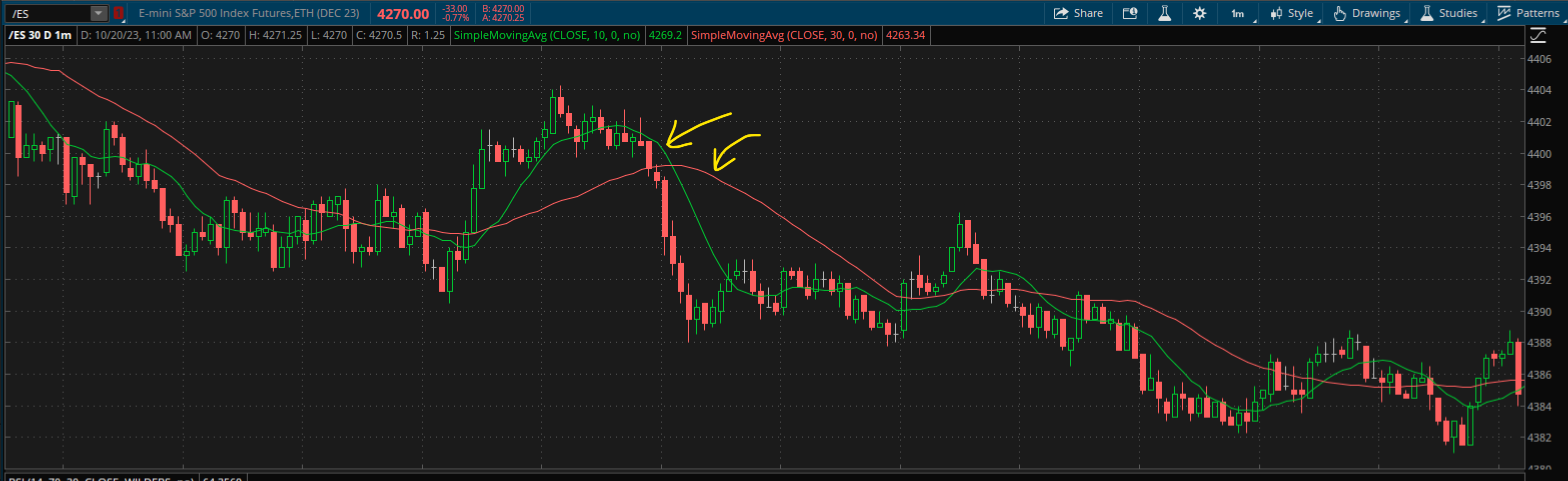
Figure 1: Image of the ES 1 min chart with 10 SMA (green) and 30 SMA (red) noted.
The Strategy
When developing our day trading strategy, we want to pick a concept that logically makes sense and has unambiguous data points that can be processed by Tableau.
Below is an image of the last regular trading hour of 10/9/2023, 2 p.m. — 3 p.m. CST. Do you see any interesting “hints” or “flags” that could help predict future prices?

Figure 2: A broker chart of the last hour of trade time.
- Point #1: 2 p.m. start of our trading time frame
- Point #2: 3 p.m. end of our trading time frame
- Point #3: The specific price candle where our two SMA lines cross, after 2 p.m. CST
When we analyze SMA line crossings, we know that whichever comes out on “top” is the potential direction the price is headed. In this case, the red line crosses on “top,” which hints for the price to go down, meaning we should make a “short” trade.
Short Trading is just like buying a stock, but instead, you’re “betting” that the asset (the ES) will go down.
The time at which the SMA crosses above was 2:08 p.m. CST at price $4370.50. So, we’re going to short the ES at that price. Now what?
Any sensible day trading strategy has both a “profit” point and a “loss” point. That said, it can be difficult to pick two different numerical values that are unique and systematic. Thus, I like the idea of having symmetric/equidistant value that determines the exiting point of the trade.
In this case, I find that $5 is a reasonable, static numerical value to target when setting a profit and loss. That means we would want to set our stop loss at $4370.50 + $5 = $4375.50 with a profit point to be $4370.50 – $5 = $4365.50
This is how you build a trading strategy! Although, it could use some “optimization” and back testing, because we don’t know if it works! This is where Tableau comes in.
Data Collection
I created a Google Sheet where I collected all the relevant data we’ll need to build our Tableau dashboard.
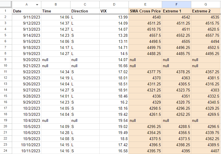
Figure 3: Incomplete data sheet
The data we need are:
- Date
- Time (of SMA cross)
- Direction (buying/long or selling)
- VIX (the volatility metric of the market)
- SMA Cross Price (the price of the ES at which the SMA values crossed)
- Extreme 1 (the first extreme price to take place)
- Extreme 2 (the second, opposite direction extreme price to take place)
Tableau
Optimization should start in Tableau with our previously talked about “profit” and “loss” point, aka $5. The $5 mark might work well for most situations, but if it’s avoidable, you shouldn’t have static values for a market that changes rapidly. Thus, let’s develop a calculation that takes into account volatility.
The VIX is a popular metric on the NYSE that many investors use to gauge the volatility of the market as a whole. It has a relatively high value during volatile times and relatively low during calm times. The 10-year daily average for the VIX is 18. Thus, the calculation below is the metric I’m going to use to take “profit” and “loss.” Where going to call this new metric Real Best Value (RBV):
RBV = (5 * (Current VIX / 18)) + .25
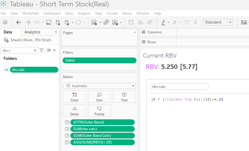
Figure 4: Making RBV into a Tableau calculated field
Next, we want an actionable way to keep track of the VIX, so let’s design the sheet below:
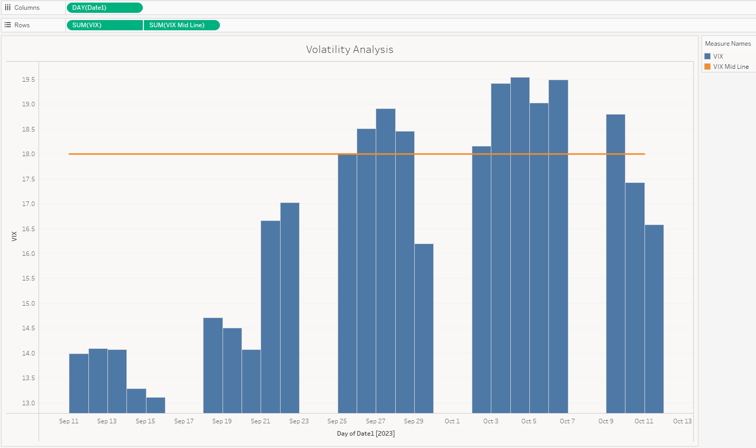
Figure 5: Tableau sheet showing the historical VIX trades.
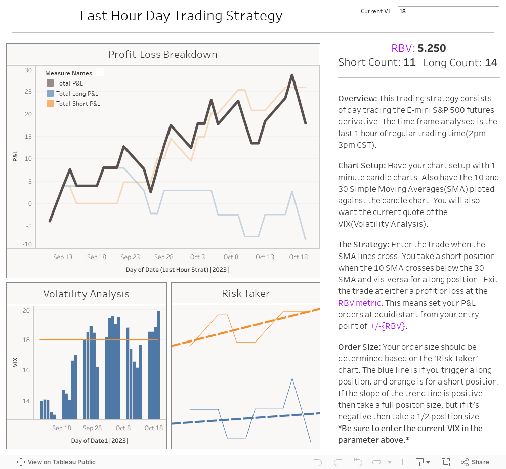
The next Tableau sheet is one of most important when keeping track of your day trading strategy: How about our profit?
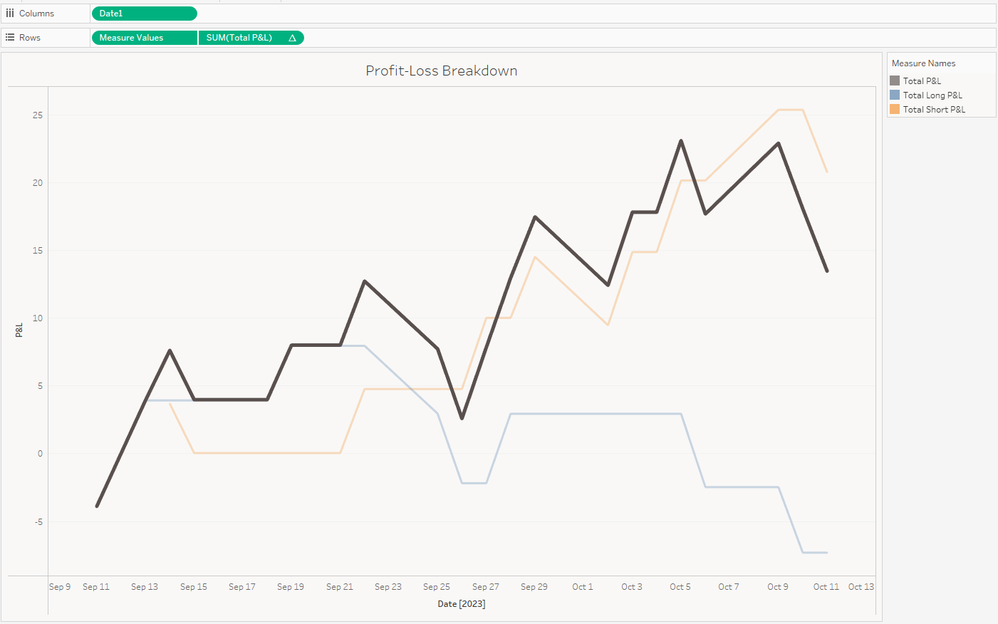
Figure 6: P&L Chart
The dim orange line is the running sum of “short” (selling) trades taken with the strategy, while the dim blue line is the running sum of the “long” (buying) trades taken. Finally, the bold black line is the cumulative of the two when taking both trades as they appear in the designated time frame (last hour).
You can view the calculated fields in the tableau public link attached.
Risk Taker
This is great! It looks like after the past 20 trading days our trading strategy is in the profit. Although, it would be nice if I could have put less money into the “long” (buying) trades as they seem to be the current black eye of the trading model.
There’s a way we can address this! Let’s duplicate the chart and get rid of the black line. Next, let’s go into the “Analytics” pane and drag over “Trend Lines” to each line on the chart.
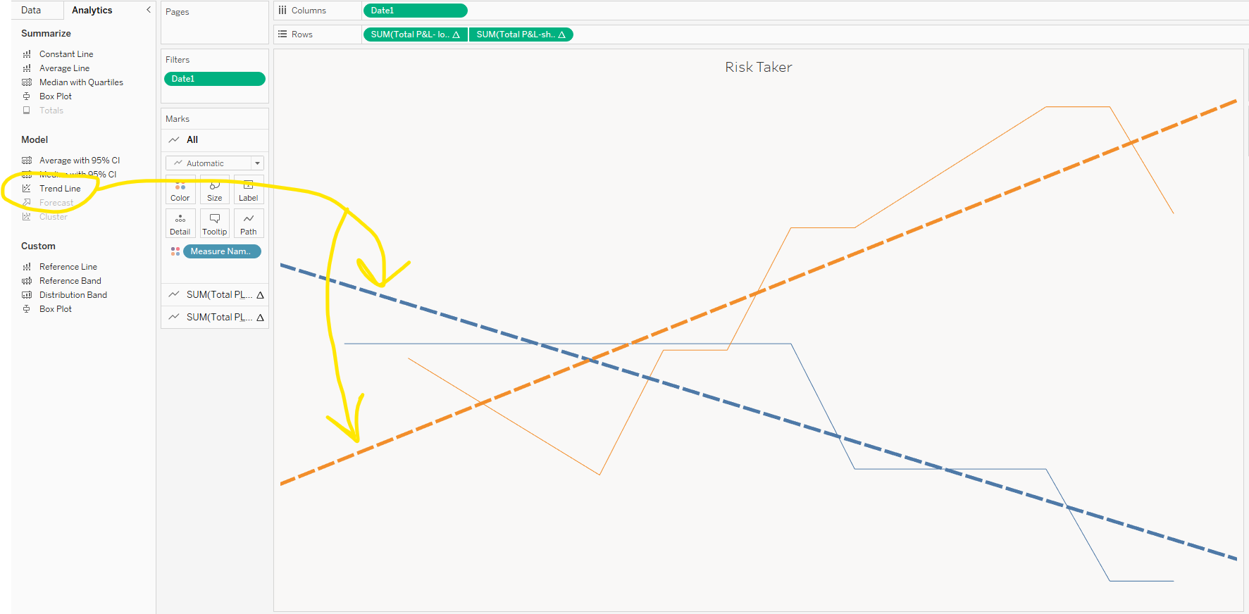
Figure 7: Trend line plotting
Finally, let’s limit the window for how much this tab “see” in the data field. Drag date into filter, select “relative date” and set it to the past 15 days. This forces the trend line to reflect only the most relevant data. The slopes of these trend lines are what will inform us of how much money to allocate to each trade type (long vs. short). This is called “trade size.” For example: If I normally trade two contracts (shares) for my trading account, I would use two contracts for the short trades, but only one for the long trades. This would apply until the slopes of these lines change!
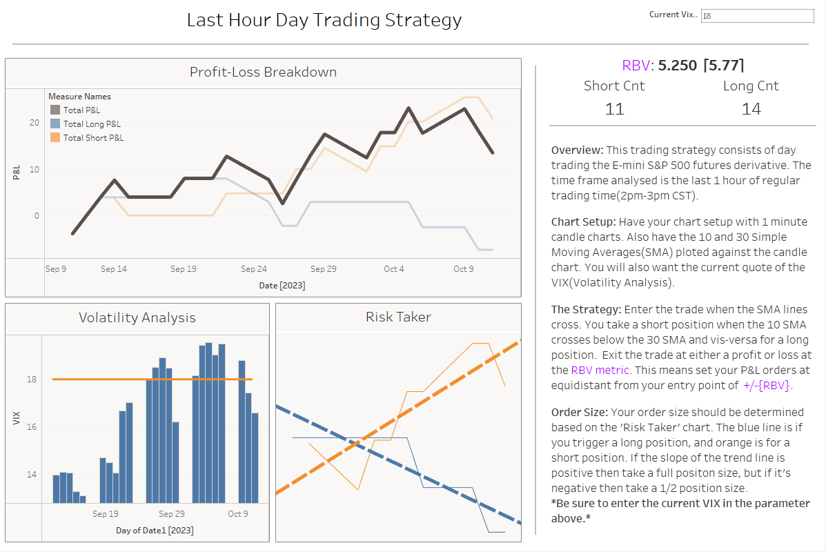
Figure 8: Applying everything into a dashboard
The final dashboard looks something like above. It enables us to see all key metrics and make key trades based on our criteria. I hope you enjoyed this and inspires you to build your own trading strategy and test it using Tableau!
If you want to play around with my dashboard, take a look at it here: