
One thing I noticed: there’s one last step that I always take before heading out into the street with two overflowing grocery bags. Just before the exit, I push the handicap door opener on my right. And it stays open long enough for me and an elderly lady to pass through without struggling with the heavy door. It’s something that I’ve never really considered before, but that small button gave me a sense of relief and made my day just a little bit easier.
When we talk about inclusion and accessibility for everyone, we have to talk about the just-in-case-I-need-help push button. On a more serious note, and according to the WHO, a whopping 1.3 billion people or 16% of the world’s population lives with some form of disability. You might not need extra help, but one friend from your group of six might.
Opening Door Number One
Accessibility is the practice of making information, content and functionality available and usable by people with disabilities. Disabilities can loosely be divided into two main types: physical and cognitive. Physical disabilities include problems with things like seeing, hearing or moving. Cognitive disabilities, on the other hand, affect how a person learns or processes information. Examples of cognitive disabilities include dyslexia, difficulty with memory and problems with spatial reasoning.
Identifying accessibility barriers can be challenging and costly, and current compliance checkers only find a portion of accessibility issues (Deque Mar. 2021). Following general accessibility standards may only address half of the needs of people with disabilities (Power 2012). Also, research on accessibility in data visualization focuses mainly on (color)blindness and low vision, neglecting other disabilities. Unfortunately, most of the time accessibility has been another word for checking boxes for legal requirements. Here, we follow the longstanding WCAG 2.0 principles. This includes ensuring that the visualization is perceivable, operable, and understandable to all users, regardless of their abilities.
To remind, Web Content Accessibility Guidelines (WCAG) 2.0 are a set of guidelines created by the World Wide Web Consortium (W3C) to help make web content more accessible to people with disabilities. These guidelines are organized into four main principles: perceivability, operability, understandability and robustness (POUR):
- Perceivable: Information and user interface components must be presentable to users in ways they can perceive. For example, web pages should include text alternatives for non-text content like images, videos and audio files. The content should be adaptable or presentable in different ways (like simpler layout). It should also be distinguishable for users who may have difficulty seeing or hearing the content.
- Operable: User interface components and navigation must be operable. Users can interact with the content using a variety of input methods, including keyboard, mouse and touch. This means that web pages should be navigable using only a keyboard, and that users should be able to pause, stop or adjust any moving or flashing content.
- Understandable: Information and the user interface must be understandable. The content should be readable so that it can be understood by all users, regardless of their background or abilities. The language of the content should be clear and simple, and instructions should be provided in a predictable way that is easy to follow.
- Robust: Content must be robust enough that it can be interpreted reliably by a wide variety of user agents, including assistive technologies like screen readers. This means that web content should be designed using standard coding practices, and should avoid using specific features that may not be supported at all times.
Doors of All Shapes and Sizes
When it comes to data visualization, accessibility should never be an afterthought. The ability to access and understand data is crucial for decision-making, problem-solving and overall understanding of our world. Just remember the Johns Hopkins University COVID-19 Dashboard that provided real-time data on the pandemic.
Simply complying with overly technical accessibility standards may not necessarily result in an improved user experience (Vollenwyder et al 2023). So far, we have mostly been using design principles to make data more understandable by providing alternative text descriptions or using high-contrast colors. This approach does not fully address the question of how accessible a data visualization is, particularly in cases where the visualization includes interactive and intricate components, like entire dashboards. This prompted practitioners like Frank Elavsky to expand the POUR guidelines with additional ones, namely Compromising, Assistive and Flexible (POUR + CAF) and into a design evaluation process known as Chartability.
- Compromising: This is a principle that prioritizes inclusive design by providing alternative and transparent information. A shiny dashboard is useless unless information is available at both high and low levels (such as tables and summaries), complex interactions are transparent (by giving hints to users), there is tolerance for errors, and redundancies are limited.
- Assistive: This is based on the Understandable and Perceivable principles, but with a focus on minimizing the cognitive and functional effort for users with disabilities. The goal is to add value to data visualization, which should de facto be a faster and more efficient way to process information.
- Flexible: Here we focus on empowering users to adjust their data experience. It’s important for designs to be adaptable to meet the unique needs of individual users, without making assumptions about their abilities or preferences.
A Double Dash on Dashboards
Dashboards as one of the most common dataviz use cases present additional challenges:
- End-user flexibility: Users would like a greater control over authorship and configuration. They want additional engagement features like drill-downs, more analytical support like predictions and adaptability (e.g., different display devices). Analysts often take screenshots of dashboards and create their own presentations, also suggesting that dashboards alone lack more powerful storytelling features.
- Ease of dashboard use: Supporting users with visual, analytic and data literacy places an additional burden on authors not only to inform but also to train their end users how to use the dashboard.
- Data design: Challenges here primarily involve confusion around choosing the right metrics and impoverished data vocabulary that leads to misinterpretations. Metadata is not always a given, and issues related to data quality, trust and accountability are often poorly handled by current dashboards.
- Wider impact: Dashboards are often used as the primary interface to consume complex information. Concerns here include data-limited thinking, unintended reactions to data, privacy and trust.
Each Door We Open
In his book, The Functional Art, Alberto Cairo talked about the ways we create and understand visual representations. He introduced the Visualization Wheel (or tension wheel), a framework for considering design trade-offs while creating information charts. Other authors have taken this idea further and applied it to complex visual objects like dashboards.
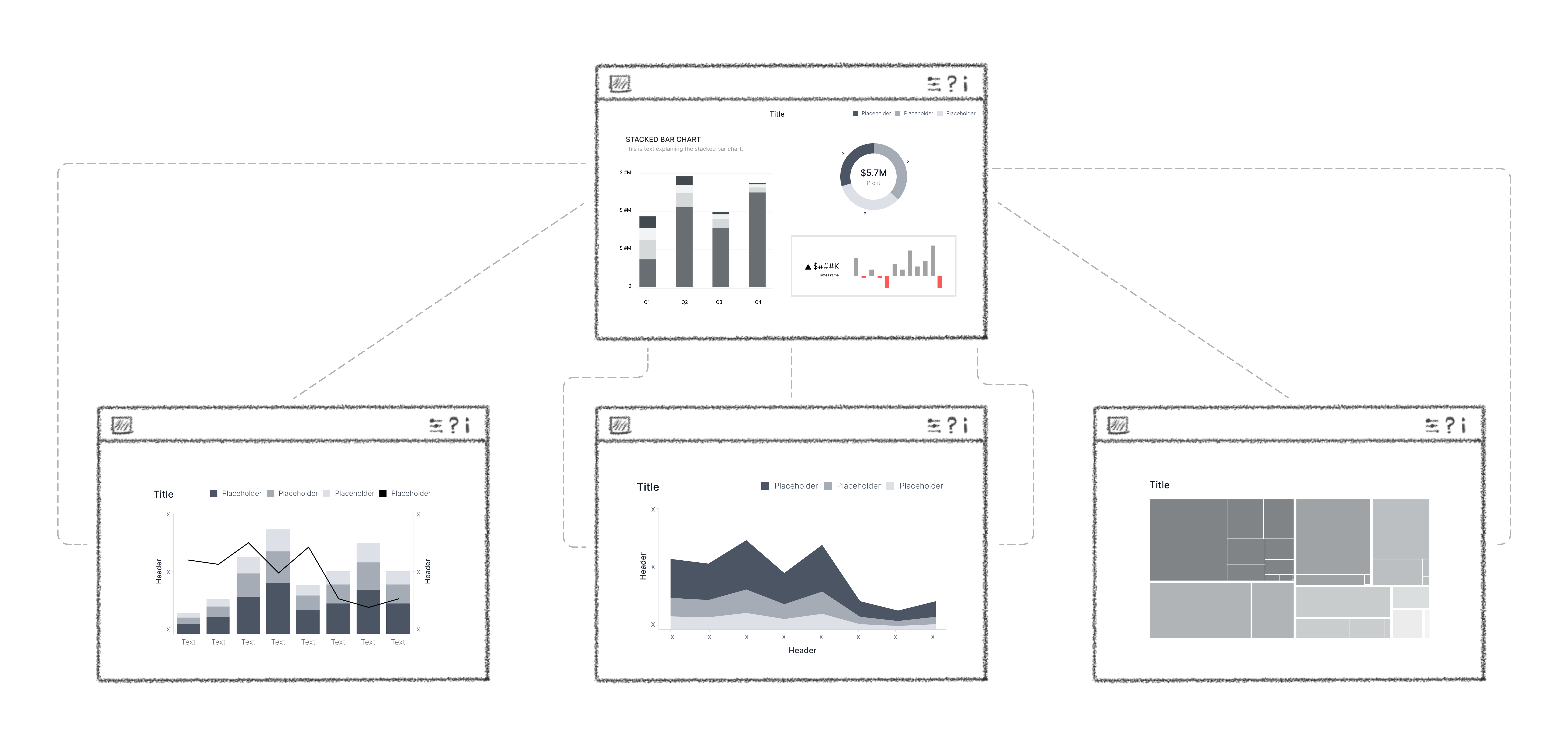
When we use dashboards, we tend to start with a general overview and then jump to details. It’s like following a tree-like structure, where we start from the root and move towards branches. This means that our interaction with a dashboard is always recursive – meaning we keep repeating the same process of starting from the overview and exploring finer details. Whenever we design for improved accessibility, we need to be aware of different interaction patterns. The eight interaction dimensions are shown on the chart below. Some of them are diametrically opposite and exclusive, but similar ones can work well together. Be mindful of this when creating interactive reports.
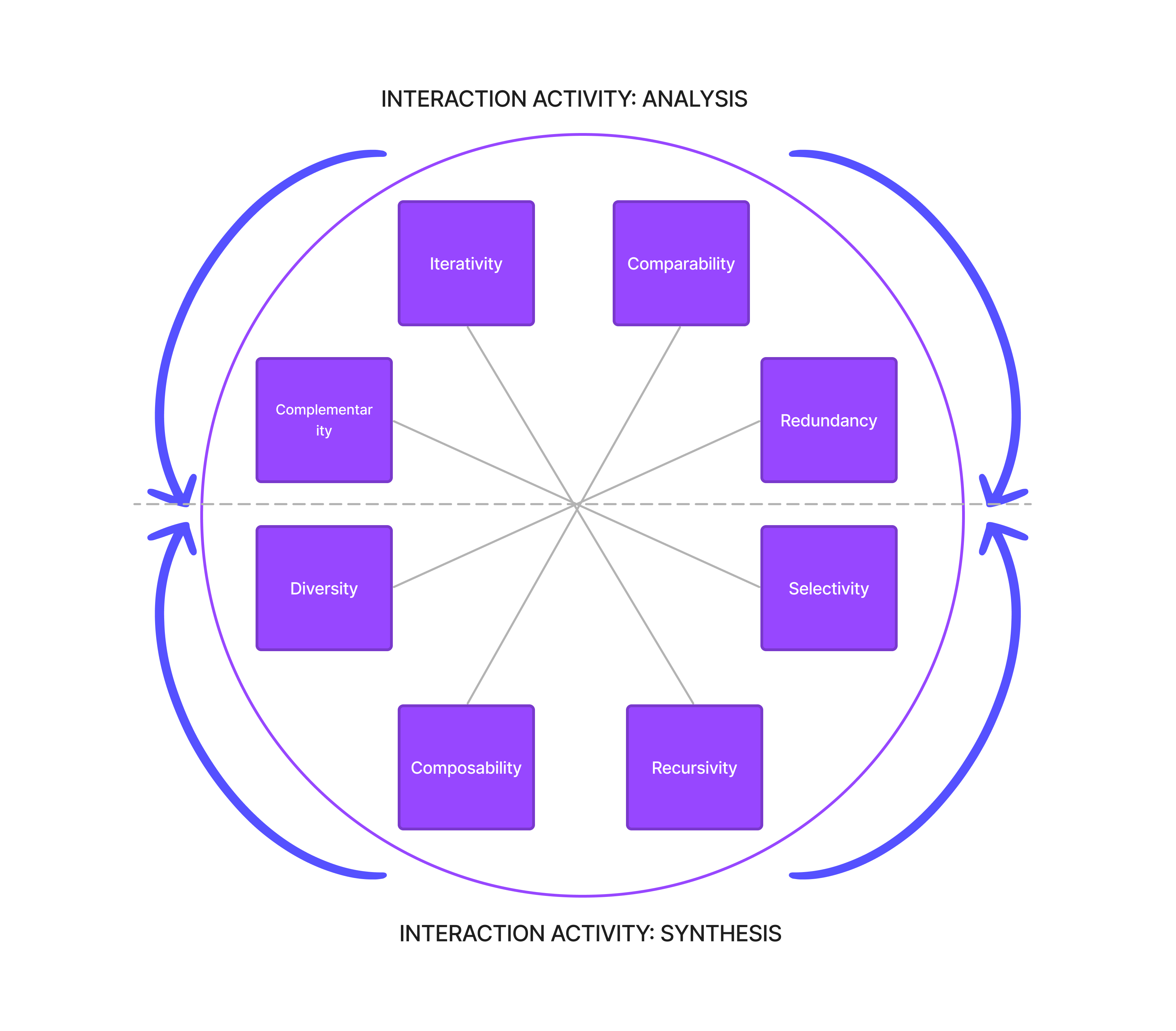
Source: Locoro, A., Buono, P., Buonanno, G. (2021)
Door Stoppers
Designing for an accessible dataviz experience should always consider the handicap button and the diverse needs of users. Dashboard is a powerful cognitive tool but we should always follow the path of least resistance when we want to communicate insights to others. Prioritize accuracy, assistance and scalability.
Star Formation
Good layouts held at the ready! Make sure that the most important information is easy to find. Don’t hide it behind dashboard interactions. As an author it is tempting to experiment with unique visualizations but users will not know how to read it. Stick with the familiar chart types like line or bar/column. Improve the readability by applying sorting, for example. Last plea, never use 3D charts (unless you’re in VR for some reason).
Clarity is Key
Have focal points that highlight the most important information by using visual attributes (The process of translating information into visual form is called visual encoding, and by applying these visual attributes: shape, color, size, area, volume, length, angle, position, direction, density) like color, contrast, position, size and visual weight. Text color should have a contrast ratio of at least 4:5:1 against the background color. The contrast for graph sections like bars should be 3:1. Don’t always rely on color – include additional visual indicators like patterns, shapes or text labels. The consistent use of colors and patterns especially helps neurodivergent audiences who need more predictability and repetition. It’s also important to strike a balance when combining these elements and not overload the chart and overstimulate the user.
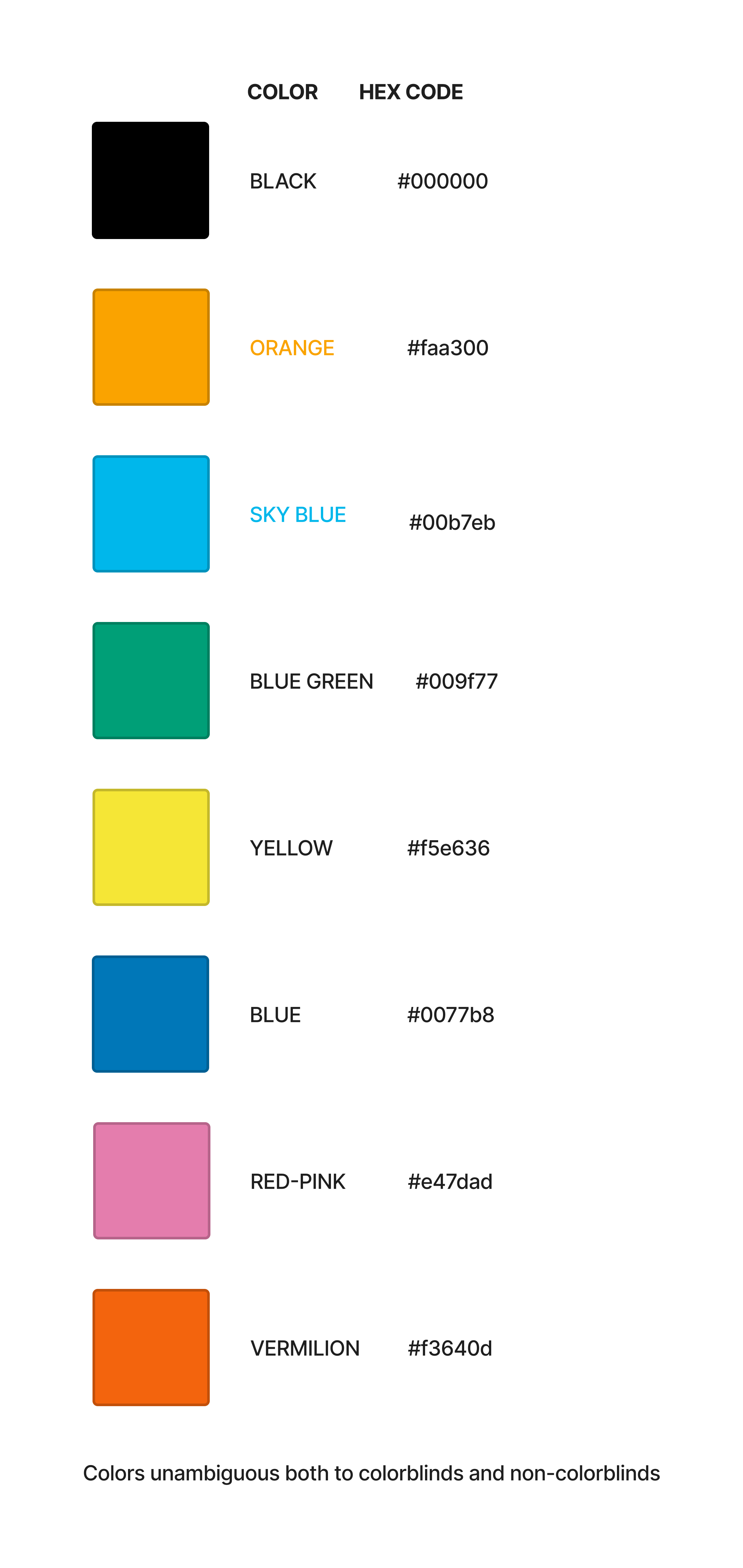 Source: Color Universal Design (CUD)
Alt + T
When creating a data visualization, context is equally important. This includes things like the chart title, the axes and additional features like tooltips. The main chart title is what users will probably read first so treat it as a short elevator pitch. Typography should follow a clear hierarchy, usually starting with the chart title and the color legend at the lowest level (see example below). Make sure that labels and legends distinguish the different data points. Provide information on data recency and collection and missing values. It’s always a good idea to provide a brief alternative text or a description. This will help explain the most important details and make it easier for everyone to understand.
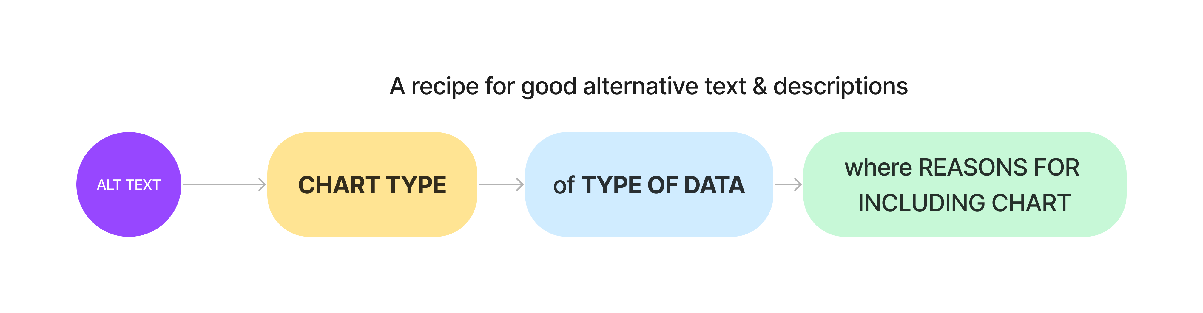 Alternative text descriptions for all images, charts and graphs help users who rely on screen readers to access the information. Keep the description short at max 140 characters (avoid adding words like ‘image of’) which is the limit of most screen readers. To optimize for accessibility, follow the checklists like these. Other methods include data sonification (see/listen to example), or the process of using sound to represent data where different tones and pitches might be used to represent different values in dataset.
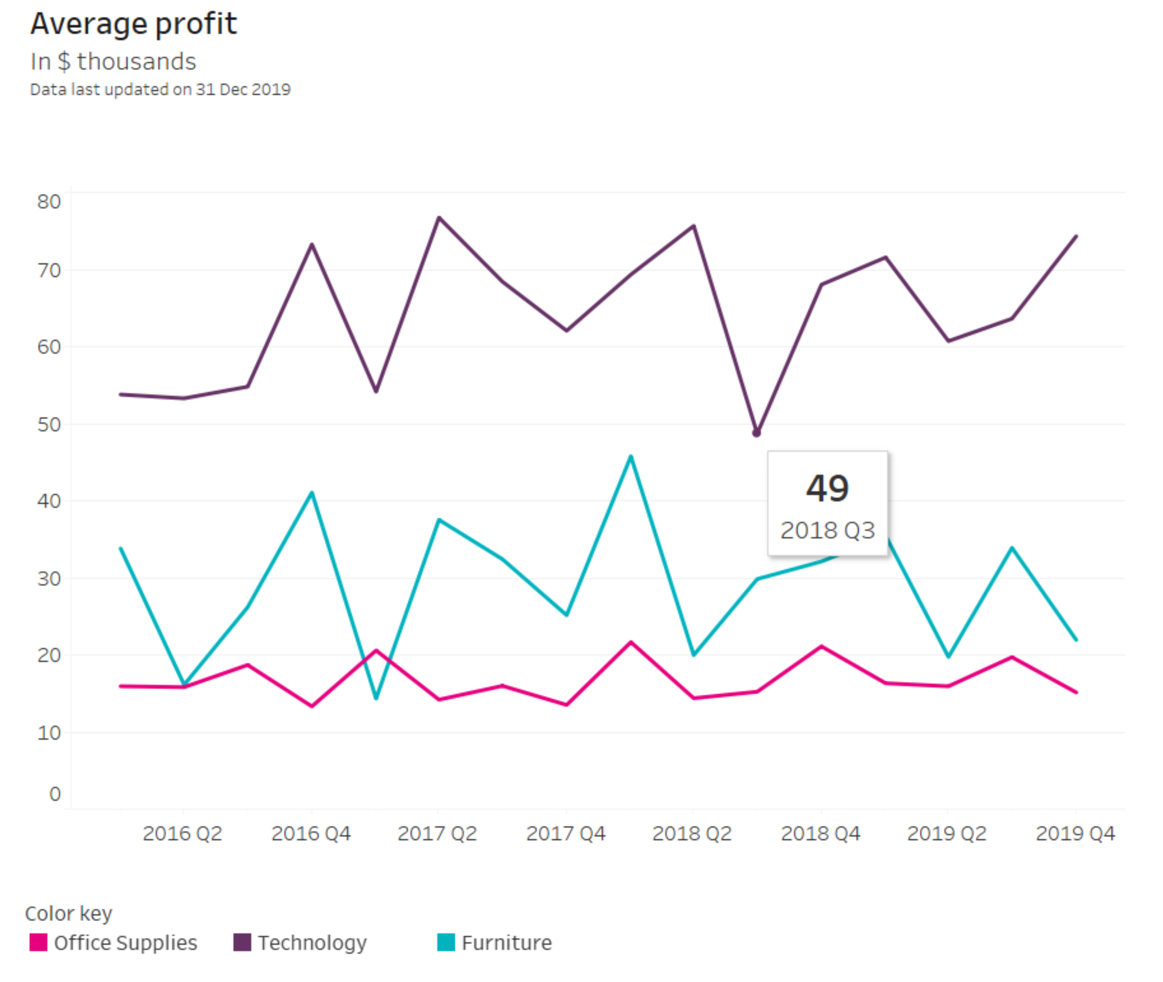
Alt text: “A Line chart of average profits quarterly 2016-2019 where Technology is consequently X times higher than Furniture, and X times higher than Office supplies”
Pad by All Means
Leverage the two types of white space – macro and micro. Macro white space is the empty space around the entire element and can help people with spatial reasoning difficulties process information faster. It can also help to focus the user’s attention on one or two elements on the page, which is helpful for people with cognitive deficits for example. Micro white space, on the other hand, helps to define different parts of the graph or chart when color differences are not enough. This is helpful when you have multiple metrics to show and color can get confusing.
While it is difficult to offer a set of one-to-rule-them-all guidelines, always keep the Inclusive Design Principles in mind but also these general guidelines:
- Recognize and embrace the diversity of your audience, including their age, abilities and cultural backgrounds.
- Involve a diverse range of users in the design process to ensure that their needs are understood and met.
- Identify and address any barriers that may prevent people from using your visualization.
- Ensure consistency in your design to make it easier to use and understand.
- Provide clear and helpful guidance to users to help them understand what they are doing and seeing and what to expect.
- Consider the different situations in which your data visualization may be used, including different devices, locations and contexts.
- Provide users with choice and control over their experience to enable them to customize it to their needs.
- Prioritize and present content in a clear and meaningful way to make it easier to understand and use.
- Test, iterate and improve your design continuously to ensure that it meets the needs of all users and remains accessible and inclusive. Read more about putting people first or user-centered dashboard development here.
References
Cesal, A., (2020), Writing Alt Text for Data Visualization. https://medium.com/nightingale/writing-alt-text-for-data-visualization-2a218ef43f81
Deque: Automated Testing Identifies 57 Percent of Digital Accessibility Issues. Tech. rep., Deque, Mar. 2021. Accessed: 2023-03-21. URL: https://www.deque.com/blog/automated-testing-study-identifies-57-percent-of-digital-accessibility-issues/.
Elavsky, F., Bennett, C. and Moritz, D. (2022), How accessible is my visualization? Evaluating visualization accessibility with Chartability. Computer Graphics Forum, 41: 57-70. https://doi.org/10.1111/cgf.14522
Elavsky, F., Mankoff, J., & Satyanarayan, A. (2022). Increasing Data Equity Through Accessibility. arXiv preprint arXiv:2210.01902.
Locoro A, Buono P and Buonanno G. Interacting with More Than One Chart: What Is It All About?. Human-Computer Interaction – INTERACT 2021. (447-450).
https://doi.org/10.1007/978-3-030-85607-6_55
Sarikaya A, Correll M, Bartram L, Tory M and Fisher D. (2018). What Do We Talk About When We Talk About Dashboards?. IEEE Transactions on Visualization and Computer Graphics. 25:1. (682-692). Online publication date: 1-Jan-2019.
https://doi.org/10.1109/TVCG.2018.2864903
Power, C., Freire, A., Petrie, H., & Swallow, D. (2012, May). Guidelines are only half of the story: accessibility problems encountered by blind users on the web. In Proceedings of the SIGCHI conference on human factors in computing systems (pp. 433-442).
Okabe, M. and Ito, K. (2023) Color Universal Design (CUD) / Colorblind Barrier Free. Retrieved March 28, 2023, from https://jfly.uni-koeln.de/color/
Vollenwyder, B., Petralito, S., Iten, G. H., Brühlmann, F., Opwis, K., & Mekler, E. D. (2023). How compliance with web accessibility standards shapes the experiences of users with and without disabilities. International Journal of Human-Computer Studies, 170, 102956.
WHO: Fact Sheets: Disability. Accessed: 2023-02-28. URL: https://www.who.int/news-room/fact-sheets/detail/disability-and-health