
We recently spent some time with the new Data Stories feature that’s part of Tableau 2022.2. In this post, I walk through that process and share the steps I took to explore the capabilities of the new Data Stories.
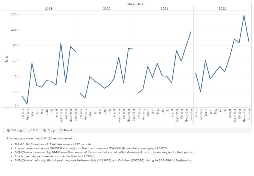
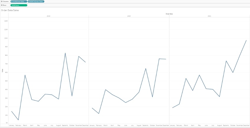
Let’s start by taking a look at the test dashboard:
Configuring the Data Story
Here’s the story configuration at a glance:
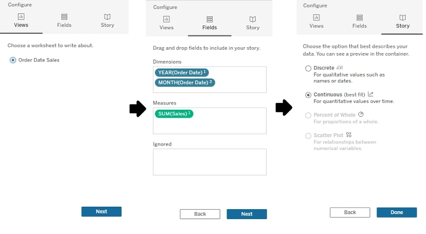
And here are the detailed steps involved in the process:
- Drag Data Story object onto dashboard and begin configuration
- Limited to one selected worksheet to generate narrative
- Select Dimensions and Measures desired
- Can choose to ignore dimensions/measures on sheet
- Can designate hierarchy of dimensions/measures, which will affect generated narrative
- Determine story type
- Story types are Discrete, Continuous, Percent of Whole and Scatterplot
- Tableau’s best-fit guess is automatically selected first but can be adjusted
- Different story types have different analytic types available in Narrative
Additional Data Story Settings
There are a number of other settings you can customize within the Data Story to fit your needs, like Characteristics, Relationships and more. I’ll just take a high-level overview of the breakdown of these dimensions and the settings contained within each. First up, let’s examine the Narrative dimension and its options for crafting your Data Story.
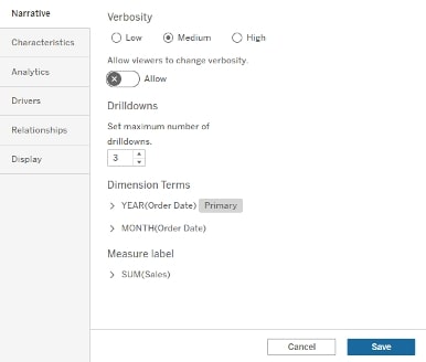
Narrative
- Verbosity option to control amount of text generated
- Adds additional analytical narrative to text
- Closely tied with the analytics enabled in settings
- Drilldown adjusts amount of narrative generated for fields in lower hierarchy
- Example: Year1 and Month2 with Drilldown 3 generated Year narrative along with three months
- Adjust dimension terms (single and plural)
- Add additional aliases (unsure how it works with multiple aliases for the same dimensions, but it is possible to add)
- Adjust measure labels
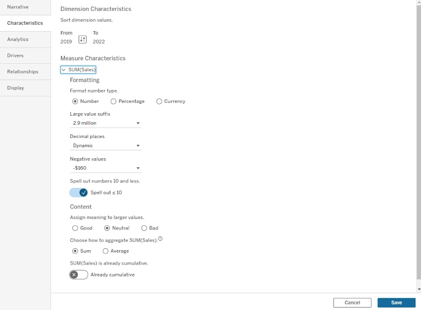
Characteristics
- Offers dimension sorting/measure formatting
- Can change how main measure is being aggregated
- Can assign meaning to larger values (Good/Neutral/Bad)
- This facet is something that warrants more exploration for functionality and use
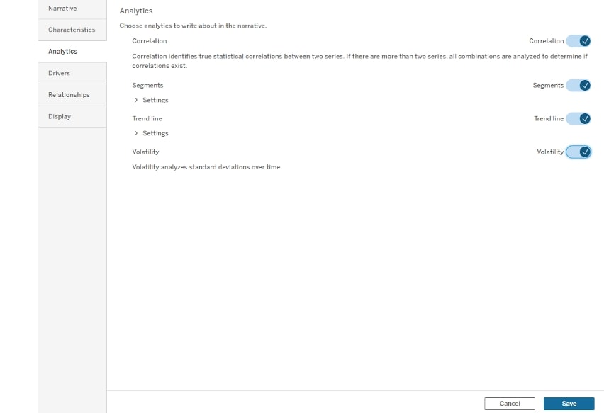
Analytics
- Offers different types of analytics based on configured story:
- Correlation
- Segments
- Trend Line
- Volatility
- Distribution
- Clustering
- Affected by verbosity level
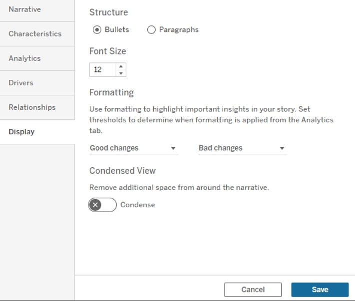
Display
- Adjust overall text format between bullets and paragraph
- Adjust font size
- Customize text coloring for assigned content meaning (Good/Bad)
- Condensed View
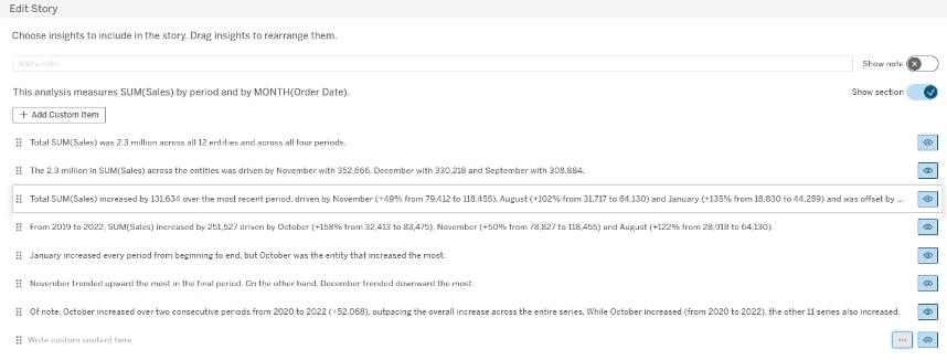
Edit Story
- Allows control on which automatically generated points are shown
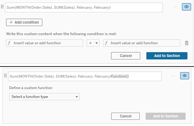
- Can add custom items to Narrative
- Custom items can include functions that generate values
- Conditions can be added to text rows that control when they appear
- Can set context based on parameter (This functionality is something we want to explore more)
Notes
- Dynamic with selections on chart
- Example: select a couple of months and Narrative will adjust
- Labeling can be wonky with these selections (wonky recognition of month vs year)
- Initial generated Narrative may already be displayed elsewhere in dashboards as BANs or KPIs but can be removed
- Offers lots of customization and can generate interesting data points
- Example: November comparison across four-year period
- Example: growth rates across different dimensions/measures
- Content Meaning (Good/Neutral/Bad) with conditional text formatting is interesting but seems limited to only “larger values”
- Need to explore more how this works and what that means
- Did not dig much into drivers and relationships
- Interested in seeing how this performs with a more calculation-heavy calculated field or with measures on Details, like an LOD
First Impressions of Tableau Data Story
Tableau Data Storytelling is an interesting, up-and-coming feature that has a lot of customization to offer. There are several settings/options that are a bit clunky, but I can see potential use cases for users, especially those interested in looking at data overtime. I predominantly explored the Continuous story configuration and look forward to digging into the others as time allows.
One potential caveat is that It’s hard to say how well this feature will function with a more complicated sheet. I’m using a sheet that does not involve LODs or other details, so I am not sure how Tableau would handle something more complicated. However, it’s clear that Tableau is providing users more possibilities than ever before to customize and craft a solid, natural data narrative.