
Layers have brought many new possibilities to Tableau. Previously, my colleague Rowan described in detail how to use layers with maps, which was the main intention behind this feature. However, I recently discovered some other helpful uses for the map layer functionality when displaying KPIs in a dashboard.
Applying Tableau Layers to KPIs
Solutions like the one below rely on using the x and y axis as coordinates of latitude and longitude. Each of the sub-categories start at 0,0. Using MAKEPOINT(), we tell Tableau where on the map—or on what is supposed to be a map but in our case is just a grid—it should present particular elements.
Hence, to present the icon in the bottom-right corner, which lies on the 0 (zero) of the y axis, we insert the following coordinates: 0.75, 0. Why those coordinates? Please examine the image below to understand where the central (0, 0) point of the axis is:
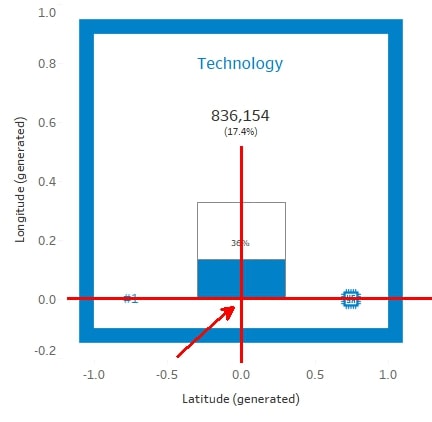
Notice that in this example, Longitude is the y axis and Latitude is the x axis. You can first drop two geo points on Layers then you can reverse them.
You follow this step by other MAKEPOINT() calculations, creating placeholders for the different elements of our view, e.g. MAKEPOINT(0, 0.8) for the title.
Organize KPIs into Columns and Rows
You will need the following calculations to arrange the KPIs into columns and rows:
- Column div: (index()-1)%(round(sqrt(size())))
- Row div: int( (index()-1)/(round(sqrt(size()))))
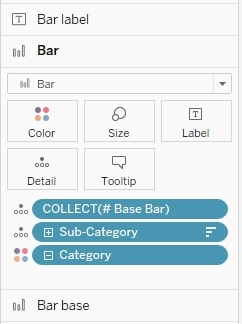
Place them on Columns and Rows respectively, and adjust each table calculation to run for each category and subcategory (or any other dimensions, to the most granular one). You must place category and sub-category in each of the elements, e.g. in Details:
The rest of the visualization is based on your needs and creativity. I’ve enjoyed the design of Fabio Fantoni where I found the above calculations, but you can redesign it in any way you like. I hope this new application of map layers opens up more possibilities for your data. Please reach out if there’s any way we can help. You can explore the dashboard and its functionalities below.
Note: Tableau Public sometimes shows errors with crosses instead of top and bottom bars. If you download the workbook, you will be able to see the correct view.