
Great dashboards start with great stories, but how much do we think about that story before we open up Tableau or PowerPoint? Many of us are guilty of dashboarding without purpose, which can limit the impact of what we produce. So, in this webinar, we take a step back and strategize on how we can apply best practices to data storytelling.
Communicating with Data
Let’s start off by thinking through how we communicate to others through data and visual analytics. Below, we see the spectrum that loosely correlates with the maturity of a company as it relates to creating narratives with data:
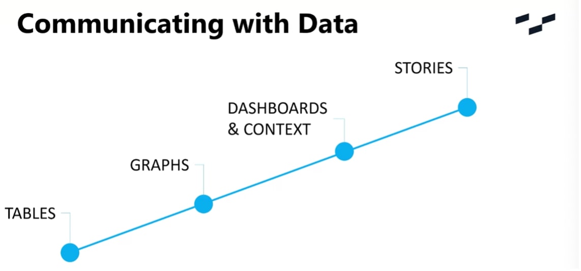
- Step 1: Tables – We might start out by using tables, identifying facts and feeding them into analytics or other business operations elsewhere.
- Step 2: Graphs – Gradually, we may want to start pushing out visual analytics in the form of graphs, typically answering a question you have in mind. This initial visual representation will provide quicker insight to decisions.
- Step 3: Dashboards & Context – A series of relevant graphs but with information identifying the key points that the visual elements are trying to tell us
- Step 4: Stories – The utopia: a story will take the data and turn it into a narrative that will drive change.
Case Study: Houston, We Have a Problem
Back during the Apollo missions, Mission Control looked at screens like these:
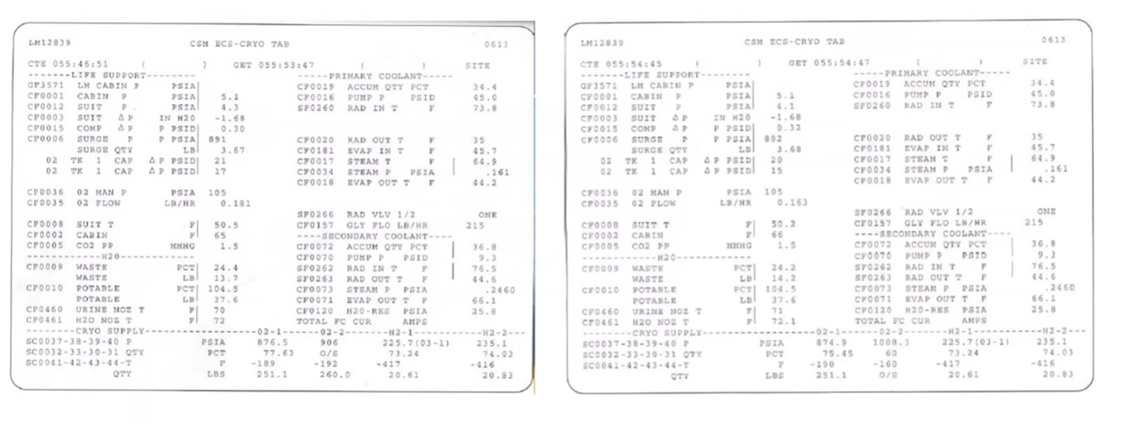
The data you see above was delivered in real time with a controller analyzing the data as it came in. Confusing, right?
We’ll focus on one part of the data – specifically, the oxygen tanks required for the survival of the crew. Taking the data above, let’s look at this in a graphical format:
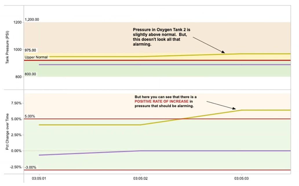
The bottom graph depicts how the oxygen tank pressures change over time, and we’ve added in a reference line to build context. The top graph looks at pressure, but really, it is the change over time that raises alarm bells:
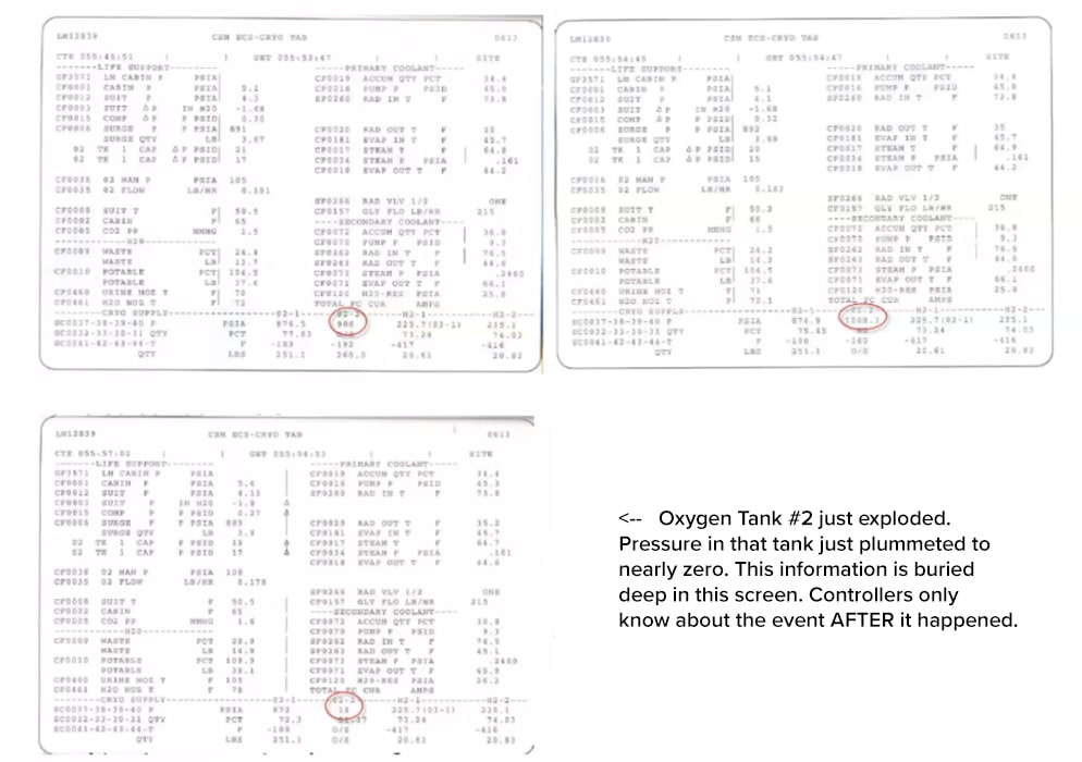
Reviewing the original data, we see that the Controllers had no understanding that there was an imminent threat of the tank exploding, and it was only after the fact that they knew. In looking back and adding more detail to the graph, we can now compare what is happening with pesky “Tank 2” in comparison to the other tanks:
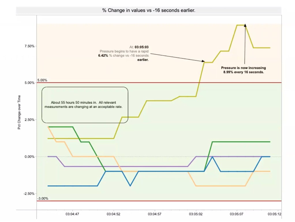
The anomaly is relatively easy to spot. If the Controllers had this visual representation, the narrative is jumping off of the screen at them. It also gives us a predictable indication of what was likely to happen. Thankfully, NASA was able to bring the crew home safely. We cannot categorically say that if the Controllers had had the data delivered in this format, it would have prevented the situation, but it certainly would have aided them.
How to Tell Effective Data Stories
We see this as three key aspects:
- Data to share
- Visual to engage
- A story to tell
Data to share means making sure you have data that is available and easily accessed. Once you have the data, it’s time to visualize it, which is the best way to engage the user. Lastly, we need a story to tell: what is the data actually telling us, and how do we use that data to drive change/ take action?
What Is Data?
In this context, we need to understand what data we have and if there are potential shortcomings in our data that may impact the story. We have two main types of data: the qualitative aspects (descriptive data) and the quantitative aspects (numeric data). Quantitative and qualitative data, when used together, provide insight and context for your audience.
What’s the Right Level of Data for Your Story?
Here, we start to assess what level of granularity is going to be most helpful in telling the story and engaging our users. A lot of the time, this all depends on who will be consuming the analytics:
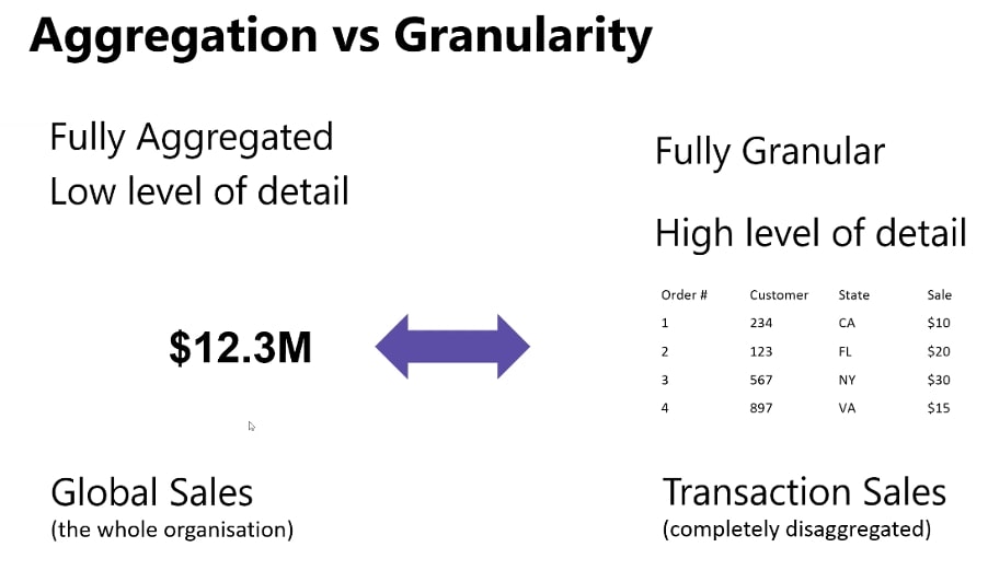
Within the data, it’s important that we give ourselves the options of how granular we want to go. Tableau allows you to do this, and we recommend you go as granular as you can, providing it does not impact performance, which gives you the choice to dig as deeply into the data as you would like.
We talk a lot about “Big Data” and we need to be responsible with our analytics around Big Data and select carefully where we start. We should be rigorous in searching the Big Data, but we should also be careful about which pieces of data we are looking at and which ones we are discounting.
In addition to Big Data, we should also be aware of the new concept of “Small Data” – data that is located at the individual level and cannot be analyzed in a clean way or grouped together. It’s the qualitative-only data and can be really valuable in creating insights to make decisions. Small data tells a more personal story, and many businesses utilize this data to really engage in what is happening with their customers. Although it is difficult to analyze in the traditional sense, it tells a valuable story.
Why Do We Visualize Data?
We could do an entire blog series on this question alone, but a simple example should give us a resounding answer:
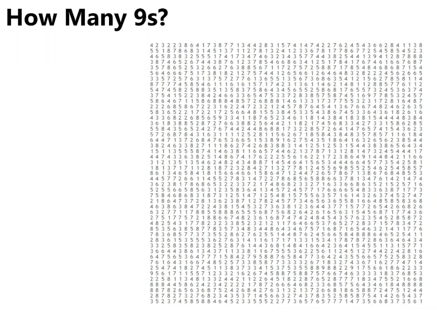
Give yourself 10 seconds to see how many 9s you can spot. No cheating!
Done?
Tough, isn’t it?
Let’s use a simple visual technique to aid us; let’s add color:

By dulling the background and enhancing the colour of the 9s, we are starting to get a much clearer picture. We start to think about: What are we happy with people being able to see at the front of their minds, and what information is background noise but still important to share as context?
We can then increase the size or use some sorting functionality:

Our dominant mental sorting is from left to right, so having the important information in the right place brings that data to the user’s attention straightaway:
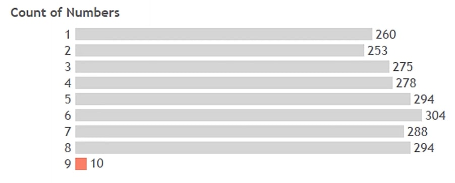
Finally, we bring in our visualization tool to build out the data and give us a bar chart and a powerful analysis of what is going on.
Visual analytics optimize the story within the data by using visual techniques to emphasize insight and improve speed to action. Some primary considerations for visual analytics include:
- Chart Type
- Level of Detail
- Data – Ink Ratio
- Colour
- Layout
- Marks
Visual analytics is based on long-established scientific research on the human brain’s ability to process information and different types of data. As analysts, it’s our job to assess what information is needed and what format will help the user identify the most important data without having to work too hard to find it:

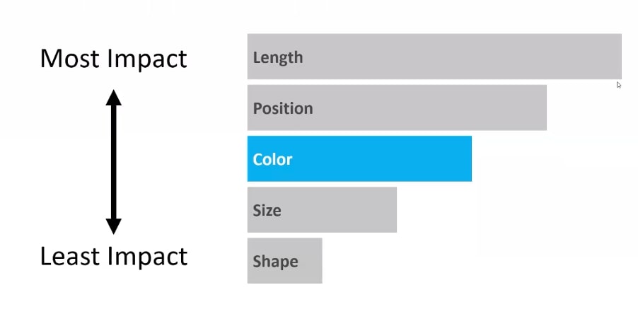
It’s all about knowing how people think, how they will navigate and using techniques to draw their attention to the right thing in the right order. We call these pre-attentive attributes. Pre-attentive attributes are visual properties we notice without using conscious effort to do so:
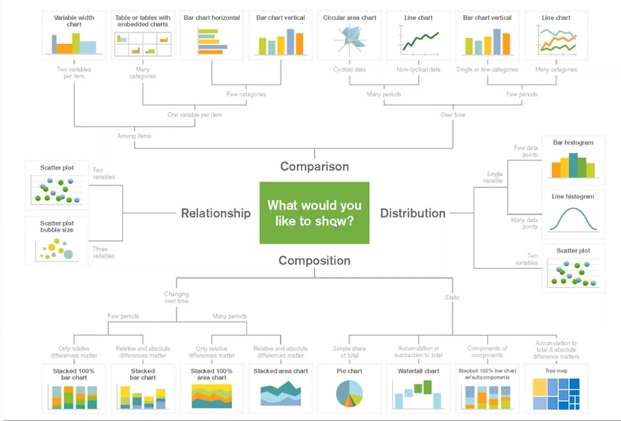
It’s important to think about the story you want to tell and the messaging you want to convey. As we mentioned, this is a whole topic in itself but asking ourselves the question of “What would we like to show?” helps guide us as we begin creating our visualizations:
One key point we like to make is that less is more. It’s a common mistake we see: busy dashboards that take too much effort to engage with and put the user off.
Why Do We Want to Tell a Story?
Coming back to the idea of why we would want to tell a story, a story makes the data memorable, has a greater impact and brings meaning (intellectually and emotionally):
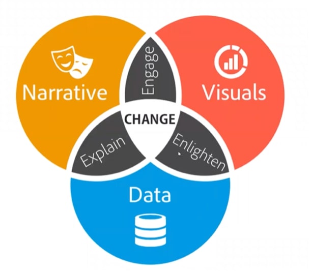
By bringing all of the pieces together, we explain, engage and enlighten, which produces the change that organizations need to thrive.
A story can be a bridge between people’s emotional rationale and decision-making. We apply the following principles to every story we tell:
- Show, Don’t Tell
- Ask the Right Questions
- Who, What, Where, Why, When and How?
- Focus on What Is Important
- Target the Audience
- Be Truthful
Your story is presented much like a traditional story, with a beginning, middle and an end. Bring the dashboard to the fore with exposition, utilize Tableau’s features to highlight the climax of the data and then provide the resolution.
Watch the Webinar
Let our expert data storytellers guide you through these topics by checking out the recorded webinar below. Follow along with the written content above as you listen in, or immerse yourself in this story uninterrupted.
Webinar Replay – US / EMEA
Webinar Replay – APAC